GroceryPal
service :
mobile app design
timeline :
mar 2020 - jun 2020
role :
user centered design
team :
Jacob Laxton, Sarah Le
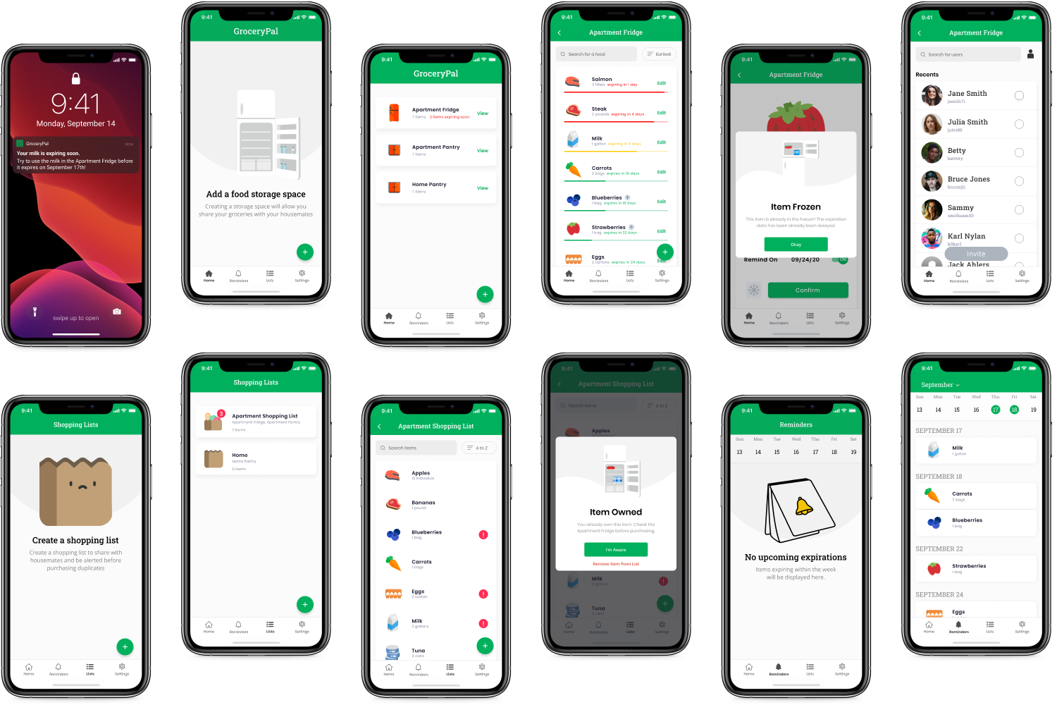
GroceryPal is a mobile app that tracks household grocery inventories, their quantities and expiration dates. Unlike other products, GroceryPal allows users to share these lists, set reminders regarding expiration dates, and create shopping lists that alert users when they already own an item to prevent purchasing duplicates and risking groceries being wasted.
PROBLEM
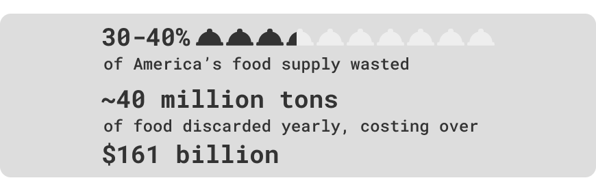
Food takes up the most volume in US landfills. Spoilage is the primary reason for food waste and people often purchase food impulsively. The availability of food and ease of purchasing in bulk within the US also escalate this issue.
...
“How can we help grocery shoppers reduce their food waste?”
SOLUTION
By creating a mobile app that will allow users become more aware about what they already own!
Please note the following solutions are a redesign by myself. I revisited this project alone in fall 2020 using insights from previous research and also after a usability test with a peer.

MARK AS EATEN
Remove items from your storage list simply by swiping.
ADD HOUSEMATES
Add users to share owned items and track together.
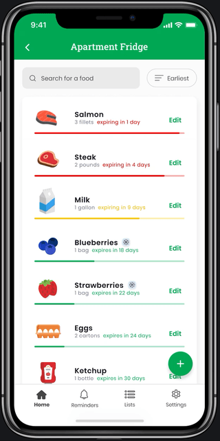
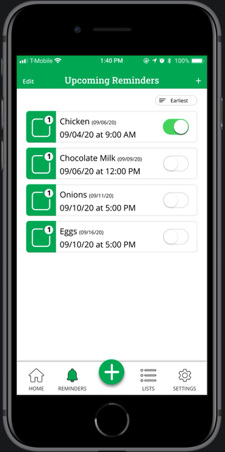
CHECK UPCOMING EXPIRATIONS
Stay updated on expiring items within the week, worry about other items later.
SHOPPING LIST ALERTS
Be alerted when items in a shopping list are currently owned and where they are.
RESEARCH INTERVIEWS
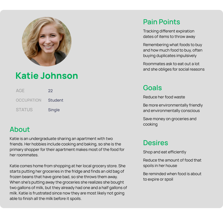
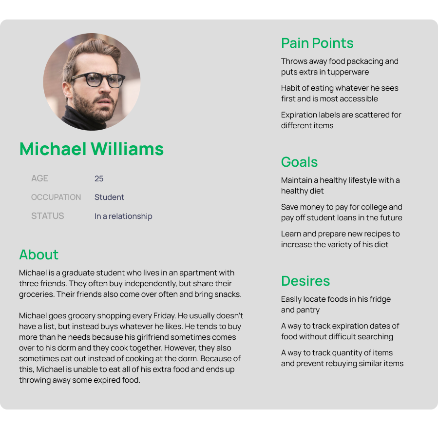
By interviewing a variety of primary household grocery shoppers, we gained insights into their needs and desires. Then, we spoke to average household members as a secondary audience. These interviews informed us about the users' basic demographics, shopping habits, current food waste habits, and more.
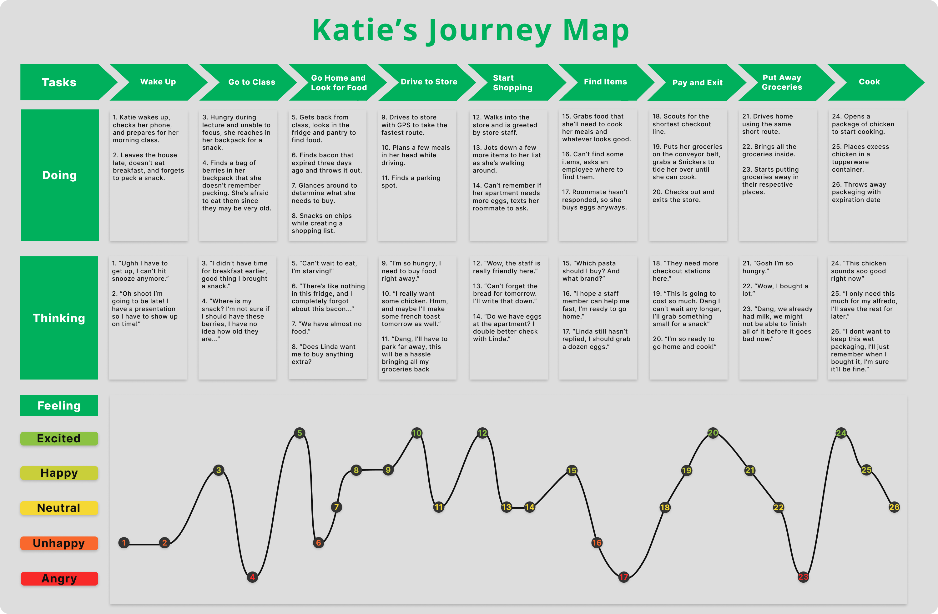
JOURNEY MAP
Condensing our findings, we generated a generic day for Katie, showing her journey with different tasks in the day and Katie's actions and attitudes in response. Her emotions throughout this process are also reflected.
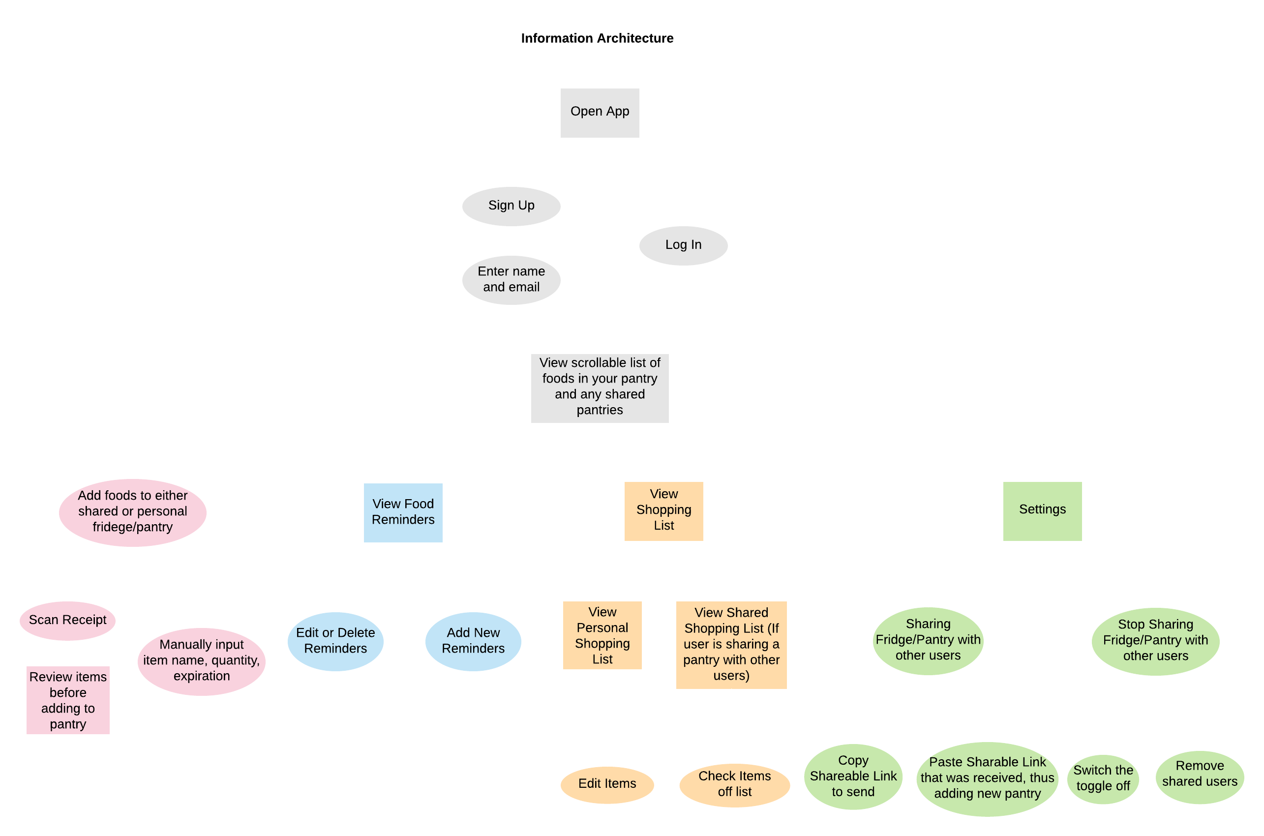
INFORMATION ARCHITECTURE
Mapping helped us distinguish the unique aspects of our design from other products while showing the relationship between different components of our system. Creating this information architecture flow also helped us understand how users would interact with our design.
WIREFRAMES
We each created paper prototypes to quickly view our key features and ideas. These were quick drafts used to solicit feedback from stakeholders. Then, we moved on to digital wireframes that polished up problems we were informed of.
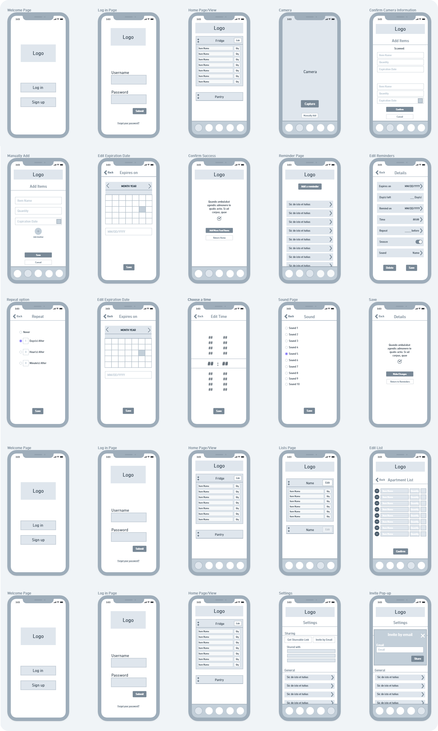
VERSION 1.0
Initial prototype which was then adapted after user testing. (Medium fidelity)
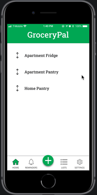
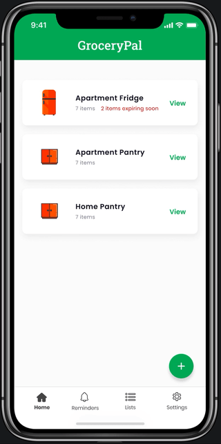
HOUSEHOLD STORAGE SPACES
Check household items with their expiration times in different locations, edit those contents, and add new groceries to these lists.
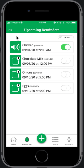
REMINDERS
View and create alerts for different grocery items, customize notification settings, and toggle them.
QUICK ADD
Create new reminders, storage spaces, or shopping lists to share with household members.
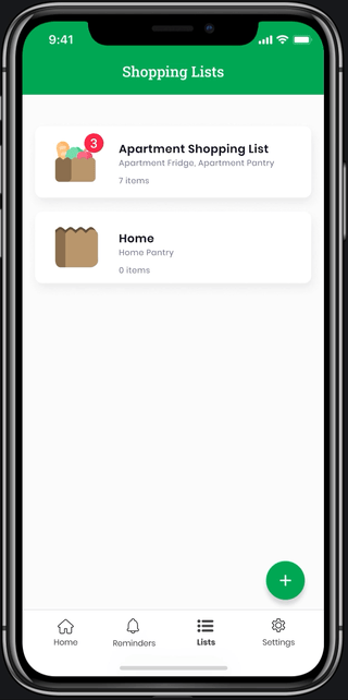
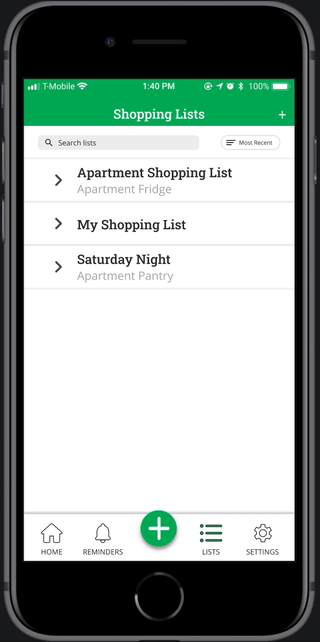
SHOPPING LISTS
Get alerted when items within a shopping list are already owned and manage lists shared with specific storage units.
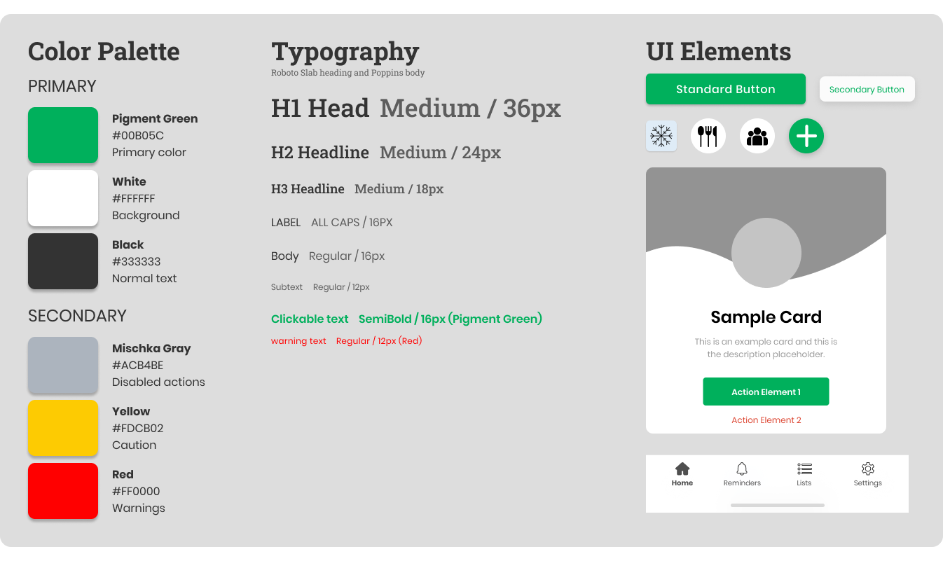
DESIGN SYSTEM
I created a design system to make the product cohesive. Ensuring that elements were consistent through this organization served to enhance the user experience. Maintaining this pattern allowed key components of the design to be memorable for a user. This design system is rough and expected to be adjusted in a future iteration; it is flexible.
REFLECTION
This was one of my first projects following the complete user centered design process. After developing personas and a user journey map from our research and interviews, I spent a considerable amount of time with physical drafts. From storyboards to paper prototypes, I was able to rapidly consider use cases and test different interactions.
As a result, I learned to appreciate the rapid prototyping approach and how I could elicit reactions and actions to different designs before combining the feedback into a digital wireframe. One limitation, however, is the access to testers and feedback physically in person compared to virtually.
The initial design system I made was also a life saver when I wanted to adjust similar elements. I created style components for different texts and colors which allowed me to organize and group headings, text, and actions to adjust after feedback. I also learned the importance of a cohesive design system from this experience and this is something I want to emphasize more in the future.
FUTURE
I plan on iterating more when I have more time. GroceryPal is a product meant to connect household members and for some people, this changes often. For instance, students may dorm or rent an apartment with different people and GroceryPal should be able to accommodate this. Allowing users to join or leave lists as situations change will be a future endeavor.
I want to encourage users to freeze their groceries and track this information. Within GroceryPal, a "freeze" function can extend the timer in the app and sort all this information for the user. A big motivation for this feature was talking to some of my interviewees who frequently purchase in bulk to save money.
Another idea is to show graphs and data of how much food users have prevented from spoiling and a rough estimate of their money savings. This was motivated from the statistics referenced in the problem and has the ability to motivate users to stay consistent and maintain good habits.
Lastly, integrating dark mode would accommodate users that are planning ahead at night. This was briefly noted as part of some interview responses.