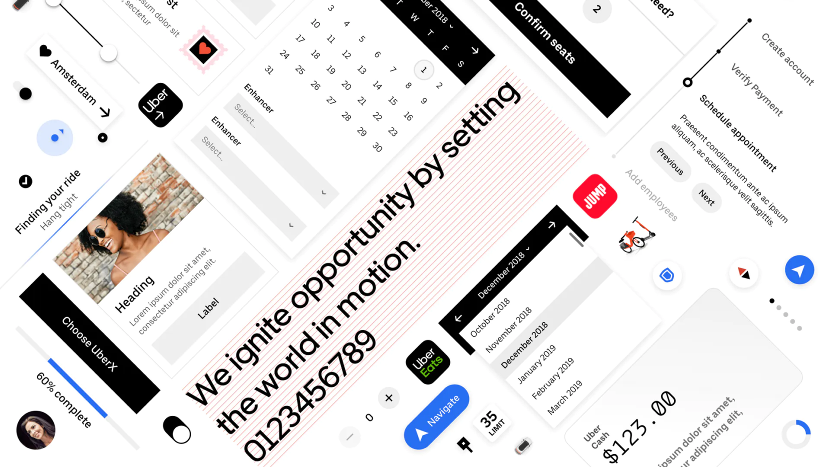
Uber Internship
service :
design systems
timeline :
jun 2021 - sep 2021
(4 months)
role :
product design intern
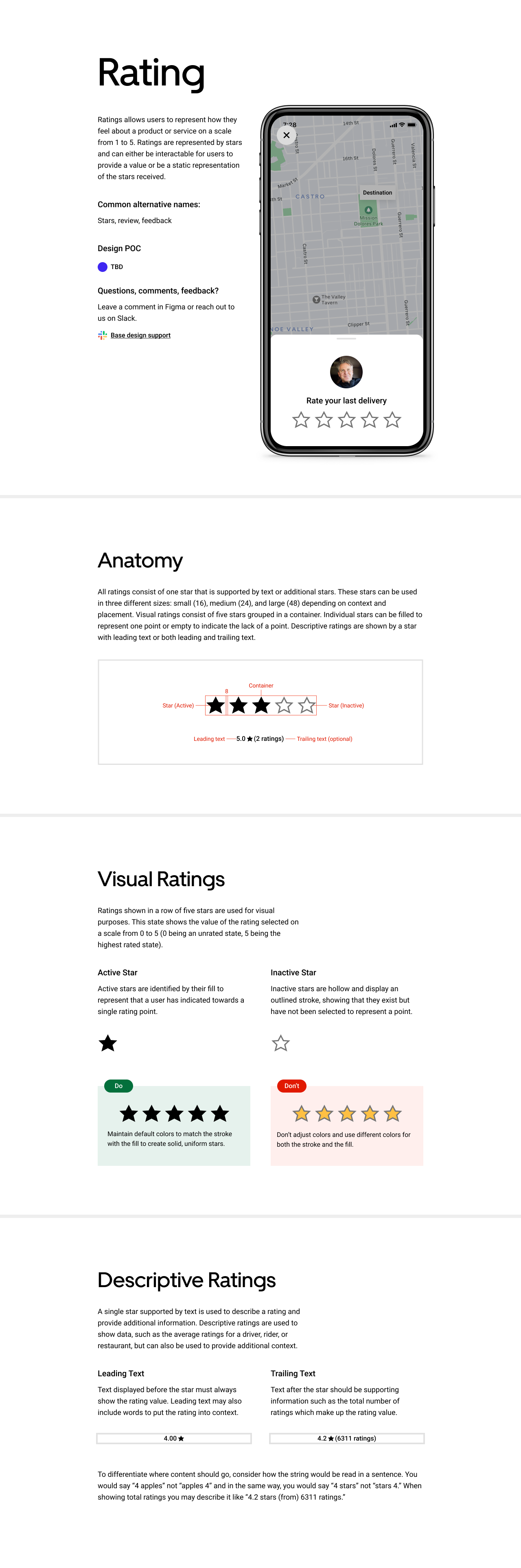
I worked with the Base team to foster a consistent, cohesive experience among Uber products. By ensuring our roots are consistent and accessible, we can aid designers in creating beautiful user experiences for all to use. Learn more about Base here.
While I worked on a variety of tasks including updating existing flows, contributing to module libraries, and working with design engineers on plug-ins, I focused on two larger projects. I created documentation for TalkBack, Android's screenreader, to aid designers in understanding how important accessibility is for our audience and how we can best assist them. Additionally, I created a component from start to end through internal audits, external research, and documenting best practices.
HIGHLIGHTS
- Documented TalkBack accessibility guidelines for internal teams
- Contributed to creating a new onboarding experience for all designers
- Created a component from beginning to end for usage in all products
- Volunteered with Suit Up to empower youth
- Updated module libraries for various products
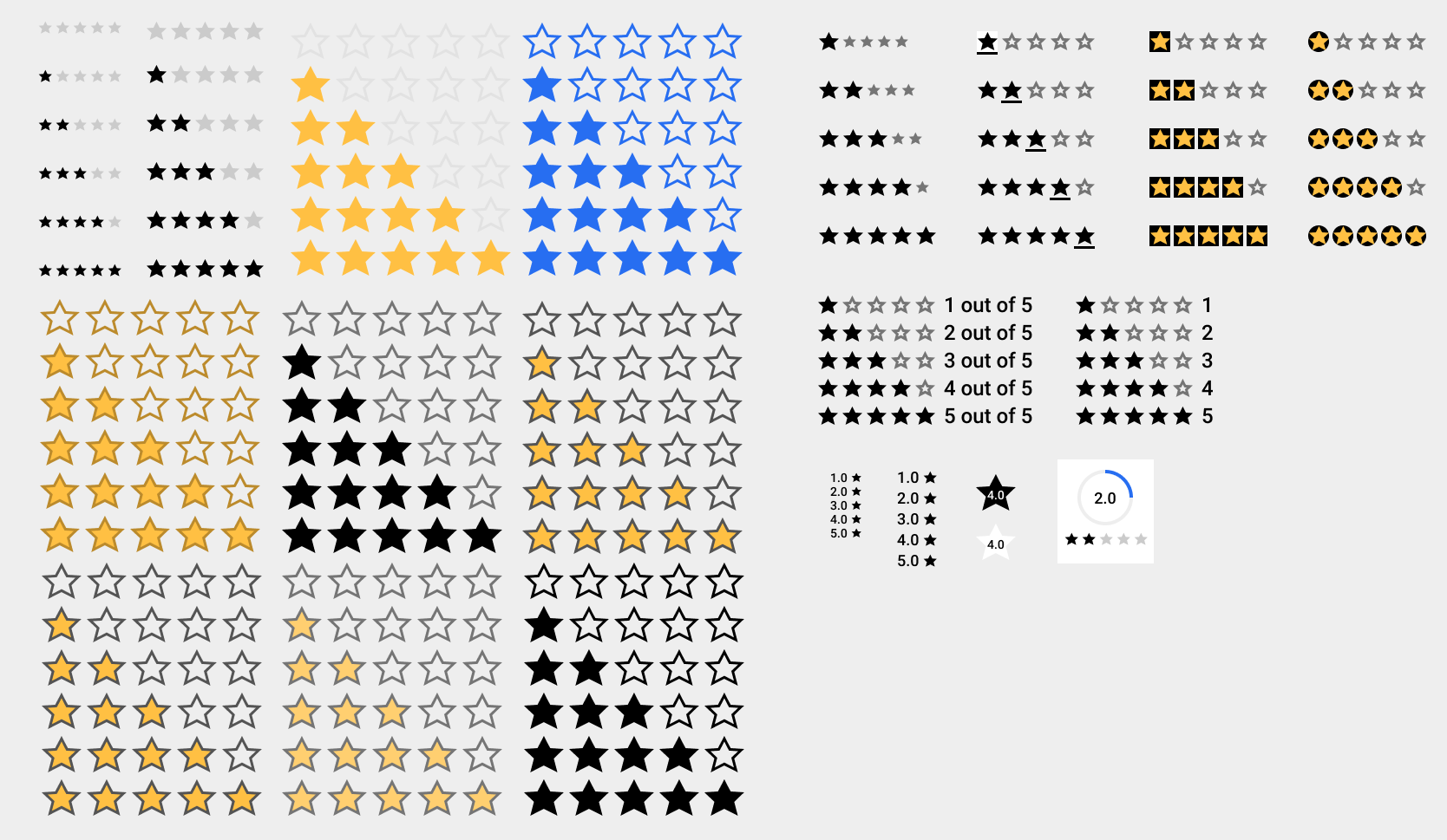
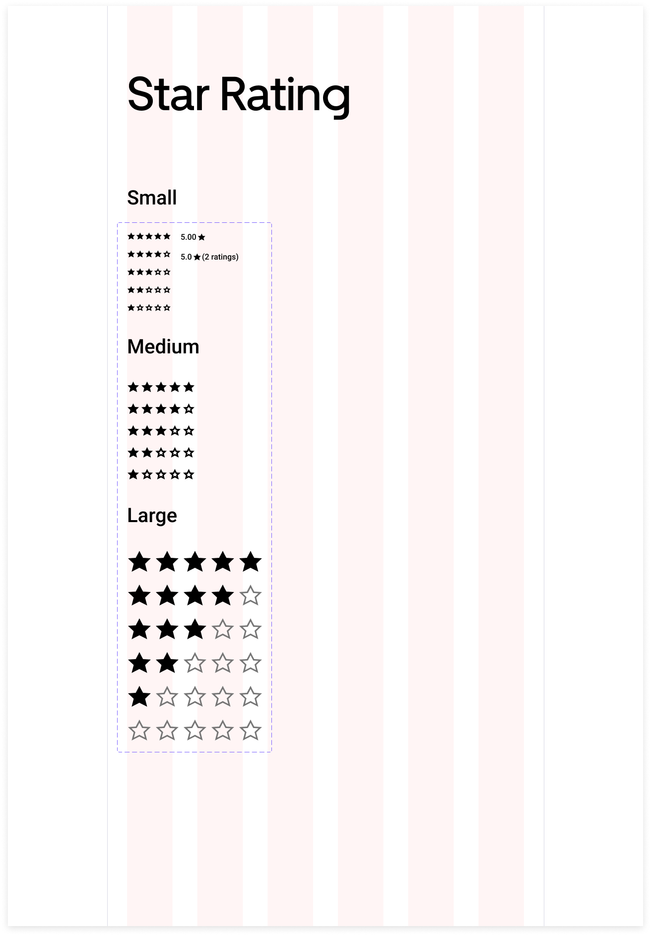
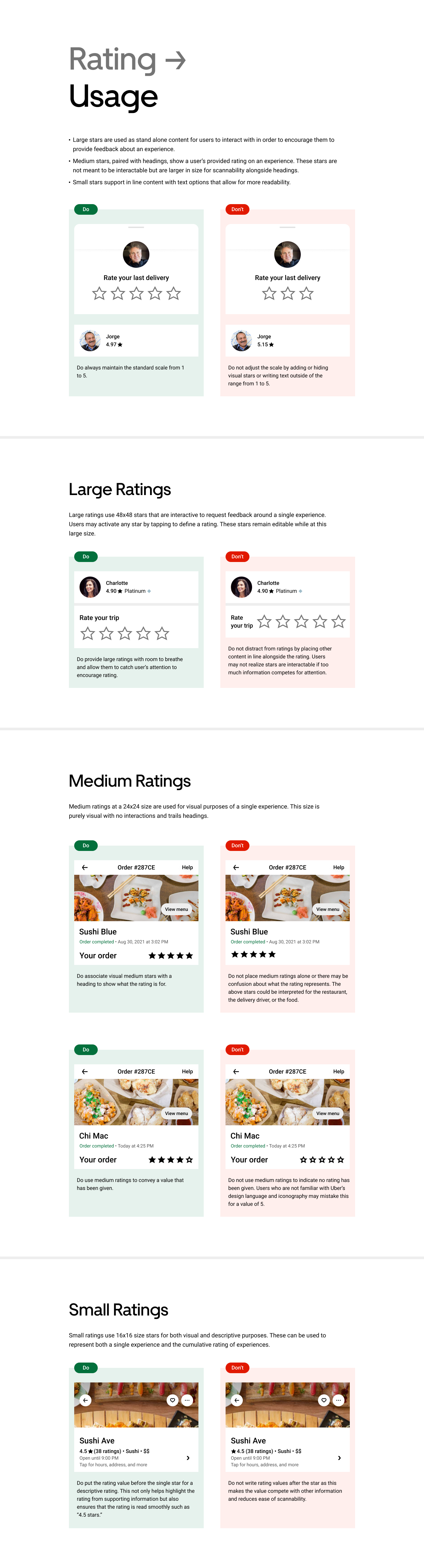
This case study focuses on creating the star rating component from start to finish.
PROBLEM STATEMENT
How might we create a cohesive rating experience across Uber products?
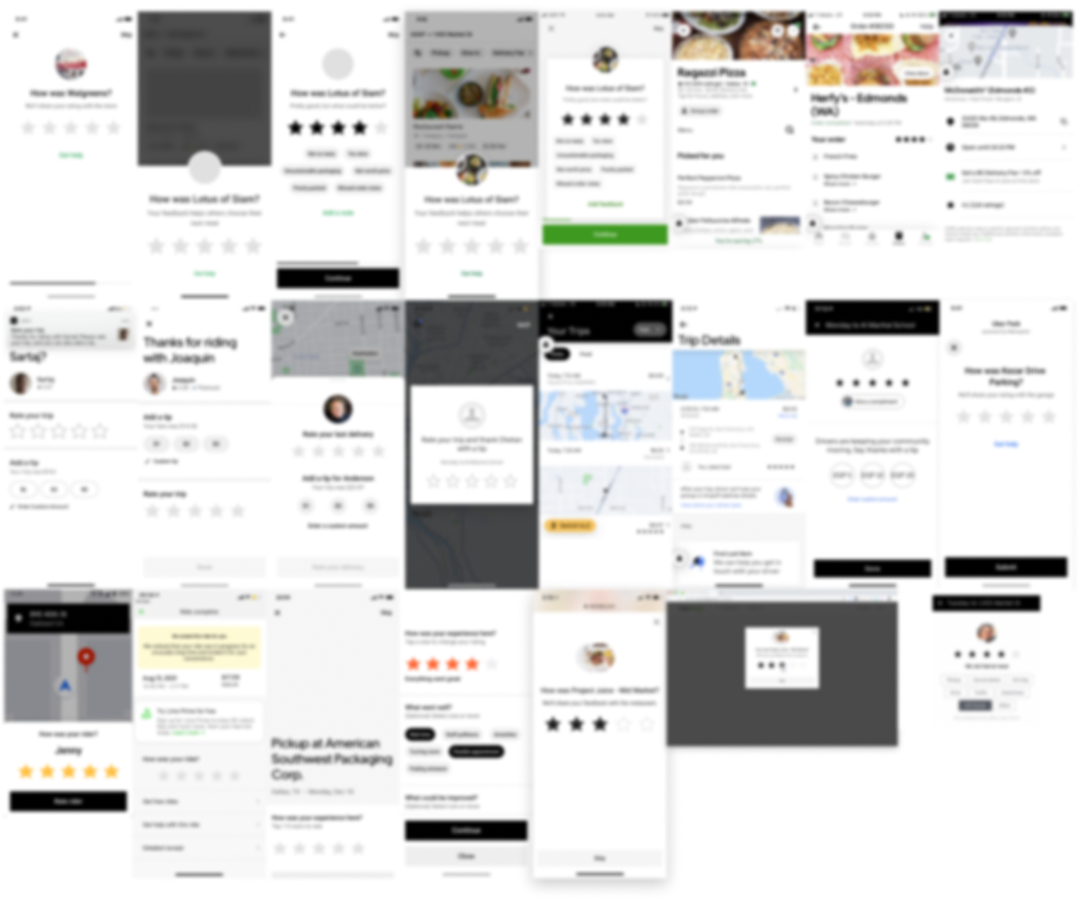
AUDIT
I began by conducting an initial audit around current use cases for stars across all products and experiences. This allowed me to understand current use cases and consider potential use cases in the future. Additionally, I had to consider both mobile and web experiences and an audit helped me see the context and placement of this particular component. This internal audit examined over 20 unique use cases across 6 distinct products.
Image is intentionally blurred to hide specific details.
FINDINGS (PROBLEM)
This audit revealed inconsistencies with aspects like size, color, shape, fill, and spacing. With color, there were also accessibility concerns as yellow stars do not pass web accessibility guidelines (WCAG). As an accessibility focused designer, I realized the color contrast was a concern as the stars with shaded inactive states meant our ratings relied on color alone to distinguish the states, which is extremely inaccessible.
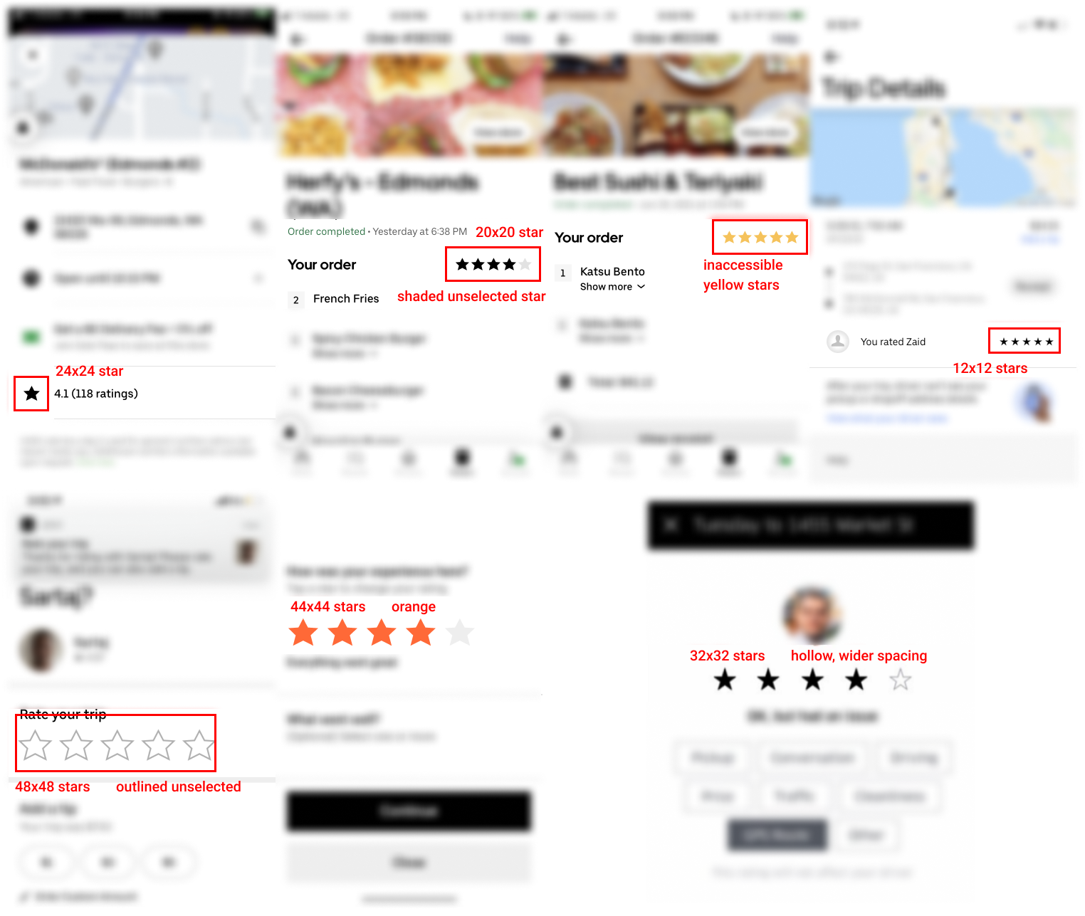
These stars vary and are simply inconsistent. If separated without context, it is easy to assume these screens are not related, but they are all Uber products.
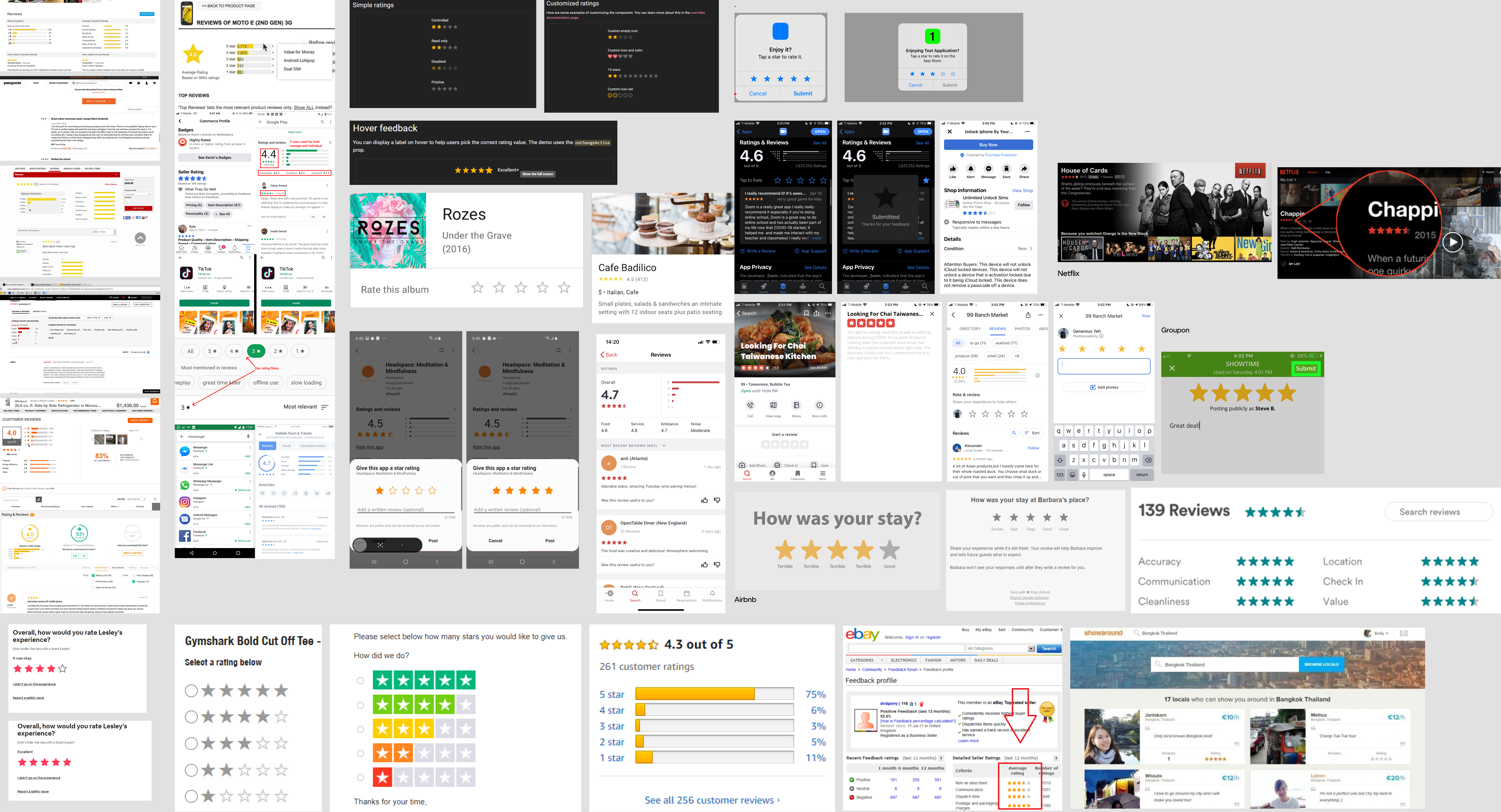
COMPETITIVE ANALYSIS
I moved into competitive analysis of products that offered rating systems. This included seeing how they were visually displayed, their interactions, and then various design systems. I took note of commonalities and differences to keep in mind and have supporting evidence to back up my design decisions later.
FURTHER RESEARCH
Next, I went on to focus more on researching our current usage of stars. To identify potential causes of these discrepancies, I went to examine existing guidelines and ask about perspectives.
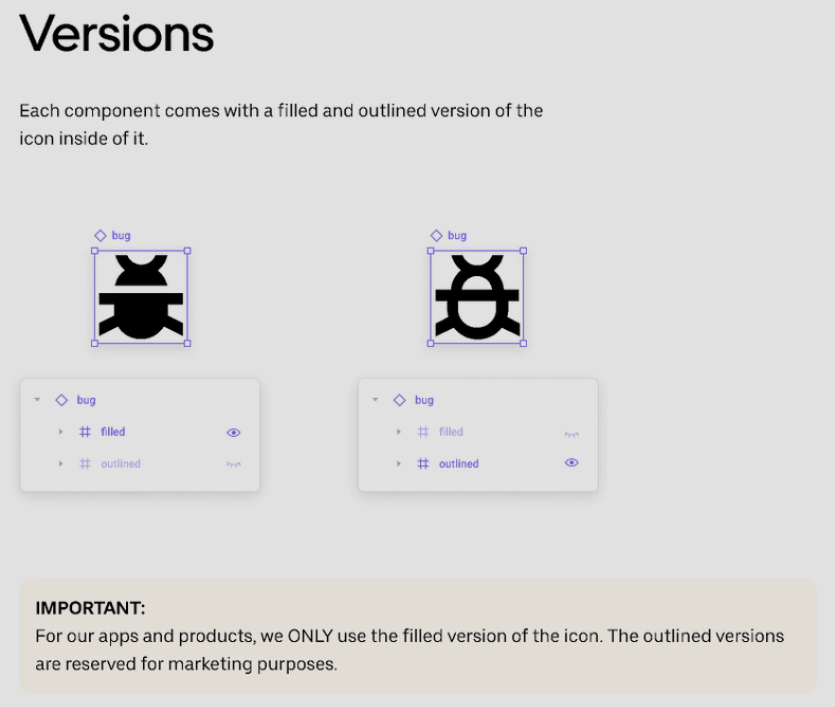
Noting the banner message at the bottom of the Base iconography documentation, most of our icons were meant to be used as filled icons and outlined versions were for marketing campaigns. This may explain the discrepancy between screens with a variety of outlined and solid stars.
I communicated the accessibility concerns with stars and reached an agreement that the stars could be an exception. This meaning that we were not limited to only the filled version of the star icon.
My primary accessibility concerns are shown below. I compared black filled active stars and yellow filled active stars against both solid and outlined inactive states. In the center, it is obvious that to a user with most color blindness (achromatopsia) cannot distinguish active and inactive states when using the combination of yellow (or low contrast color) stars in conjunction with filled inactive stars.
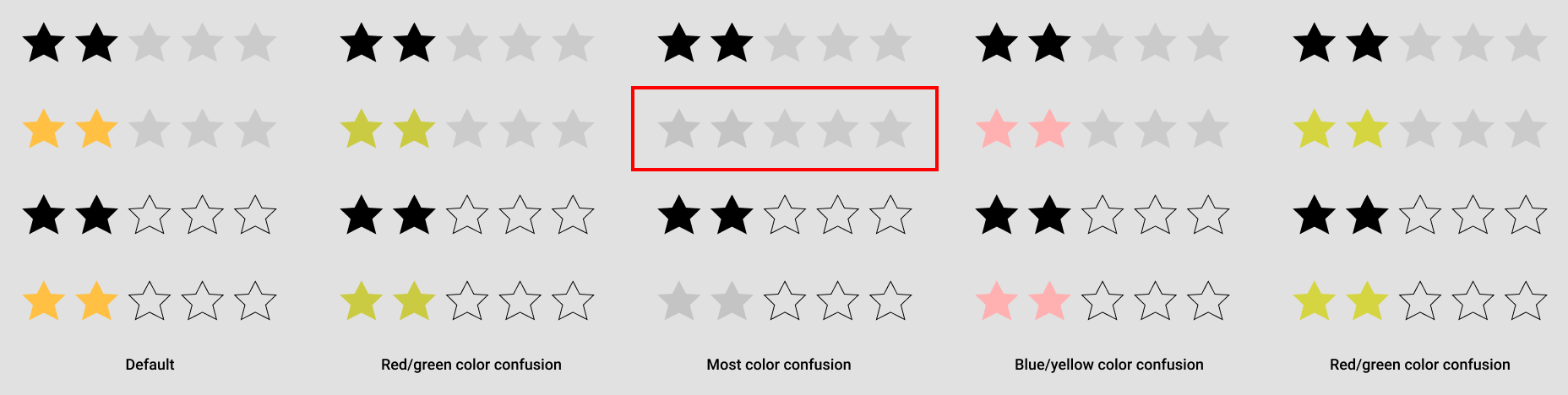
To summarize the results of the findings - the outline easily has the most contrast for a user to differentiate between two states and if opting for a yellow star, we cannot use a faded/filled/shaded star as the inactive state.
However, even with this in mind, it was possible to opt for either star treatment. If opting for a solid inactive state, we would simply need to be more careful and intentional with other design decisions. Because of this not completely eliminating an option, I conducted further research with a variety of users including other designers and non-designers who have experience rating products in general.
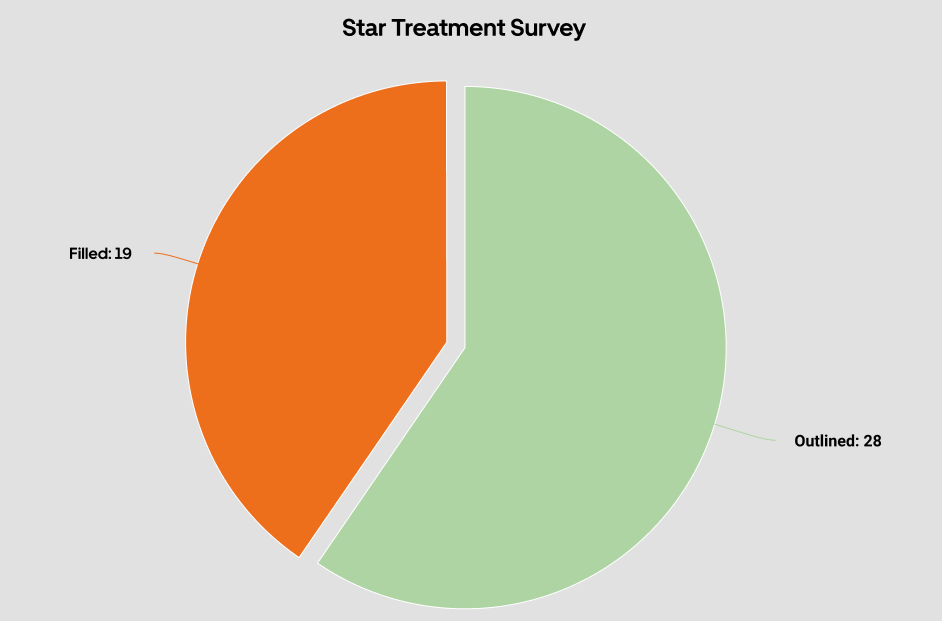
As seen, more users preferred an outlined star to prompt rating. It's also significant to note that our goal with ratings was to encourage users to rate. Below are excerpts and quotes from various users and their thoughts on the treatment for the different stars.
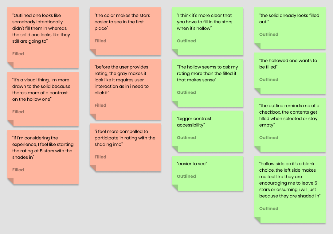
Synthesizing some key aspects from the selected quotes, I realized that some users felt the filled in stars were somewhat of a "dark pattern" where it feels like it's telling the user to rate 5 out of 5 stars in an unrated, 0 out of 5 star situation. While visually appealing, this was not the ideal user experience. In contrast, hollow stars did more often than not encourage users to "fill in" these empty stars but did not exactly push users to rate a certain value such as 5 stars.
ITERATIONS
Below is not an exhaustive list of explorations, but showcases the variety of options considered and placed into context. More details can be provided about pros and cons of each choice if needed. Feel free to reach out.
Immediately, you may wonder why I experimented with text options and other background treatments. This was because I considered localization issues as well as users who may be unfamiliar with rating systems (new, young, etc). Stars may not be the main method to rate systems these days as there are thumbs up and down (which have localization issues), facial expressions, numerical values, etc. This was definitely a consideration during the exploration. Other background treatments such as a color fill or underline for selected star were also ways to consider accessibility.
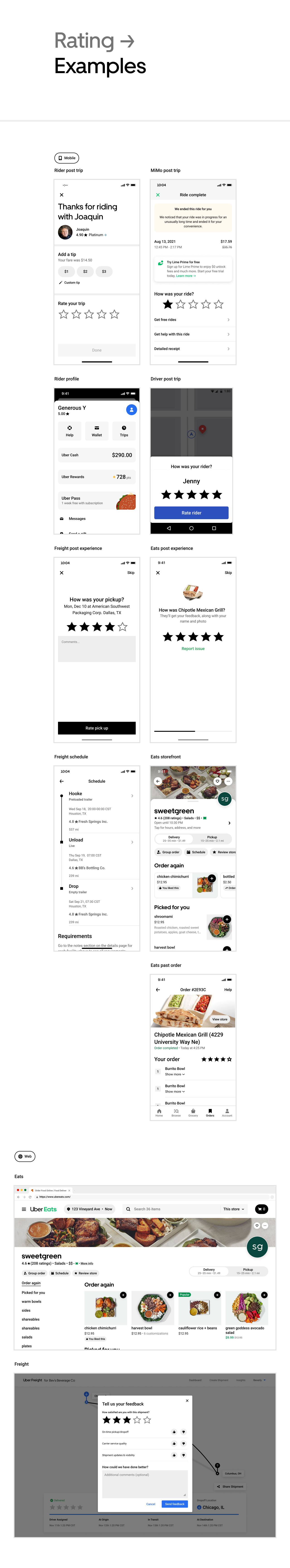
SOLUTION
These are the finalized components that address all current use cases and consider potential variations in the future.
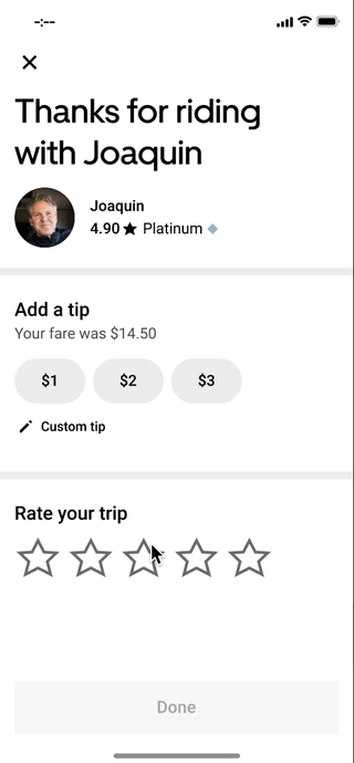
Additionally, because the components were defaulted to black for brand identity, consistency, and accessibility concerns, I finalized a microinteraction for high ratings. These ratings often feel rewarding to give and there's both an appeal and satisfaction when giving a courier or driver a well deserved rating. I played with many interactions that aren't shown so feel free to reach out if you're interested in seeing more. Finalized version below.
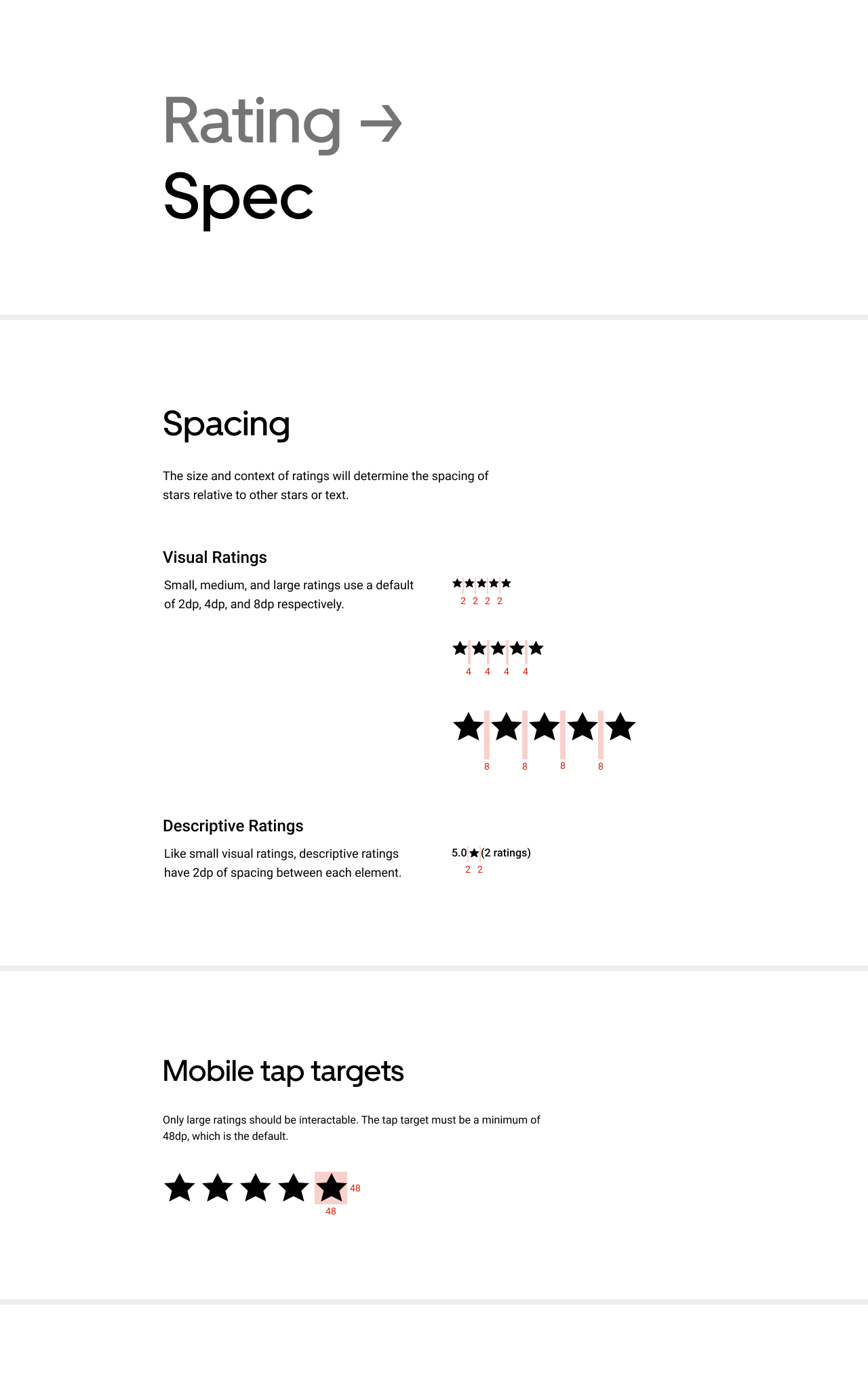
Provided alongside these components and variants was extensive documentation of recommended usage, best practices, guidelines, and specs. This is shown below but also available online at base.uber.com.
LEARNINGS
The best user experience begins at the roots
Systems thinking is no easy feat, but by spending time on design systems, we are able to ensure that our final designs, whether they be components, modules, screens, or pages, are not only consistent, but accessible for all users.
The best design happens in the open
Design gets better when others share their perspectives and learns from your work. It's a two way street and design should be seen by not only the design studio, but also other teams and customers.
Be the user. Be the customer.
Don't just know your target audience, but be your audience. Take an Uber ride and observe the experience while taking note of what could be improved.
Aim for better, not different.
We know not to reinvent the wheel without reason. Everything that currently works, works for a reason. Progress to improve something and not just make it different.
The experience extends beyond just the screen.
Consider the entire journey when creating an experience and not simply the interaction between user and screen. Our digital interactions and choices can affect physical relationships, interactions, and purposes.
MOMENTS
 Welcoming new teammates
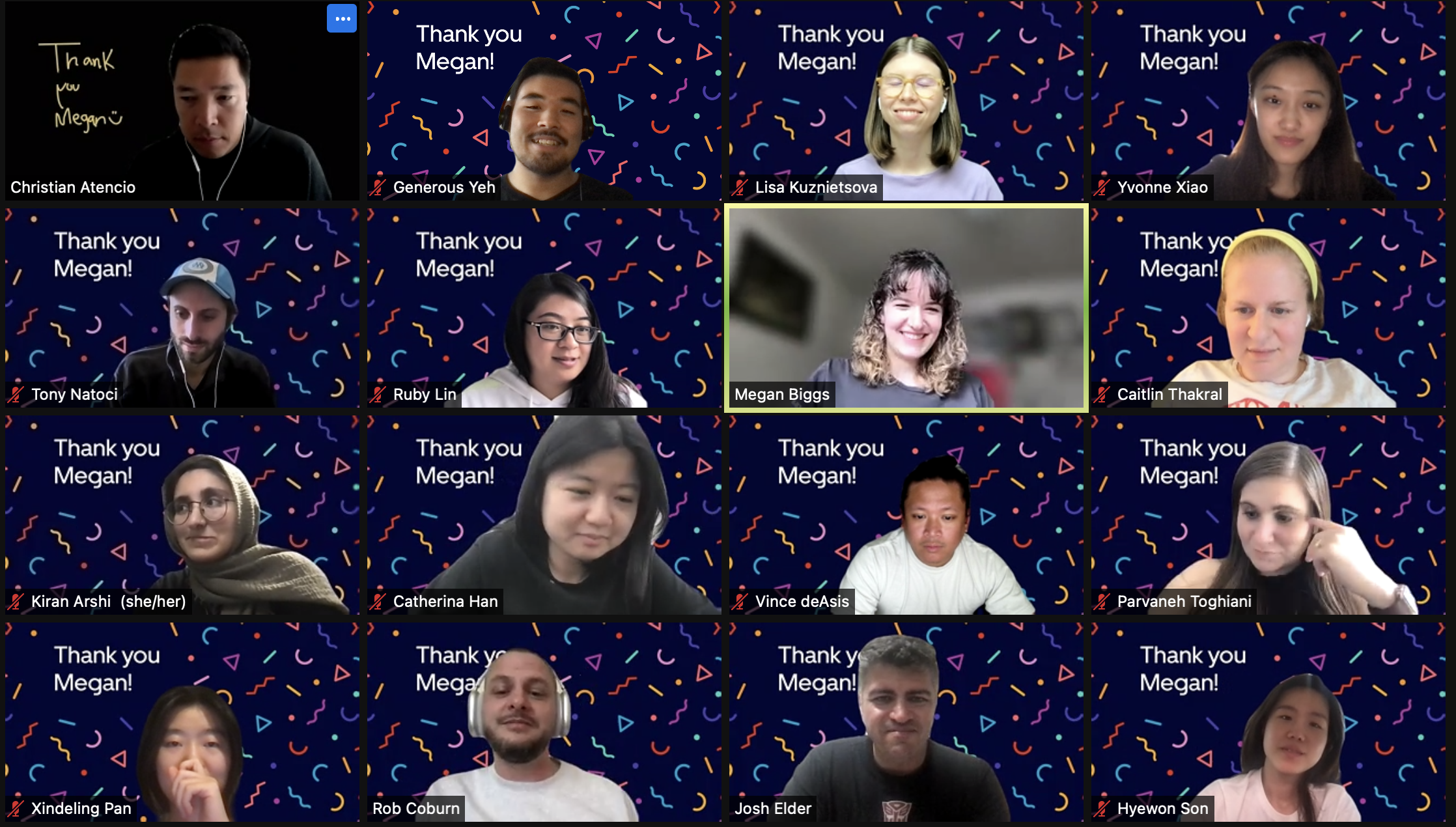 Saying goodbye (and thank you) to teammates
 Syncing with fellow design interns
 The best team
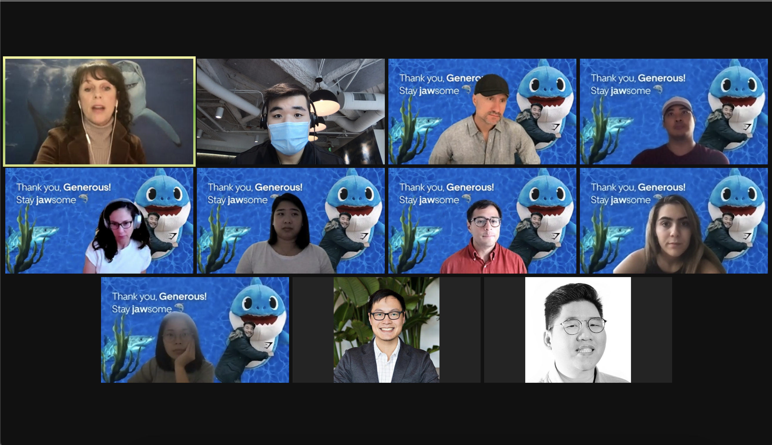 Receiving love from the best team