Wish Internship
service :
design systems
timeline :
sep 2021 - dec 2021
(4 months)
role :
product design intern
With the Atlas team, I worked with the existing system to update components, address edge cases and new use cases. Additionally, I led efforts around three components (badge, label, and pill), localization guidelines, and accessibility regarding underline links. Please reach out for additional information regarding the latter two. This case study focuses on the badge, label, and pill components. If interesed, feel free to learn more about Atlas here.
PROBLEM BREAKDOWN
The following pill component has confused designers through different shapes, sizes, color, and semantics. Because designers are unsure how to use this component, they omit, misuse, or create their own pill entirely.
Content is intentionally blurred to conceal details.
AUDIT
After reviewing current uses of the pill and speaking to designers about their pain points, I compiled the following table showcasing the size discrepancy through component and custom pills alike. Designers who used the pill component often adjusted the height themselves which defeated the purpose of having sizes in the first place. Similarly, designers also created their own pills by combining text with a background shape.
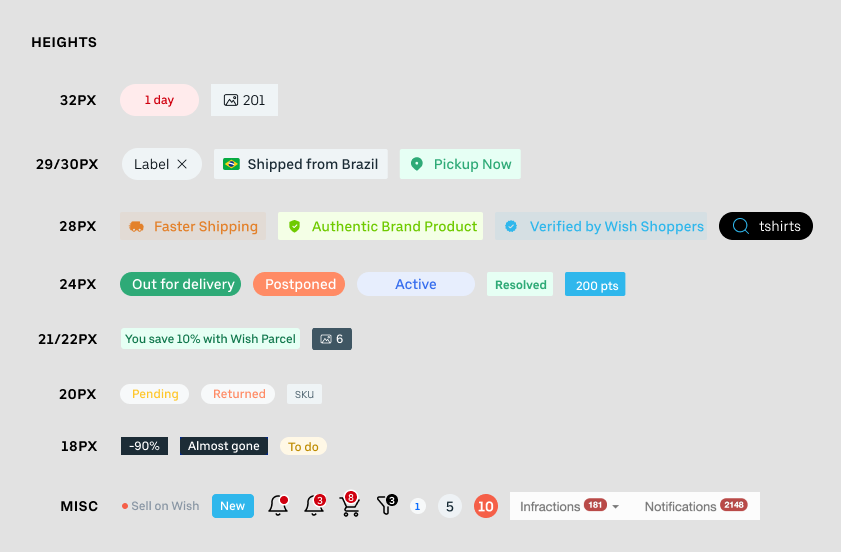
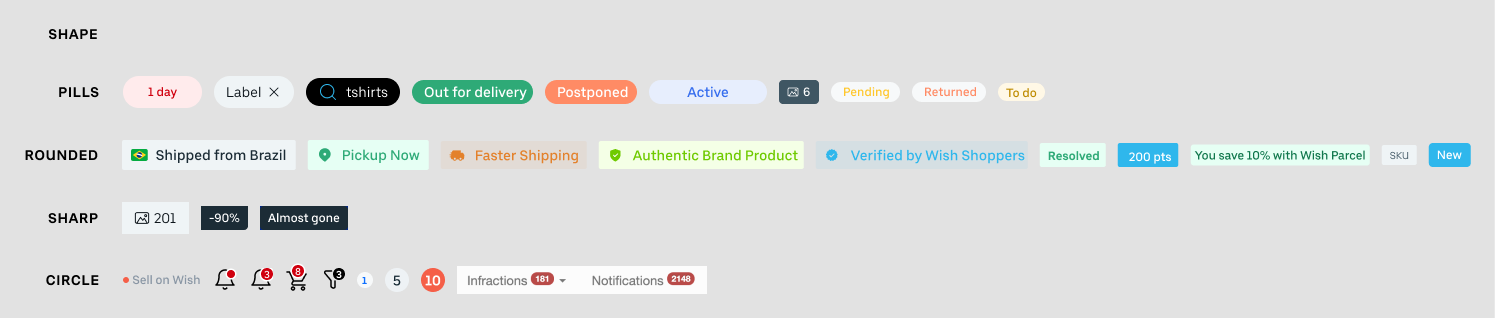
Alongside over 10 different sizes, there were also at least 4 different shapes being used including pills, rounded rectangles, sharp rectangles, and circles. This conflicts with the two sizes in the pill component, which were square and rounded. Observing this difference makes it obvious that the pill component did not suit the needs of designers, who would have to avoid the pill or create their own variation.
PROBLEM STATEMENT
Designers are confused on when to use the pill component. This confusion often leads to them creating their own "pill" to use, avoiding the component, or even incorrect usage.
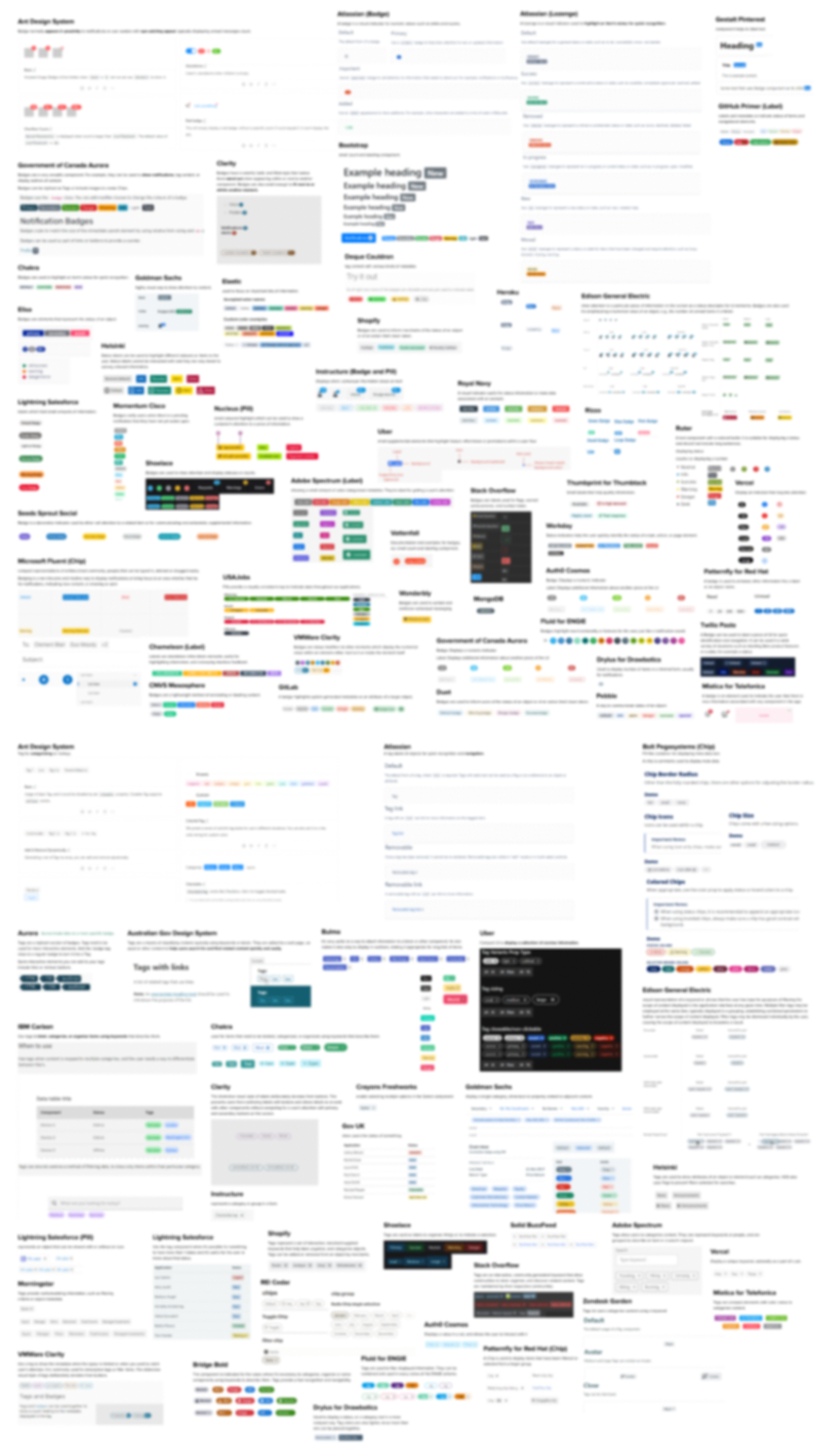
COMPETITIVE ANALYSIS
After discussing pain points and ideas with designers, I validated my concerns and ideas with other design systems. I looked through over 50 unique design systems with over 84 examples of badges, tags, labels, pills, chips, and lozenges. By gathering these examples, I was also able to strengthen my arguments and reasoning to present to the larger design org.
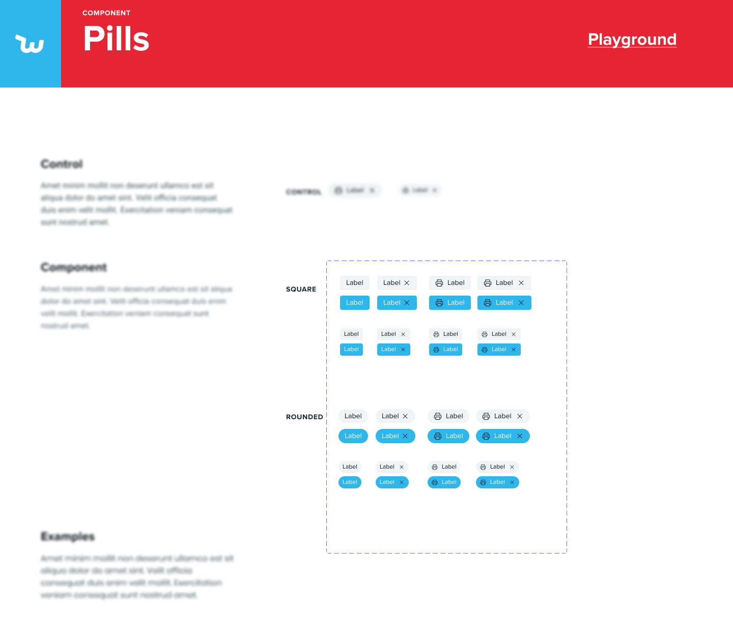
SOLUTION
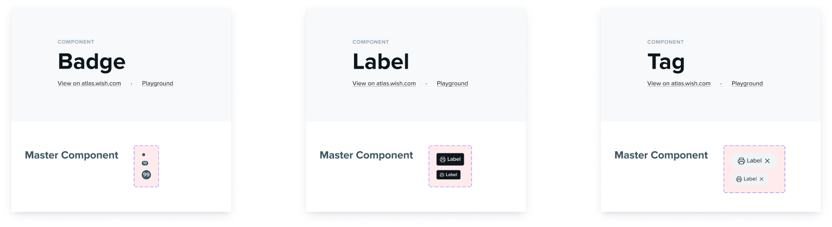
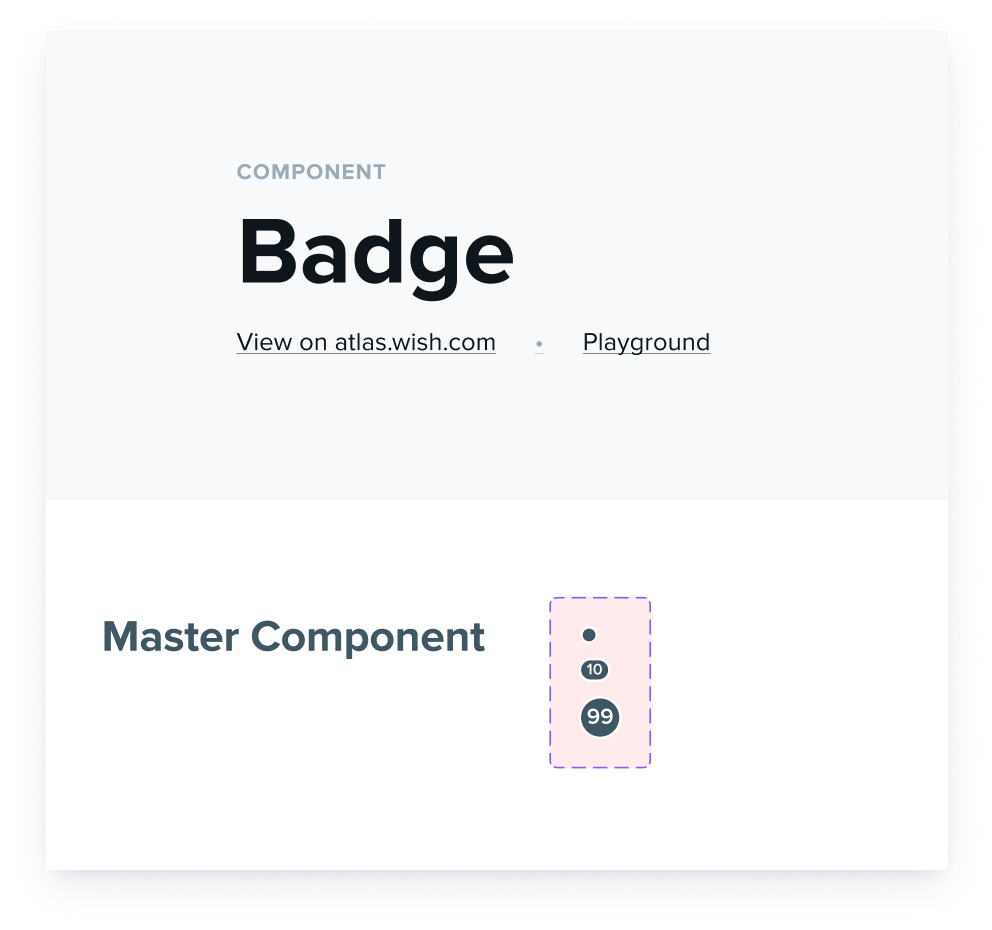
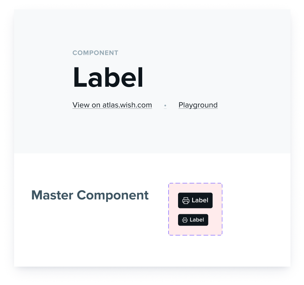
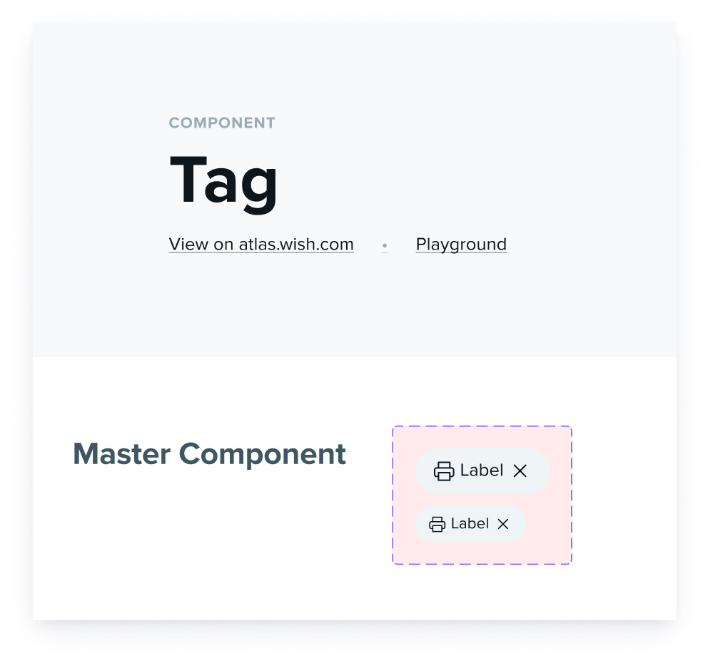
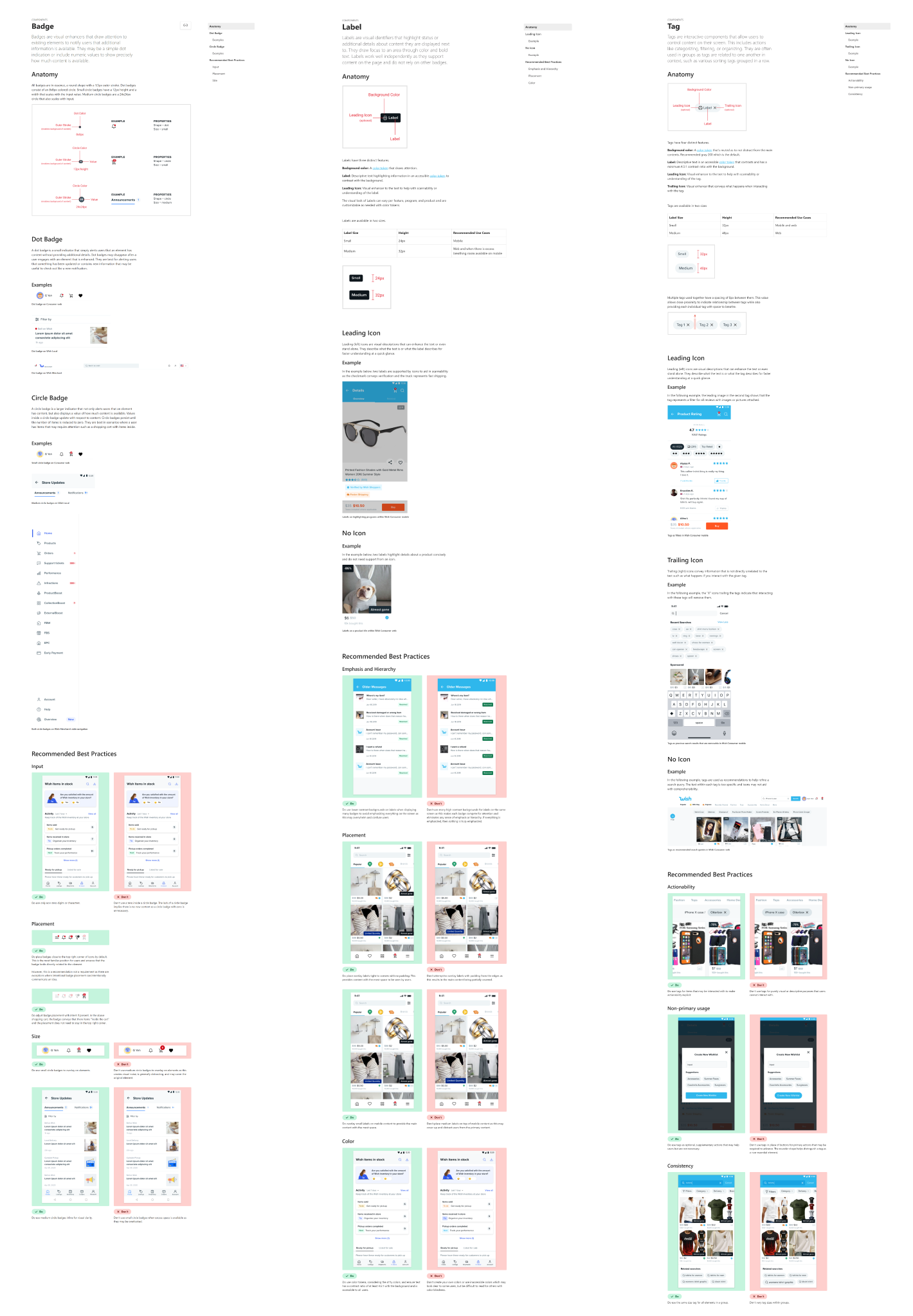
The following are the finalized components of badges, labels, and tags represented at a global scale.
In addition to the global components, I went into each product module library to customize instances and create master components for those product libraries. Rather than displaying the private product module libraries, various customized versions are shown in context below.
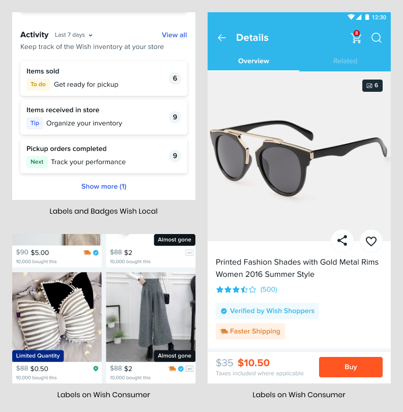
Dot badges, hinting at new content being available, and circle badges showcasing the amount of items hidden behind other elements are shown below.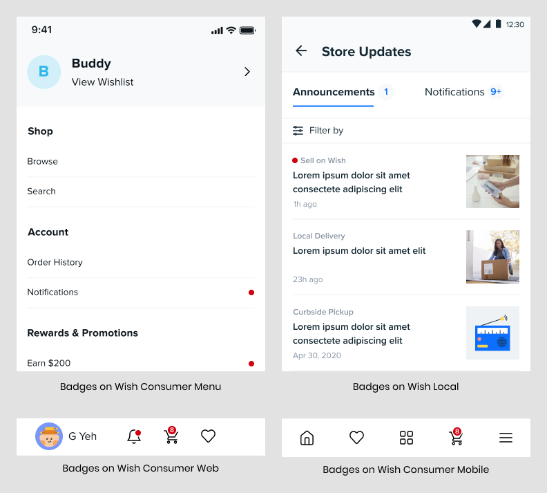 Text only labels, shown on the left examples, draw user attention to provide
additional information and encourage actions. Icon leading labels are shown
towards the right with visual elements that enhance the meaning of the following
text. Additional circle badges are also displayed.
Text only labels, shown on the left examples, draw user attention to provide
additional information and encourage actions. Icon leading labels are shown
towards the right with visual elements that enhance the meaning of the following
text. Additional circle badges are also displayed.
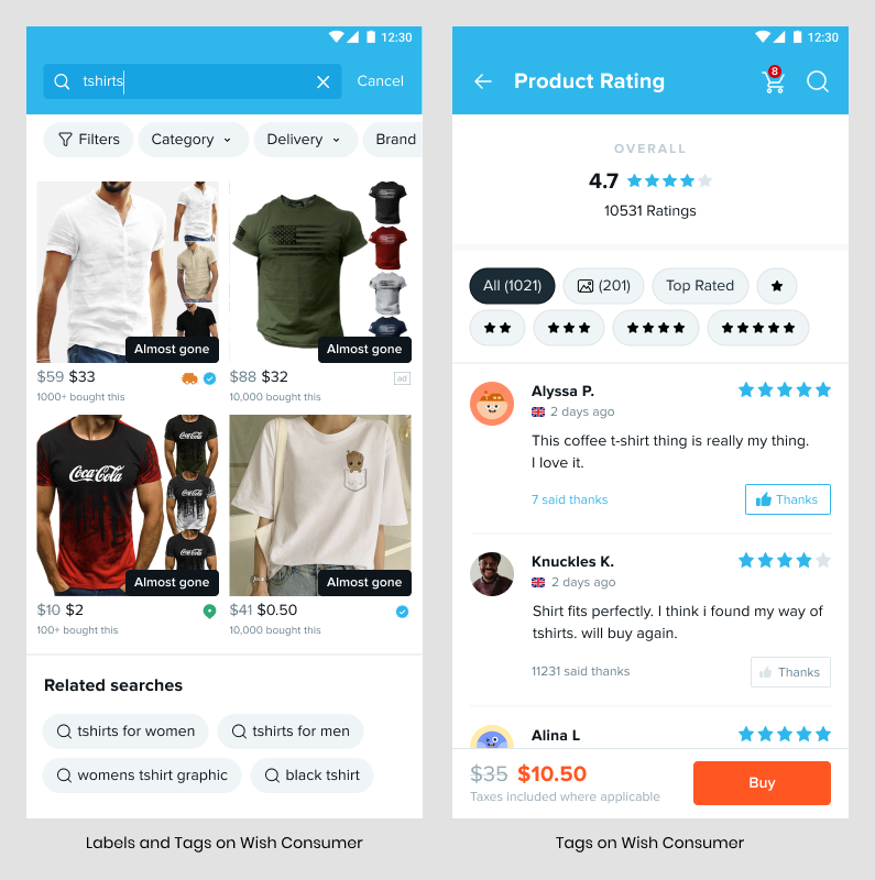
 Tags are used below to help users filter, find related content, and sort reviews.
Leading icons enhance the meaning of text within tags and trailing icons showcase
what occurs after interacting with the tag.
Tags are used below to help users filter, find related content, and sort reviews.
Leading icons enhance the meaning of text within tags and trailing icons showcase
what occurs after interacting with the tag.
I also created separate documentations for each component to educate designers on the differences, including use cases and best practices. Below is a reference to the three documentations, but they are also available at atlas.wish.com.
RESULTS
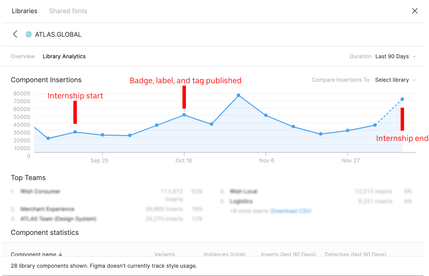
After I published my three components, component insertions more than quadrupled. Throughout my internship, component insertions ultimately increased with a trend upwards. As seen below, when I began my internship, component insertions hovered around 19,000.
After I published three components, insertions went up to 78,000, which I somewhat attribute somewhat to my three components being important and relevant to many designs. However, I do acknowledge not all of these insertions are badges, labels, and tags.
Lastly, on my last day, there were 72,500 insertions showcasing a steady increase and validating the overall design system, including components I updated or created were being impactful.
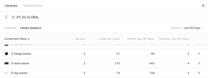
Breaking these results down, here are statistics for the global instance and one of our product module libraries (consumer library). At the global level, which feeds into product levels, my three components were used just under 900 times.
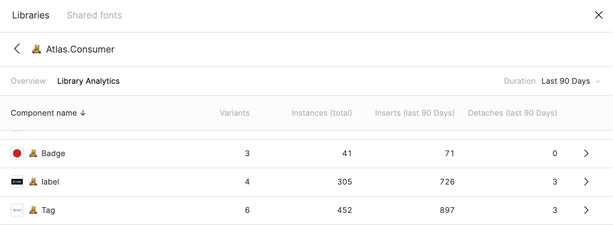
Diving into one particular product module library, namely the consumer level, my badge, label, and tag component were used just under 1700 times. Other product module library data is intentionally omitted for privacy.
Also, there were minimal detaches of these components as they satisfied most designer needs. Speaking with some designers who had to detach the instance, I found out their uses were niche experimentations and did not need to be supported which meant no updates were needed.
To summarize, I was in charge of 1/6 of the design system. I not only created 3 of 18 components, but also wrote extensive documentation for those 3 and these efforts led to component insertions nearly quadrupling from 19,000 to over 70,000 with my three components rarely detached.