The nature of this work is confidential. Many images relating to this project and its processes have been omitted or substituted. Please reach out for more details.
Amazon MyHR
The go-to Amazonian Support System.
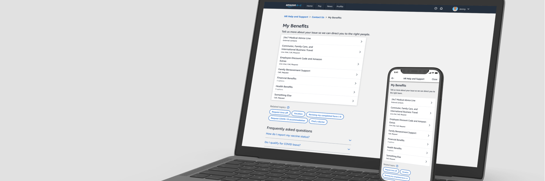
Amazon MyHR is a service for all Amazon employees, corporate and associate, that supports
all HR needs. The primary navgation relies on a Category, Type, Item menu that allows
employees to narrow down and seek support for the topic that best describes their problem.
MyHR is a single entrypoint to receive support through live chat, phone, and request tickets.
PROBLEM
Amazon has over 1,000,000 employees worldwide. In different locales with varying educational levels and exposed to unique experiences, these Amazonians all rely on MyHR for internal support. Across all employees, there are over 39,000,000 requests documented in 11 different channels annually. With so many channels, it can be challenging to discover where to find the proper support and each channel offers a different experience.
The navigation menu is confusing for a variety of reasons including lack of expectations, confusion between self servicing and speaking to a representative, and human resources jargon.
SOLUTION
Improve MyHR as a single source of truth for which Amazonians can seek support for issues at various levels through live chat, phone, and request tickets.
... I focused on and explored variations for
a Focused Menu Flow
Expectation Setting
Progress Indication
Vertical Navigation
PHASE ONE
RESEARCH
Beginning with customer anecdotes and previous findings around MyHR, I broke down the top three pain points and areas of improvement for the navigation. These were patterns that multiple customers had commented on, such as questions about a certain option or the flow.
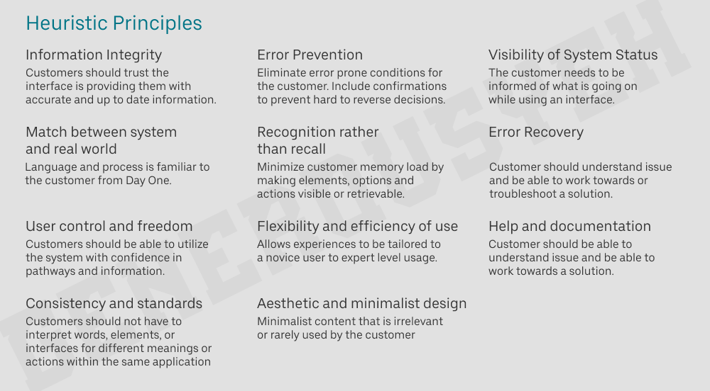
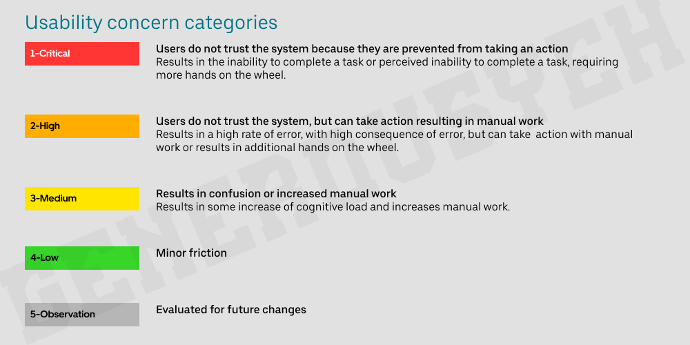
As I empathized with customer experiences navigating through the one stop shop for all HR needs, I also conducted a heuristic evaluation using a personal principle and usability concern table. This helped me uncover common issues and understand the overall health of the application.
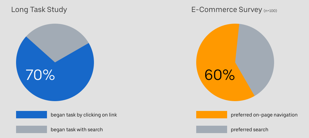
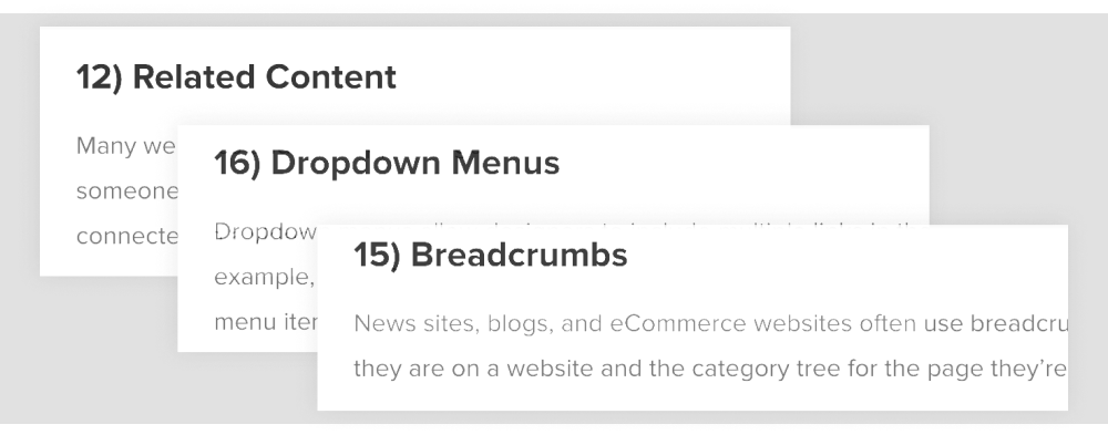
Then, I moved on to conduct secondary research around navigational patterns in relation to not only flows, but also individual components. These were to be starting points for design explorations. While search was heavily pushed for, I realized that search would not solve all of our problems. Research proved this as a majority of customers began navigational tasks on an existing page.
Another discovery included ranked common navigational elements. While this information inspired various directions, a significant use of this knowledge was empathy. It was important to understand the types of patterns and elements customers are familiar with and leverage this understanding to improve their experience in finding HR support.
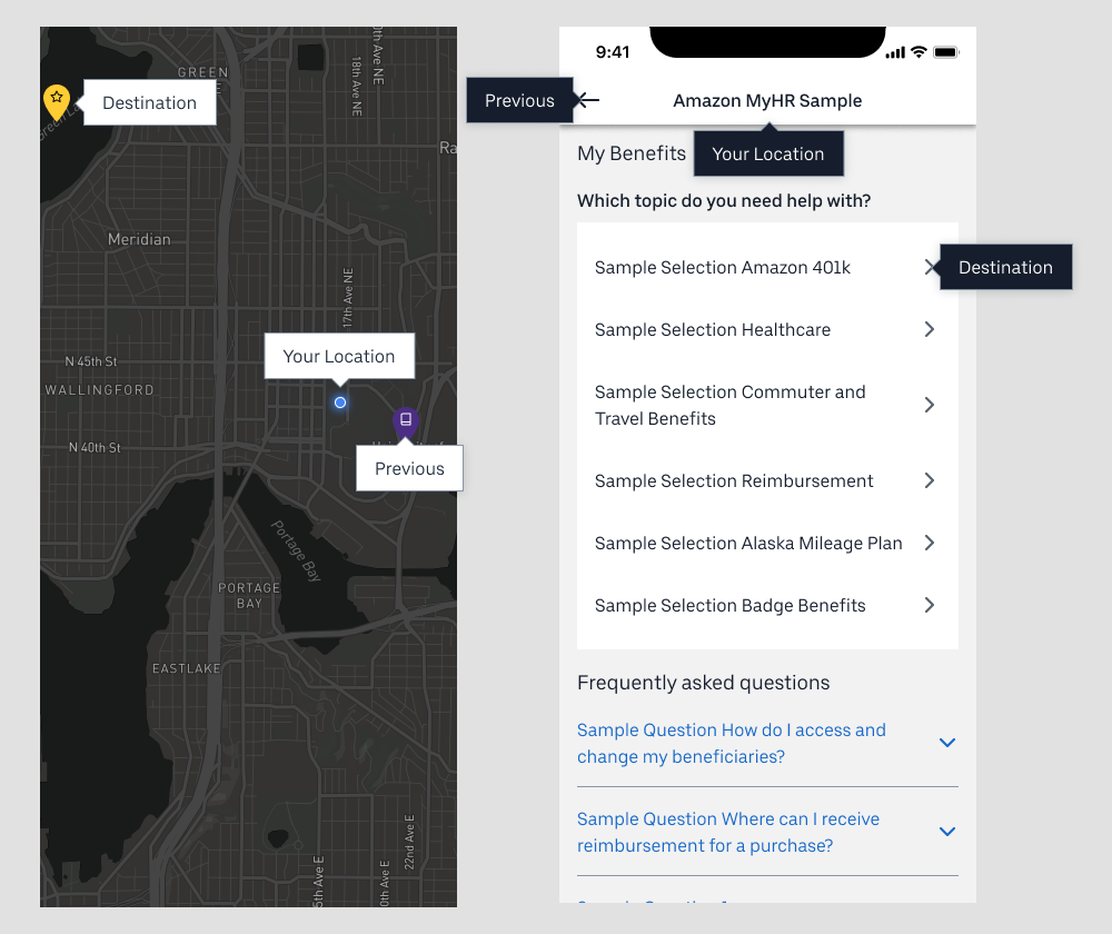
While conducting secondary research, I aimed to connect Amazon MyHR with a physical product to gain a unique perspective and consider alternative solutions. In short, doing this pinpointed three major hints for where a customer was within their journey: their current location, previous location, and future destination.
Afterwards, I moved on to examine over 20 competitors and analyzed their flows and patterns on mobile and web, to better support both corporate Amazonians on web and associate Amazonians on the go with their phones.
Finally, I analyzed recent research on MyHR, it's menu, and navigation. This helped me validate and reinforce pains I noted earlier.
PHASE TWO
EXPLORATIONS
With research findings, I developed an overarching design question in the format of "how might we" and scoped for pathfinding.
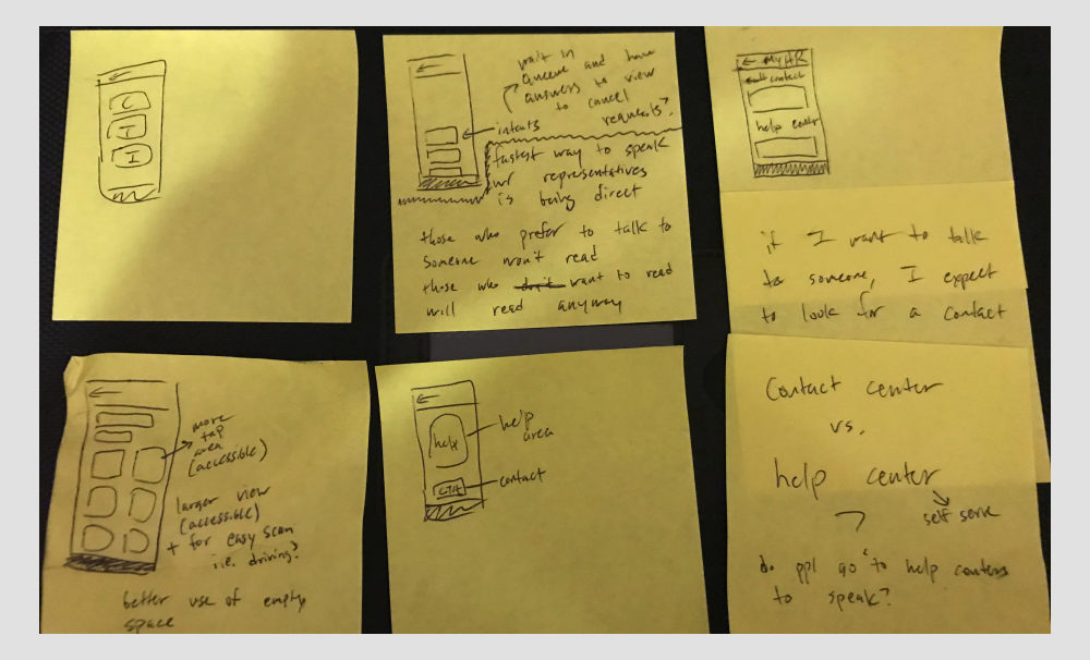
My first step began on pen and paper, where I sketched and jotted notes to consider big picture flows before pushing to specific experience changes.
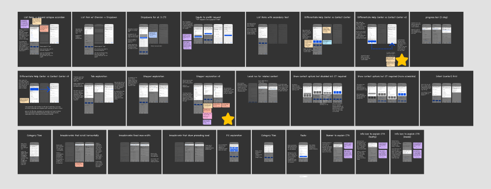
Pushing on each of the 6 ideas further, I generated 26 approaches starting with mobile. I attached research and notes to validate each design.
Top 3 ideas were usability tested with 5 Amazonians. These ideas were also compared to the existing flow. I provided three tasks for participants to walk through within each design and provide comments. The original flow was a control group to reference against.
PHASE THREE
SOLUTION
After various usability tests and validation from prior research, I finalized a focused flow. However, I cannot share this to the public.
As a bonus, I tackled accessibility annotations and localization. Similarly, I am unable to share this publicly. Please reach out for more information.
Finally, I published and handed off my work with a 7 page findings and recommendations report summarizing my research and design, explaining the methodology, calling out key recommendations and detailed findings, and described next steps. Image intentionally blurred.
The nature of this work is confidential. Many images relating to this project and its processes have been omitted or substituted. Please reach out for more details.