Coding with Kids
service :
website re-design
timeline :
1 week (spring 2020)
role :
user research, hcd, uiux
team :
Charlotte Chen, Sandy Co, Isabella Samantha, Kenny You
This redesign received first place recognition out of 280 participants.
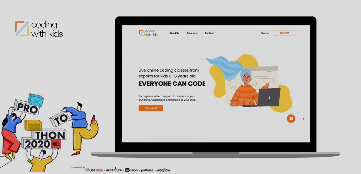
DubsTech's virtual protothon in May 2020 tasked us to edit the Coding with Kids
website to improve the experience for a parent to discover and sign their child
for online courses while also providing a way to seek support if needed. Our
emphasis was on differentiating Coding with Kids from competitors and tailoring
the website to be friendlier to those with minimal programming experience,
accommodating those who are unfamiliar and being more inclusive towards them.
Complete presentation located at the bottom, or alternatively
view our presentation deck here for a complete summary!
Problem
When registering their children for online classes, parents often feel overwhelmed by the different options in sites, programs, and topics. There are many sites online that offer programming courses, but this can be difficult to understand without prior programming knowledge.
The main focus of this redesign was to "improve the experience for a parent to discover and sign their child up for an online camp, class, or workshop and improve the way they may seek support if required."
Solution
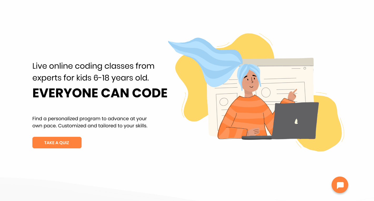
We spent the week researching, ideating, and then creating a more concise homepage. First, we visually showcase results of different courses to avoid technical jargon and accommodate an audience with little programming knowledge. This would aid both a parent and child in showing course offerings.
Then, we simplify the task of searching for courses through an interactive quiz, matching courses to each unique student instead of them browsing through a list of course titles.
IMPLEMENTATION
Quiz Feature
Originally, we created a set of 20 questions to ask to individualize our recommendations, pointing users towards a specific course to take. However, after interviewing a previous Coding with Kids instructor, we realized that the attention span of children may not suit 20 questions, so we reduced it to 5 and generalized our suggestions, recommending multiple courses. We also wanted to keep the registration process quick and this also helped keep the design simple for the parents. Our quiz implementation tackled the first challenge to improve the registration process.
Support
We created a FAQ to display on the home screen and introduced a live chat in order to resolve task number two, allowing users to receive support if needed.

RESEARCH
Site Audit
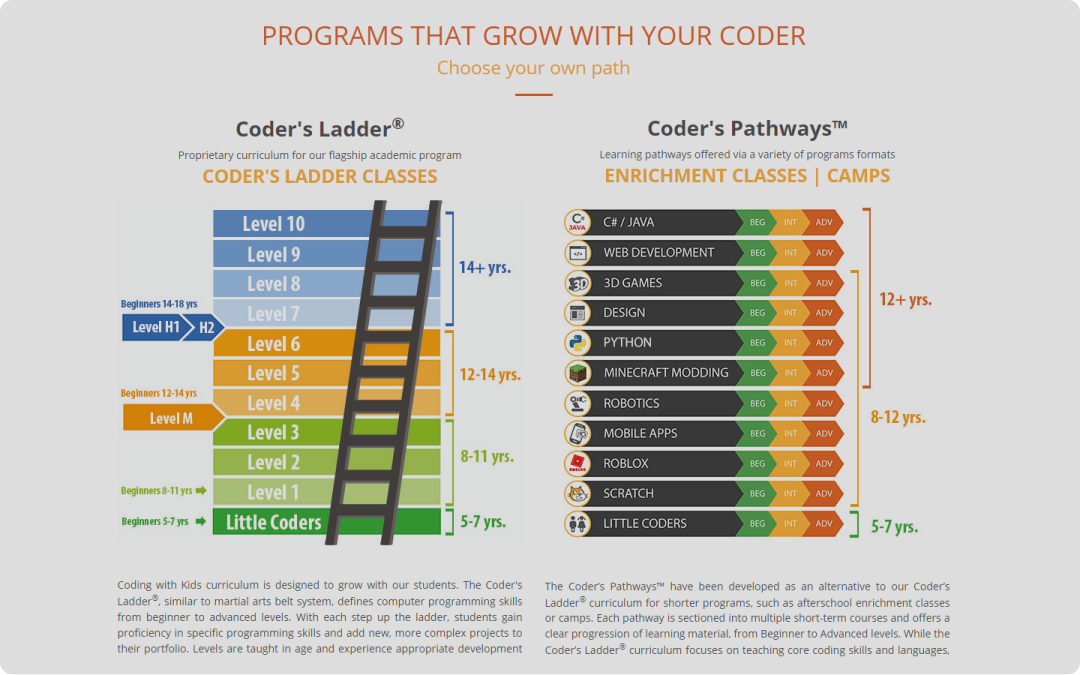
We began with a side audit of the current website and empathized with our target audience of parents and children. Pain points we discovered involved a confusing website, no platform to ask questions, and a lack of hierarchy for information. However, we identified a big issue in that classes were grouped as levels on a ladder or described programming languages. To those registering without prior knowledge, these levels and languages meant nothing and were confusing. Empathizing with this process opened up an opportunity to show what other kids are learning.
Competitive Analysis
Afterwards, we scouted competitors such as Code.org, Khan Academy, and Codecademy to understand how these sites leveraged different techniques to appeal to a common audience. Our first task was to improve the experience of registration and the Coding With Kids website was too text heavy and difficult to understand, resulting in confusion regarding what one was registering for. Online classes were rigid and the type of content learned was not always obvious to those without prior coding knowledge. As a result, we decided to try an unorthodox way of quizzing the parents about their children to recommend courses that best suit them.
Another goal of this redesign was to differentiate Coding with Kids from other websites. Because of this, we did not rely on other websites, but took note of what types of content they chose to display and how they displayed it. Our implementation would be different but still consider the main details to focus on.
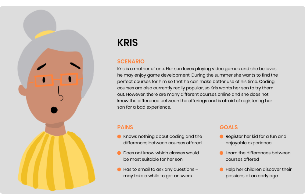
User Persona
From our research and insights, the persona of Kris, a mother of one, was built.
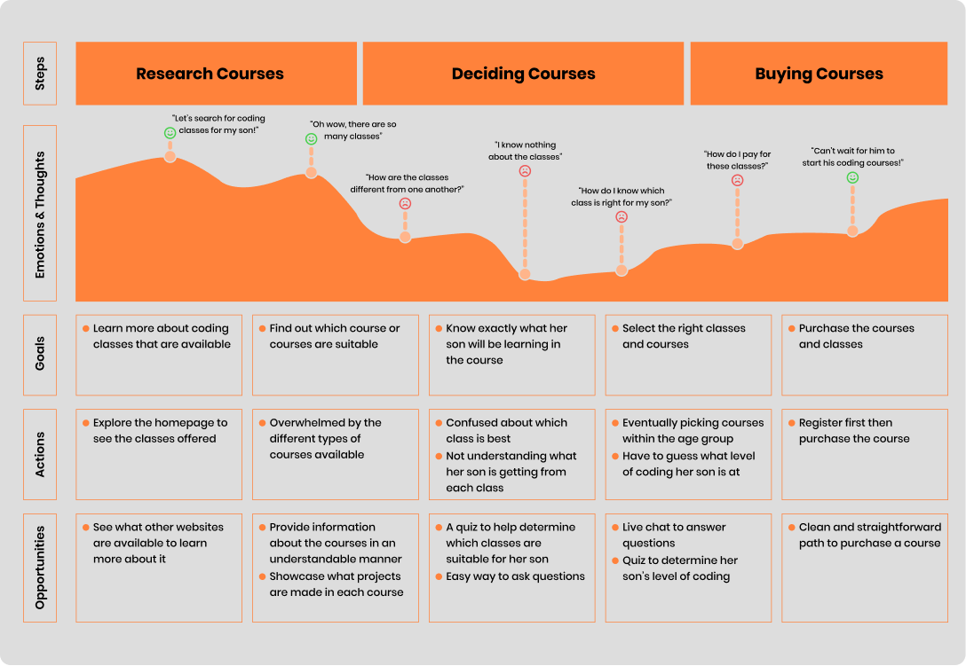
User Journey Map
We then created a journey map from the perspective of Kris to outline key pain points and highlights. These points were referenced consistently during our design.
Outcomes
We won first place at the DubsTech 2020 Protothon for this prompt! As a team, we discussed reaching out to Coding with Kids to update their website. Stay tuned for that and any updates!
Reflection
It was difficult for us to follow and perform the standard user centered process with research, interviews, etc due to the quarantine and our limited time. As a result, we used different approaches to try and virtually contact others for feedback (as opposed to physically) and empathize more with our audience. Because of our restraints, I also learned to collaborate more effectively in remote situations. I was able to work alone on some aspects, receive feedback and revise my work while simultaneously provide critique to others on their work. I also got the chance to document our process and create a presentation highlighting our key changes in a span of three minutes for judging.
With a short timespan, I found myself beginning with and working a lot on high-fidelity. This meant I had to edit with attention to detail because every version felt like a "final product." A large lesson here is to be comfortable working in low to medium fidelity while listening to feedback and critique. That way revisions and edits do not cost as much time and can be taken into more rounds of critique.
Most importantly, I learned to value the differences we have as designers coming from different backgrounds and experiences. Leveraging these differences would lead to a better user experience for a more diverse audience while reducing bias from myself.
One last shoutout to my teammates Charlotte Chen, Sandy Co, Isabella Samantha, and Kenny You!
Final Presentation
If you missed the link above, here is our polished 3 minute presentation from a persona's perspective.