The nature of this work is confidential. Many images relating to this project and its processes have been omitted or substituted. Please reach out for more details.
Groupon
consistency, reliability, and reusability
I worked on source of truth files for cart and checkout as well as search and browse.
In addition, I redesigned deal cards to be used across all products and scaleable for
future programs.
PROBLEM
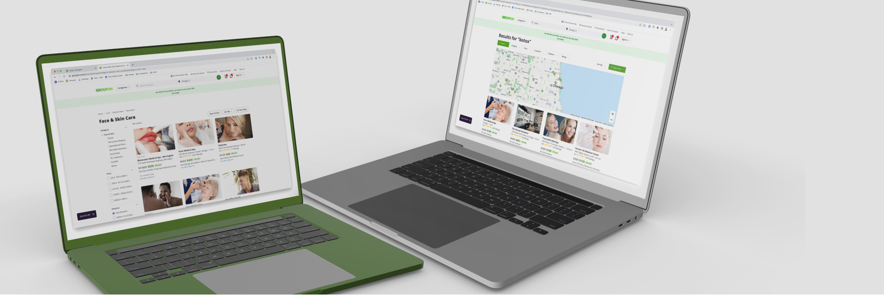
Existing designs for cart, checkout, search, and browse are non-existent. Production pages are not fully supported by the internal design system and there exist inconsistencies between platforms as well as between live and design.
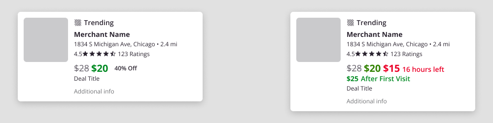
Deal cards, which are an integral element across Groupon, are unique for various programs and platforms. As such, there are over 10 card types supported which display different information or the same information in different patterns. These card types result in a steep learning curve and overall difficult experience for both designers and engineers to determine which card to use. Lastly, with multiple cards, scalability and future-proofing of cards does not exist so new programs and features or changes often rely on new card designs.
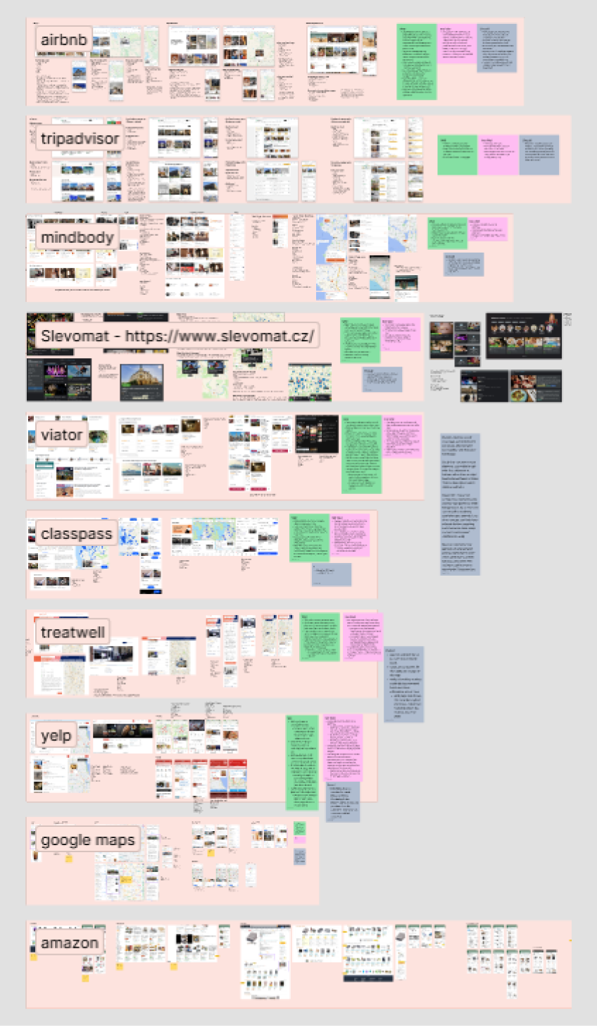
Below are examples of common deal cards found on Groupon.
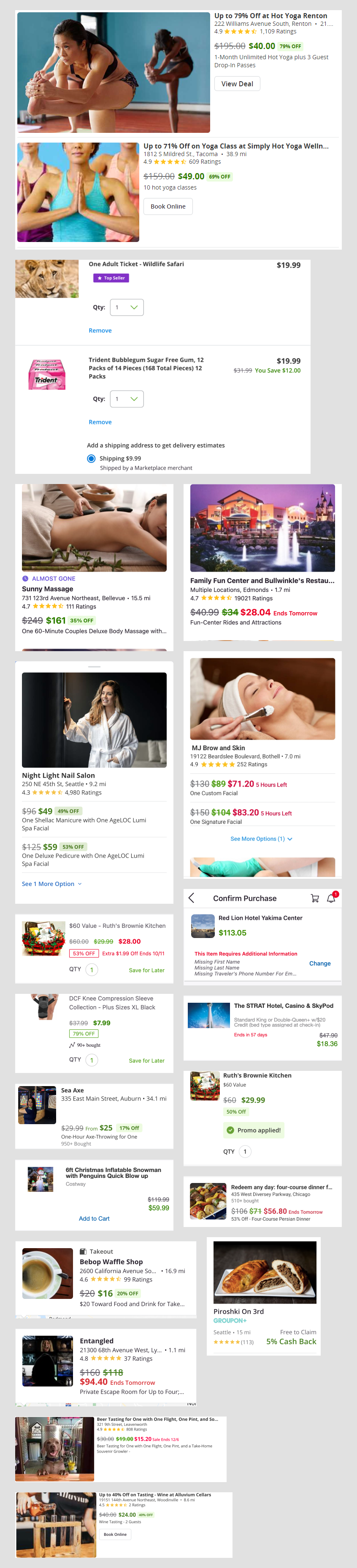
Note variations of image sizes, layouts, call to actions, and callouts such as badging or tags. There is an obvious disconnect between pages.
SOLUTION
Create a pattern library for cart and checkout, as well as search and browse using the existing design system as a foundation. With team and pod level patterns and modules defined, create a source of truth containing templates for reference and for future design.
For deal cards, define a short term change to consolidate over 10 card types and envision a blue sky deal card revamp. Short term changes include shifting hierarchy, accessibility, consistency, and highlighting value props. The blue sky solution overhauls search and browse pages and their corresponding map usage. While other programs are being worked on, the focus is on short term changes and blue sky designs are put on pause.
PHASE ONE
RESEARCH
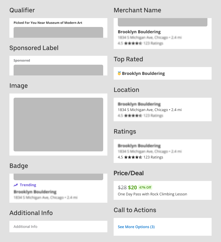
First, to improve the deal card, we must understand what the deal card contains. As such, I began simplifying cards into basic layouts.

Then, by deconstructing the deal card, I was able to understand the each piece, note commonalities, and discover elements to merge or otherwise alter.
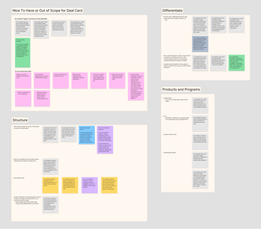
Moving on, with a breakdown of our deal cards to share, I brainstormed pain points with the team before affinity mapping themes.
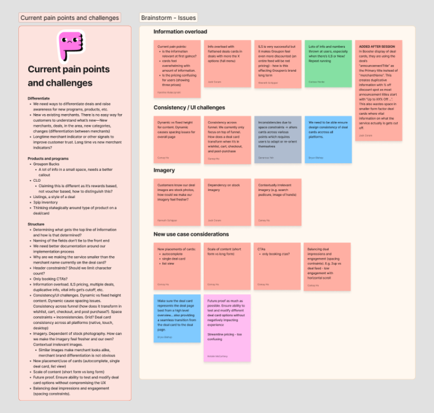
Mapping themes allowed us to observe patterns and reprioritize, but while doing so, I was able to write user stories with respect to our internal archetypes and personas to better understand motivations in reading deal cards.
Next, an analysis of competitors helped me empathize with the customer experience on purchasing and focus on familiar patterns. Each competitor was examined by what was working well, what wasn't working as well, and an overall analysis. This helped me understand how to break down information overload and present important information to customers.
To wrap up research, I conducted secondary research to validate patterns and themes observed. Ecommerce patterns are fairly similar and it was important to maintain similar experiences for familiarity and ensure a deal card revision wouldn't a shock to online customers.
PHASE TWO
EXPLORATIONS
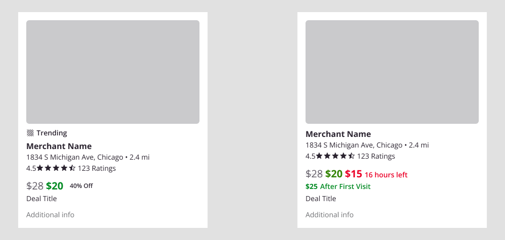
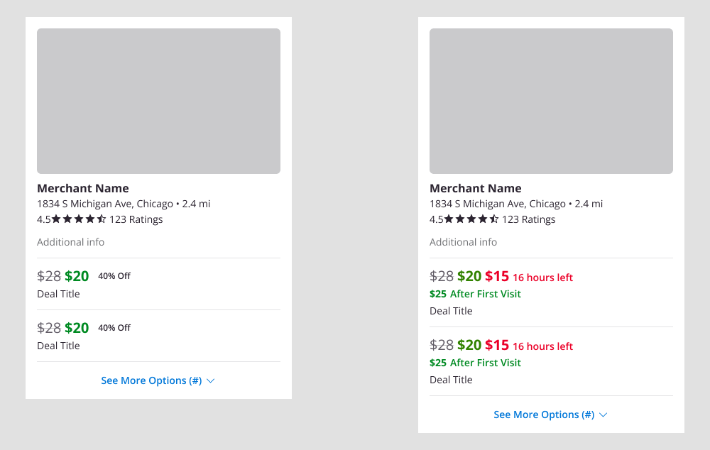
As I integrated card changes and supported them with edits with research and logic, I highlighted short term callouts in a table. I used this table as a set of notes to to share and push recommendations to the team.
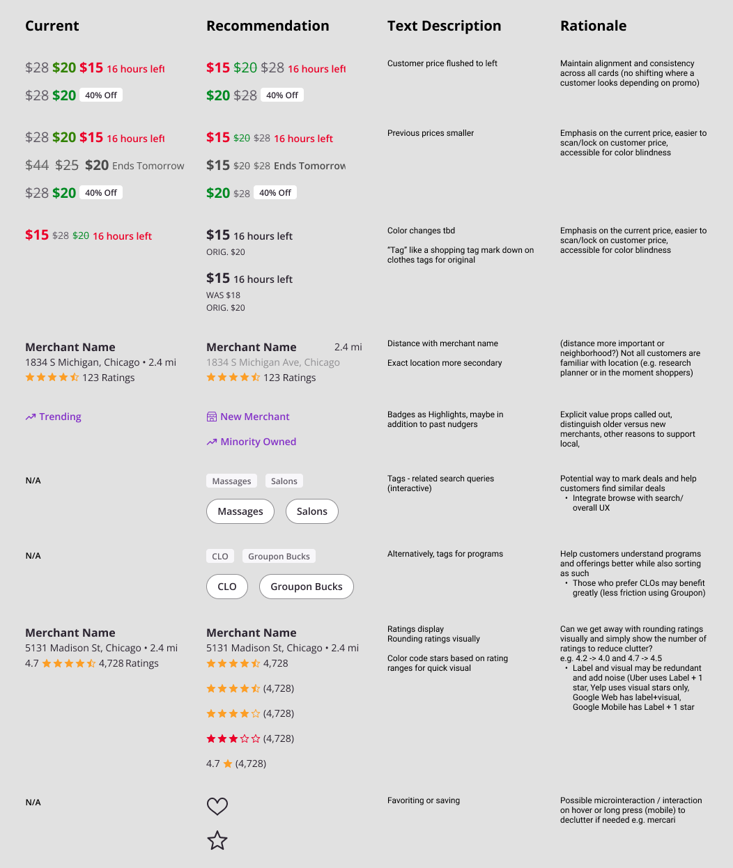
Dissociating elements from the entire card helped give an unbiased and clear answer of how certain design stood by itself, without support from surrounding content. Because customers were quickly scanning, it was important to have content visible at a glance and easily understood.
After discussing these recommendations, I moved forward with team aligned changes. The table served as a library of potential grab and go directions and were compatible with each other. Below are six proposed variations, exploring ways to adjust hierarchy, emphasize deal and pricing, and call out explicit value props. Other card directions were explored, but rationale for the below six were strongest.
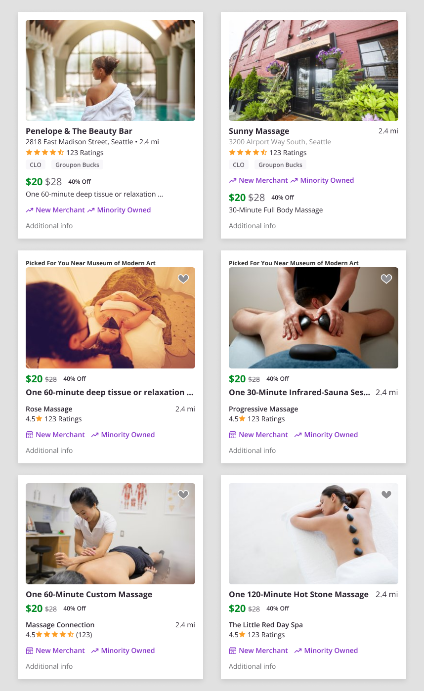
After polishing short term directions, I used my source of truth templates to lay out new changes, providing an example of the full experience. These new cards would be foundational elements for the future.
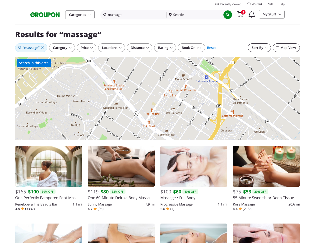
Lastly, I moved on to envision an overhaul to improve the search and browse experience. With this project, I tackled more than the cards themselves but also revamped the map and filters.
The design of this work is not released and is not public. Thus, it is omitted. Reach out for any additional information.
The nature of this work is confidential. Any and all images relating to this project and its processes have been omitted or substituted. Please reach out for more details.