Homemore
service :
mobile app design
timeline :
February 2021
role :
user centered design
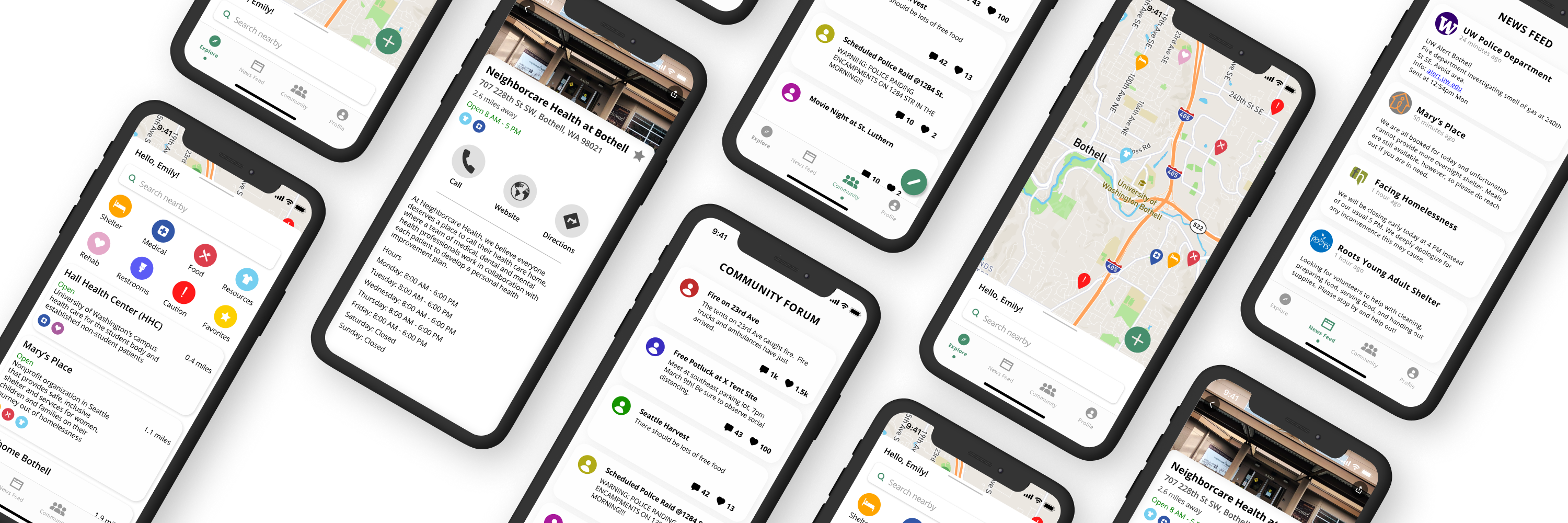
Homemore is an app for the homeless aiming to connect them to resources including shelter and food, but aiming to provide more. A large majority of the homeless population actually owns a mobile device, but there are limited apps tailored for them.
PROBLEM
Homelessness is a major issue that has swept the United States and is often underserved by services. Disabled people, people who use drugs, and minors or vulnerable populations often find themselves without a safe home among others.
Access to medical services is also crucial, especially in the midst of the COVID-19 pandemic, and people should have the ability to see where free medical services and other helpful resources are offered.
Each individual has a unique reason for why they are homeless. People who find themselves without stable or safe housing are underserved by most services.
...
“How can we empower individuals without consistent access to basic resources recover and improve their situation?”
PAINPOINTS
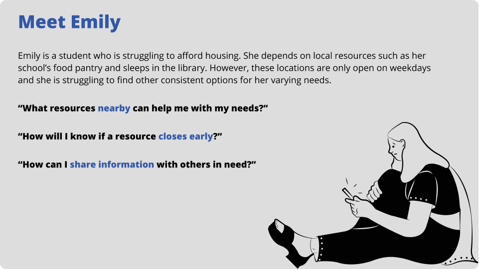
"What resources nearby can help me with my needs?"
"How will I know if a resource closes early?"
"How can I share information with others in need?"
SOLUTION
There are existing apps designed for a non-homeless person to aid homeless people, however, Homemore is an app designed FOR the homeless individual to help themselves.
Homemore connects homeless individuals to local resources, providing options to access key services to empower them to better their situations. Individuals can stay up to date with local events and emergencies through the app, ensuring their safety and ability to stay connected with ongoing events. They can also share their experiences and comments within their app to strengthen community bonds and alert other users of Homemore.
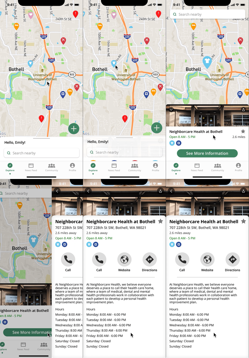
VISUALLY SEEK RESOURCES
Explore the nearby area on a map to find resources available for various needs, indicated by markers
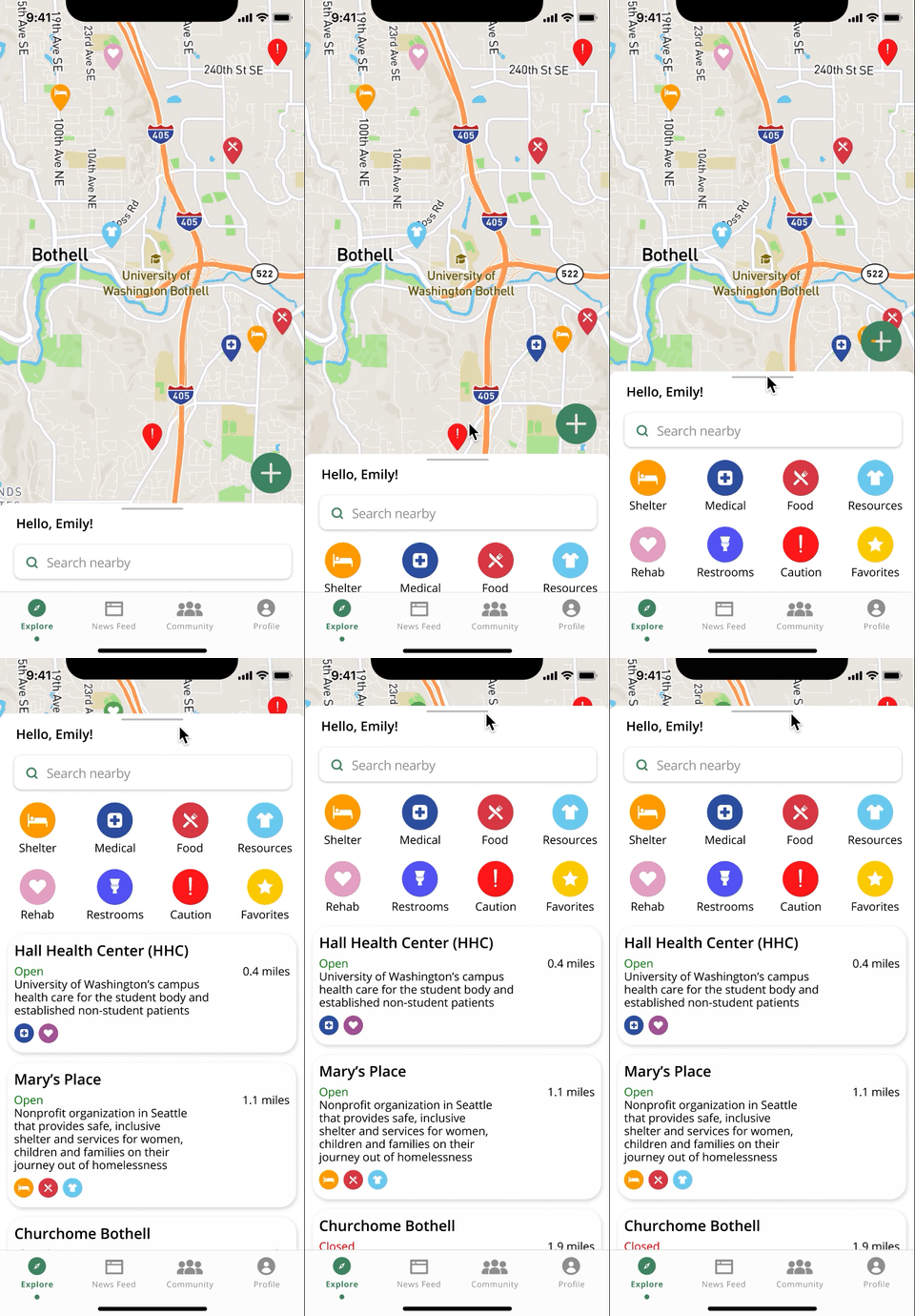
FIND RESOURCES
Sort by certain resource types or find the closest resources
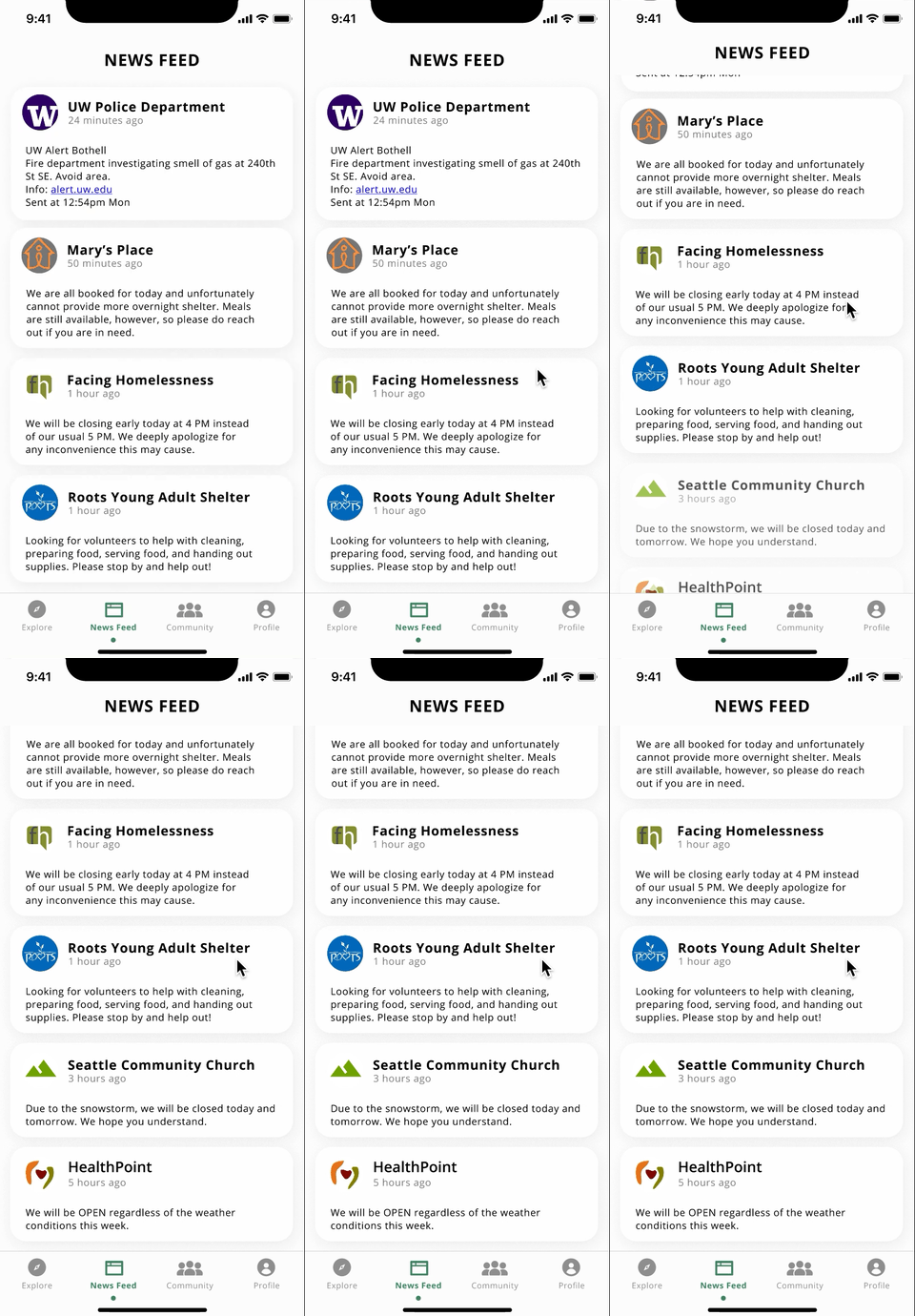
NEWS FEED
Stay up to date with official statements from resources on the news feed for updates and alerts
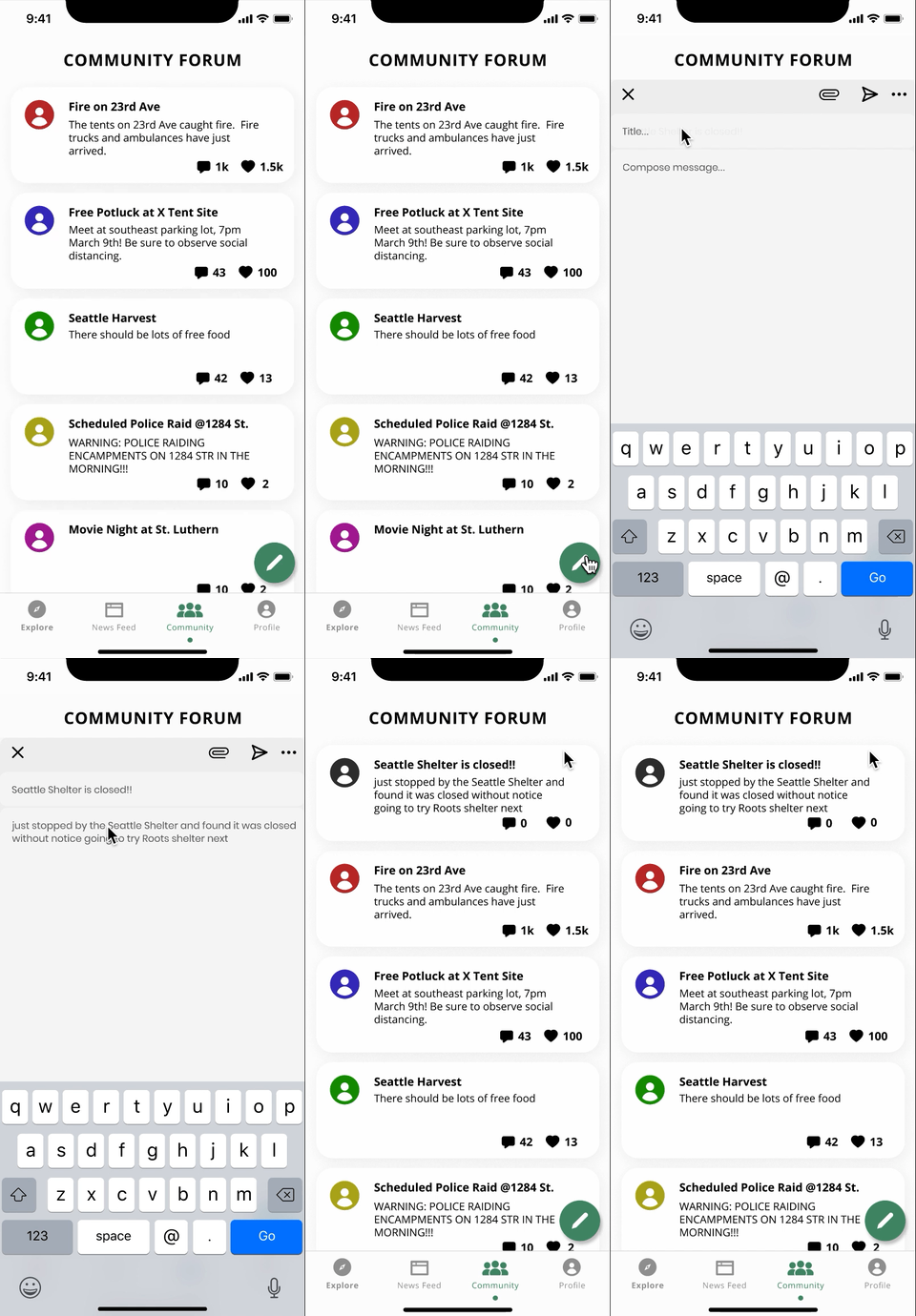
COMMUNITY
See and share updates with other Homemore users in the community and assist one another
RESEARCH TAKEAWAYS
Many apps are designed for a non-homeless person to aid homeless people, but an app for the homeless individual to help themselves is just as valuable, if not more. This is an opportunity.
Many people might find the idea of building an app for the homeless contradictory, but a large percentage of the homeless population own cell phones that serve as a lifeline and allow them to search for resources.
Mobile phone ownership by homeless individuals ranged from 44%-62% in 2016 and this number is growing.
There are many reasons for this, but it is important to realize that any individual can become homeless at any moment and should still have access to help. They may have access to a mobile phone initially and then become homeless, but that mobile phone access does not vanish.
WIREFRAMES
The following wireframes helped me see how different layouts might work for app concepts and envision basic interfaces.
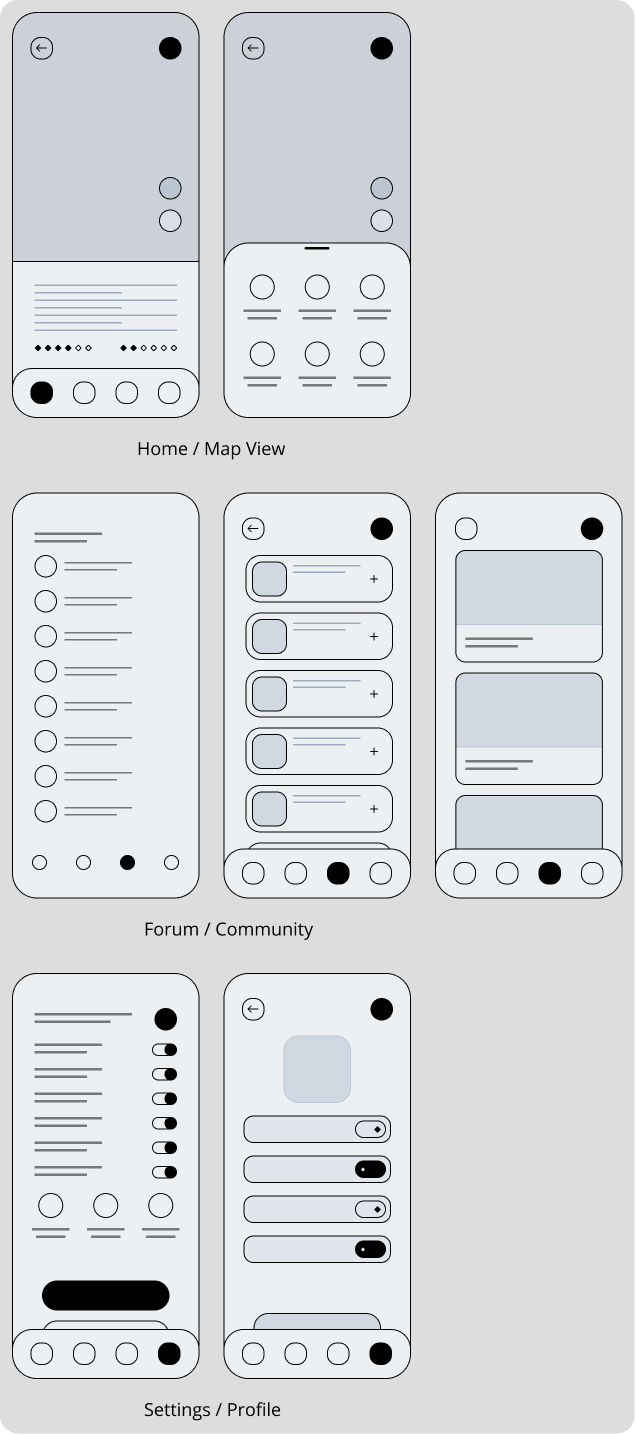
Each screen was a potential opportunity for app features to consider the best presentation of information for the specified audience. This meant considering what other mobile apps they may engage with, their education, and literacy.
LOW-FI
After reviewing potential interfaces from above, I polished up an approach slightly focused on three features - a map to visually locate resources, a search tab for finding specifics, and alerts for recent information.
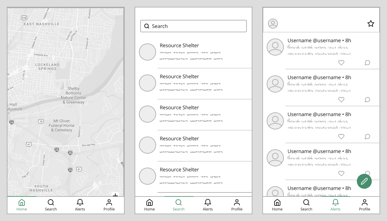
These basic screens were then tested to see if they would meet the needs of an individual who was homeless and needed to find resources.
TESTING RESULTS
From speaking with volunteers at various shelters, I realized there were a few additional concerns and considerations to address. Below is a summary of notes raised which were then addressed.
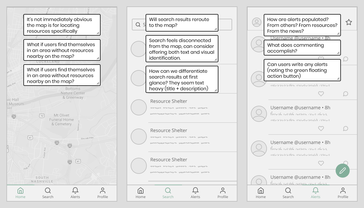
UPDATES
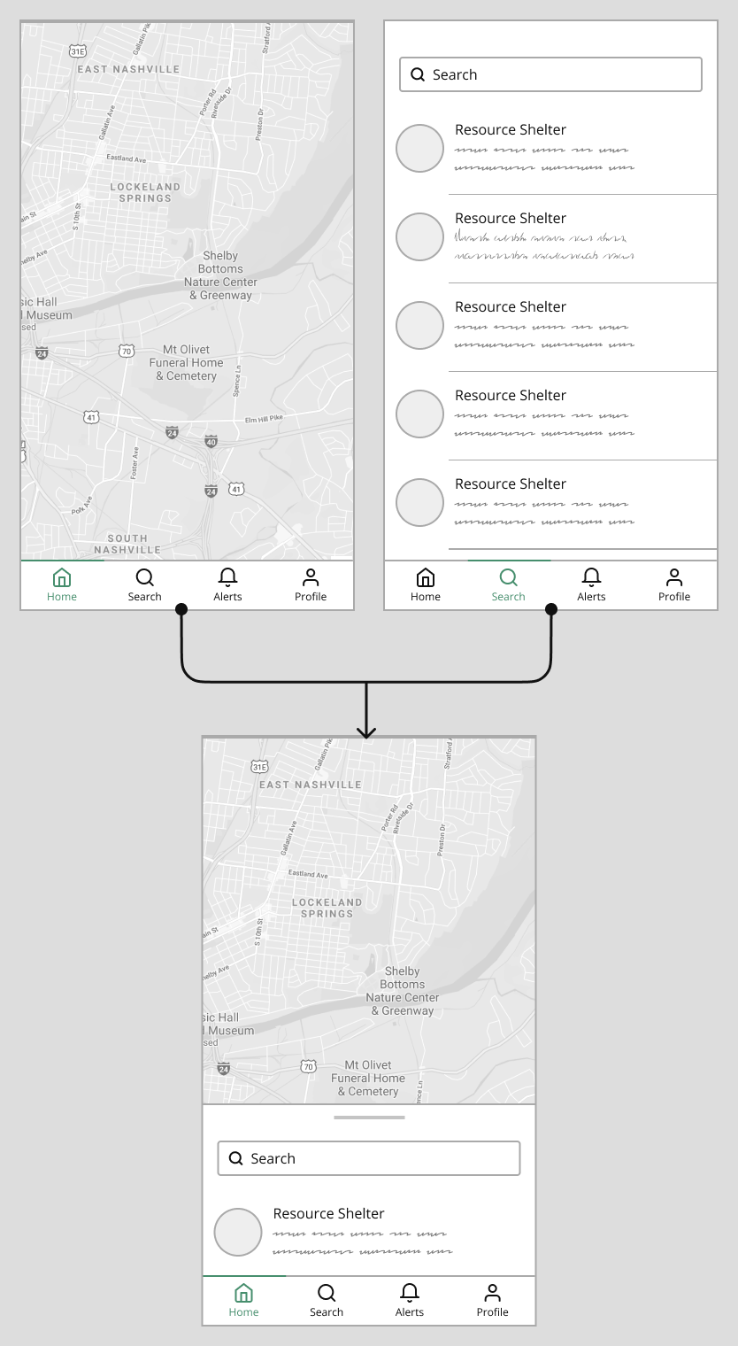
The home page and search was combined to create a map with a search feature. This increased discoverability of resources throughout and accommodated users and situations where resources may not be widely available.
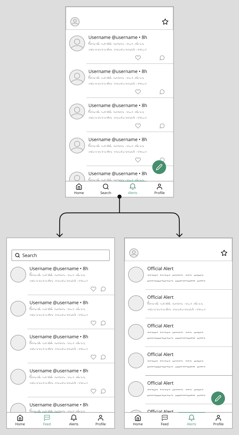
Conversely, alerts were split into official and unofficial updates. Official updates would be maintained by local resources to alert of circumstances such as early closing, stock of items, and special events.
Unofficial updates consist of users spreading information together, updating one another and supporting each other.
REFLECTION
I had the opportunity to work with beginners on this project which helped me talk through decision choices and explain my process to not only gather their thoughts, but also avoid my own biases. In doing so, I learned to talk it out. No one knows what you're thinking as they can only infer if you don't speak. Communicating will help the team stay on the same page and also help reduce potential personal biases in the initial phases.
Delegate, but not too far out. With a larger team working on the same project, it's easy to feel like there's nothing to do. By planning and spreading out work, we can all be productive while not feeling pressured that we're not contributing. However, it's also important to focus on being narrow so design isn't chaotic and can be cohesive. Spreading too far out can lead to time consuming editing or recreating designs as a result of an initial design or screen being altered.
Components are not only "noob friendly," but also undervalued. I personally used to underappreciate components because I felt they were complex. I learned to first teach the beginner designers in my group about components and how this would allow us to edit in the future. This pairs well with the note above, if spreading far out, at least make sure to design with components in mind so that when initial designs are changed, it's not an obstacle discovering what needs to be changed on other screens.