Keep Stanford Wrestling
service :
publication design
timeline :
mar 2021 - jun 2021
role :
research and design
advisor :
cal dobrzynski
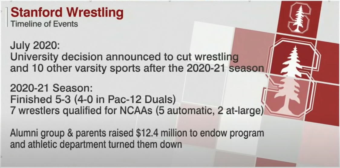
In the summer of 2020 (COVID), Stanford announced that they were dropping 11 of their sports programs due to "finances and competitive excellence." Since that announcement, the wrestling community and Stanford alum have raised over 12 million dollars for the wrestling program which would self-endow the program (costs $150,000 annually). Without the support of the university, the wrestling team had to train outdoors and because of the lack of support, the coaching staff and wrestlers wore all black without the Stanford logo at the national competition. Despite all of this, Stanford crowned a national champion this year and the university has yet to acknowledge the attempts and remains silent.
This publication aims to highlight the inconsistencies with this action and raise awareness about the issue. Stanford has chosen to continue these programs after 10 months of battling (05/18/2021). Feel free to view the entire publication here.
PROBLEM
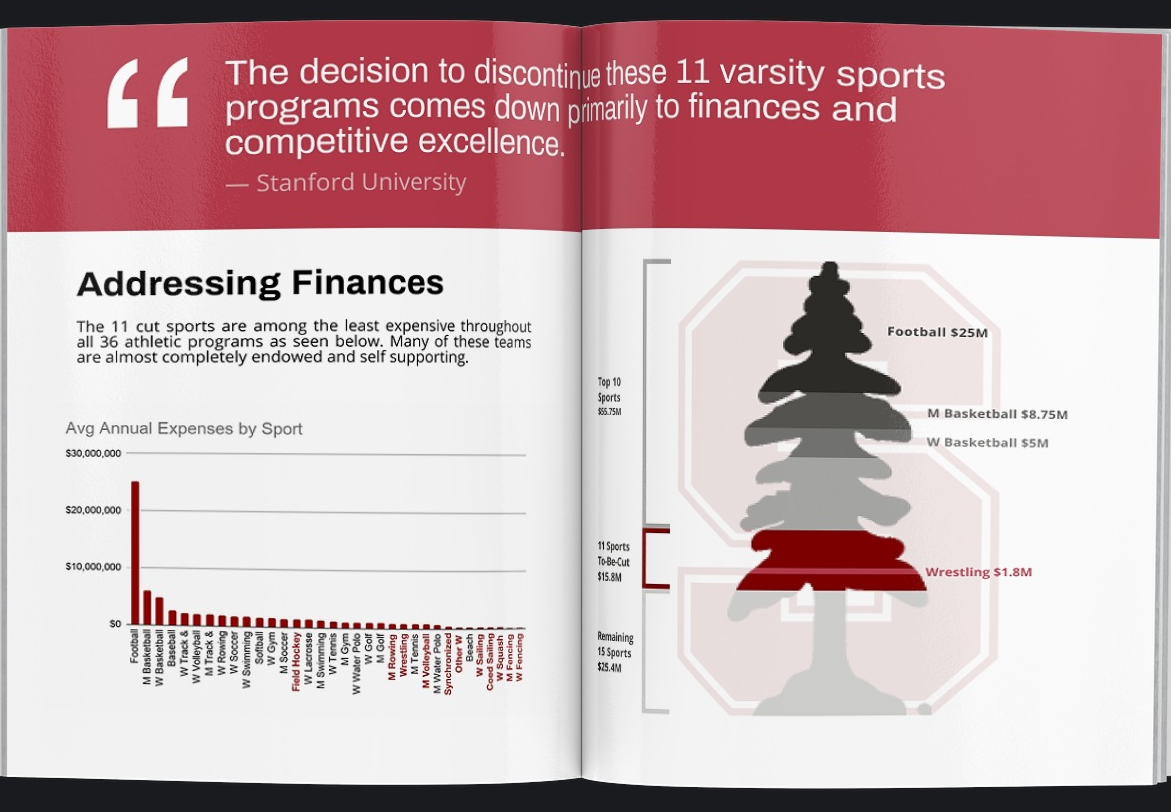
Reasons for dropping Stanford Wrestling and 10 other sports was unclear. While lack of finances and competitive excellence are cited, there is no evidence regarding these claims. Because these sports are less popular (than say, football or basketball), the issue is overshadowed and deserves more attention.
ACTION
Through researching and gathering information about Stanford's initial reasoning and comparing this to the student athletes, their families, and alumni, I designed a miniature publication targetting the general public.
By editing images, creating data visualizations, and compiling information about the topic, I aimed to highlight the importance of collegiate athletics and raise awareness about the battle between Stanford Athletics and the university.
VISUAL LANGUAGE
After a few iterations, I was able to design a visual language that was slightly off-brand from Stanford University while also calling for action in a friendly manner. This is reflected through the usage of two sans-serif typefaces, one of which is large and attention grabbing and another that is welcoming and open.
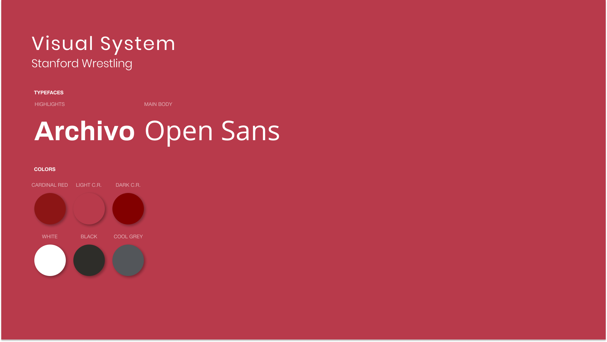
I turned away from using Stanford's brand identity completely because the program lacked the university's support. As a result, I tried to showcase some independency by using a new set of type while maintaining their color palette. Allowing the typography to be separate also allowed for the publication to look separate, as in Keep Stanford Wrestling is unaffiliated with Stanford.
PUBLICATION HIGHLIGHTS
INTRODUCTION
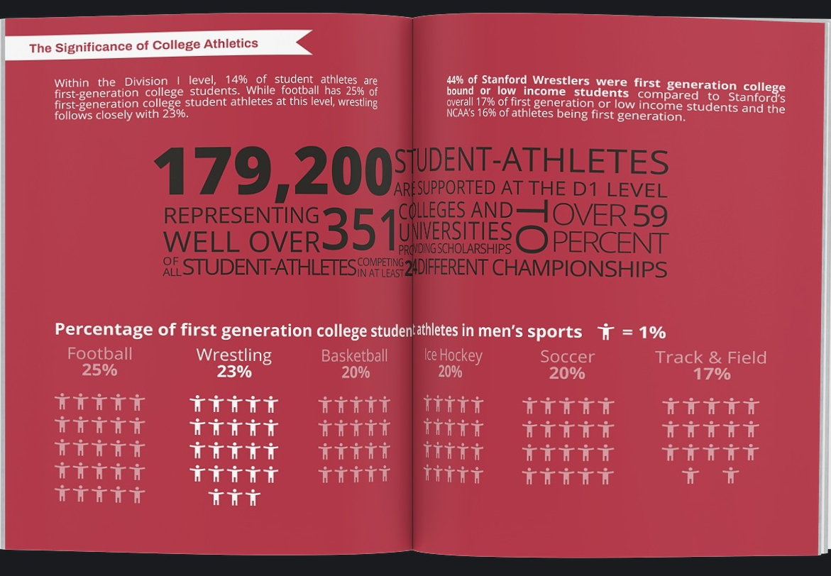
Data is presented in the beginning to introduce that statistics will be used throughout the publication to provide evidence to begin the argument.
VISUAL HIGHLIGHTS
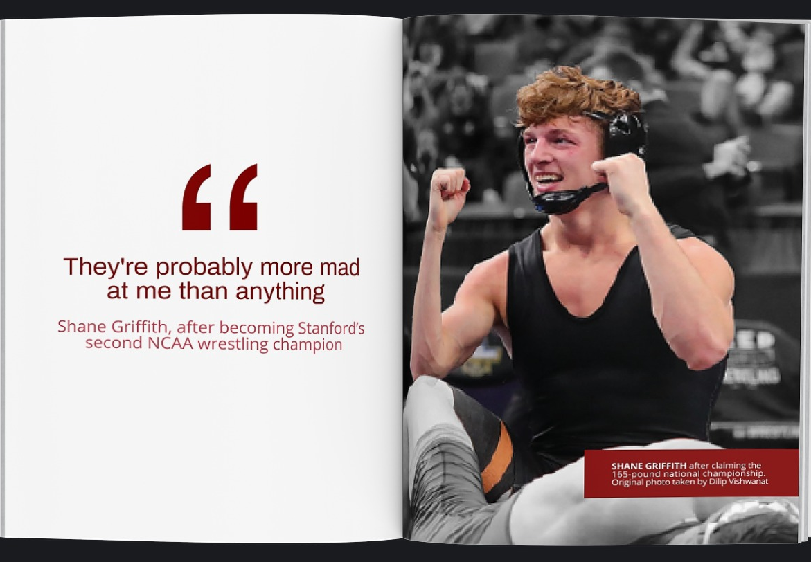
Quotes are provided space in various ways to highlight discussion points that contrast Stanford's claims.
DATA VISUALIZATIONS
Data and statistics are visually represented to illustrate key arguments within the publication.
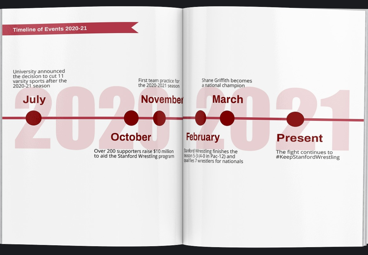
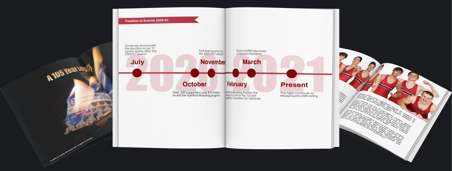
TIMELINE
Key events and important dates are shown to emphasize the battle between the program and alumni versus the university.
FULL PUBLICATION
COLLATERAL
On May 18th 2021, Stanford finally reinstated the 11 sports after a 10 month battle.
To follow up on that news, I created collateral pieces to pair with this publication.
The first was a poster and the second was a social media campaign.
These collateral pieces used Stanford's brand identity (both typography and color)
to show that the program was affiliated with Stanford oncemore.
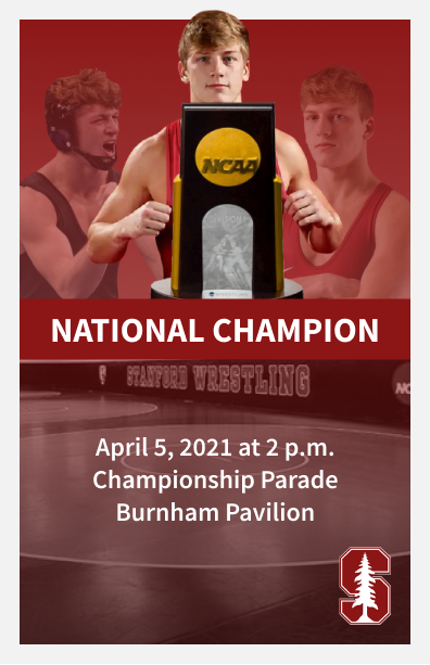
POSTER
After Shane Griffith claimed the 165lb national championship, Stanford did not comment. The womens basketball team, however, also won the national championship that same week and Stanford put on a championship parade. Because wrestling has been reinstated, I created a poster to promote a hypothetical champions parade.
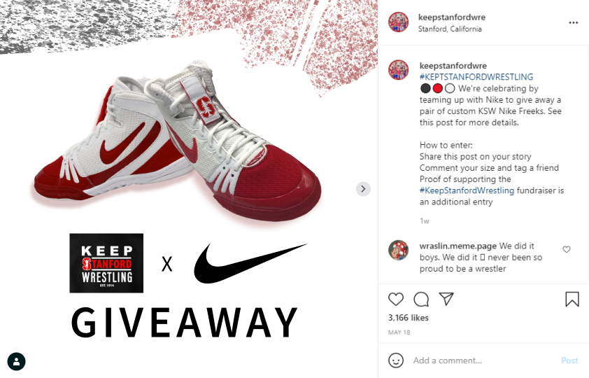
SOCIAL MEDIA CAMPAIGN
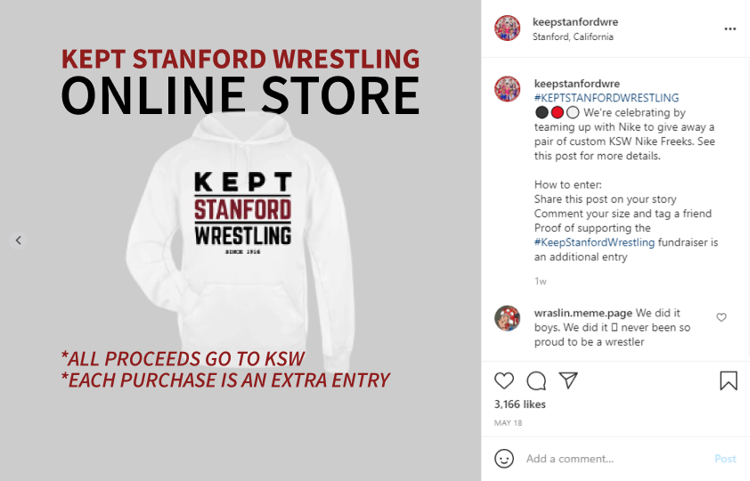
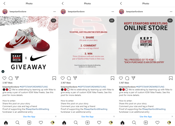
To celebrate that Stanford Wrestling was here to stay, I created a hypothetical giveaway. I aimed to appeal to the supportive community by adding Stanford's Cardinal Red and logo.
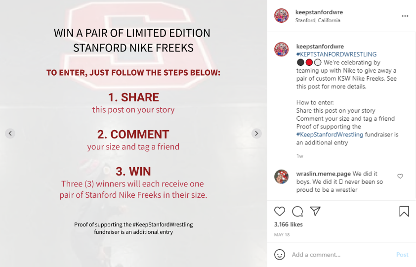
SOCIAL MEDIA CAMPAIGN
Much like other giveaways, I dedicated a page on instructions on how to enter. Familiarity with social media and the audience was important to understand.
SOCIAL MEDIA CAMPAIGN
Lastly, the Keep Stanford Wrestling fundraiser was ongoing because Stanford was allowing the programas to self-endow. As a result, I also wanted to highlight the merch store to help fundraise.
SOCIAL MEDIA CAMPAIGN
I created a mobile version to showcase how the campaign might look on different devices, considering a large population of users would be on mobile devices.
REFLECTION
Publication design and digital design are similar and it's important to remember the audience. Readers and users both need to understand the content and the flow must make sense. In all design, storytelling makes up the bulk of communication to all end users, not simply content.
Information shapes design directions. The overall aesthetic was created by my content as my structure and layout was dependent on what I wanted to share. This was originally more obvious in my digital design but spending time with my initial page layouts and planning saved me a lot of time understanding how I would showcase information. Using a full spread over a single page, for example, was meant to emphasize key ideas and arguments by providing ample space.
Following the above, the information I wanted also changed my layout and outline, so understanding what information will be shown is important. Filler content is nice to show what design might look like in an ideal scenario, but obviously not all design ends up ideal. Gathering the content and information is a significant portion of the initial stages.