Recovery Cafe
service :
organization re-branding
timeline :
winter 2020 (6 weeks)
role :
research, design, ui, ux
My project in the second half of my visual communications course was dedicated to rebranding Recovery Cafe, a Seattle based cafe that supports individuals as they overcome mental health challenges. I started by conducting research about the brand’s mission and goals, learning to focus on offering support, love, and opportunity to their intended audiences. With various lessons on visual systems, I designed a brand book to convey the brand’s values and redesigned some mobile interfaces for the website. A detailed brand book about my process can be found at the end of this page.
Problem Statement
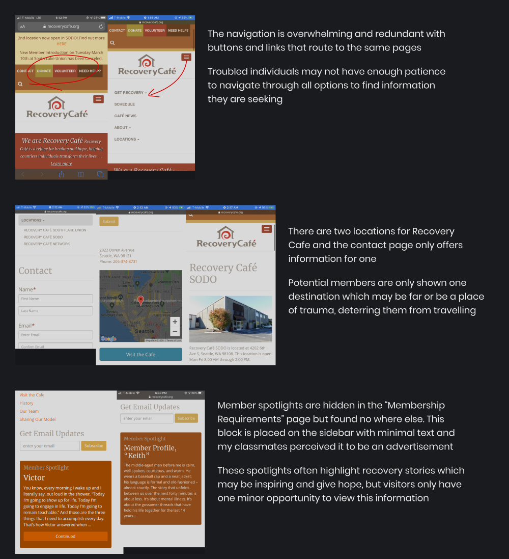
Currently, the website is highly redundant with multiple navigation options redirecting to the same pages. Information is difficult to locate due to the amount of options presented and a majority of the content is given the same importance. The target audience has been challenged in the past and requiring excess work may be too difficult to follow.
Vision Statement
Reducing the navigation and options presented will allow those in need to find key information easier and help these individuals find recovery.
RESEARCH
Site Audit
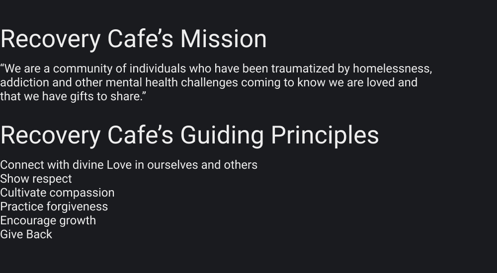
Before designing, I discovered that Recovery Cafe primarily targeted individuals who have been traumatized by mental health challenges. Their secondary audience are volunteers and those who wish to assist the cafe and it’s members. Key information regarding their mission was also noted and this was to assist those in need, connect with love, cultivate compassion, and encourage growth.
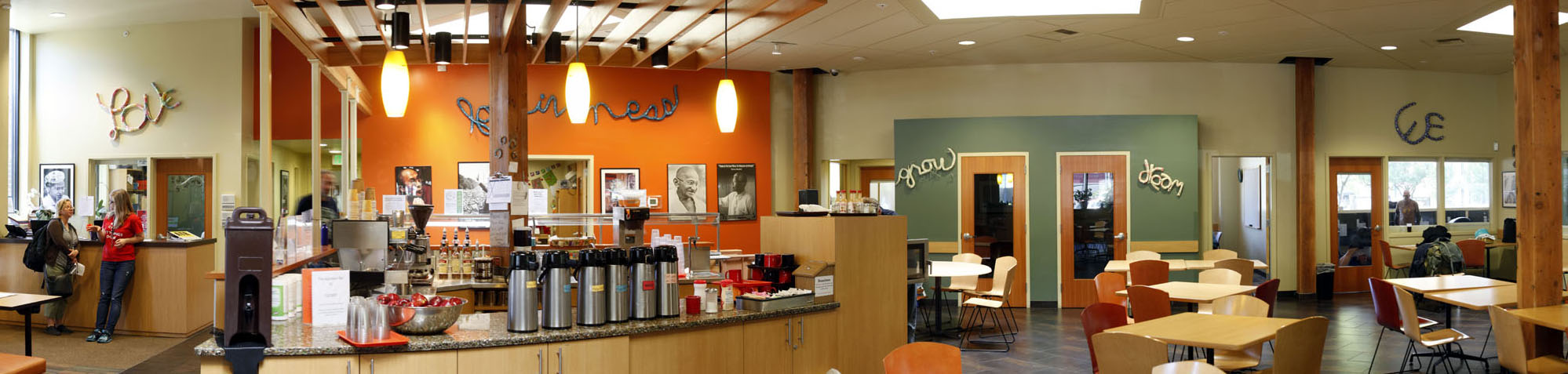
Glancing at the current home page, the two main things to notice are the images of community and the efforts to engage, which were the focus of my rebrand.
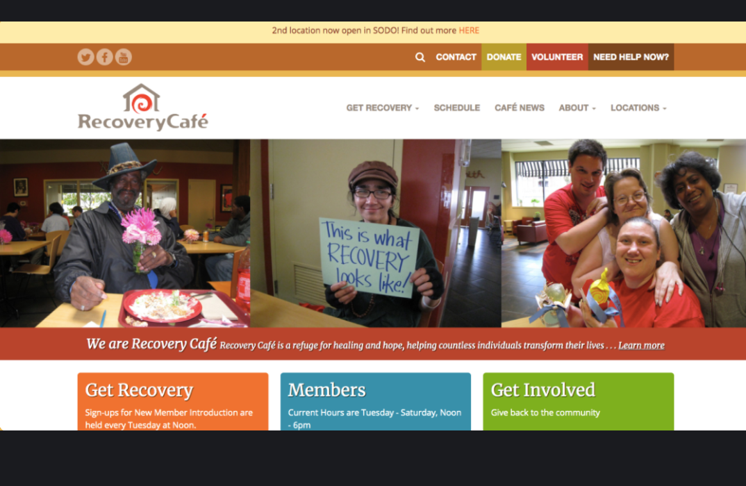
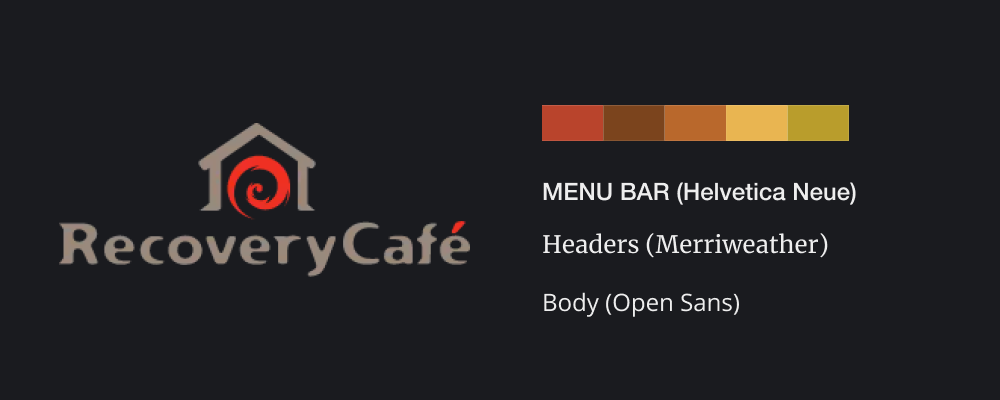
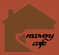
Below is their current brand identity, which I maintain to keep consistency.
DESIGN
Logo Design
I began drawing from my knowledge of Recovery Cafe's organizational values, brand ethos, audience, and mission. I outlined key words to consider as part of the logo's meaning. This was a mass brainstorm activity to freely sketch all ideas and have a plethora of designs to reflect on and receive feedback.
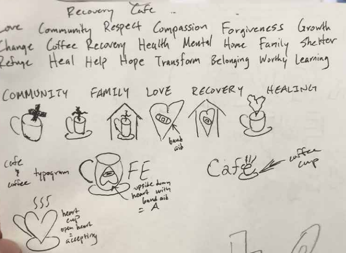
Keeping the client’s mission in mind, I began sketching different digital logo iterations before transitioning to more geometric based logos. I focused my designs on the key ideas of “community, love, and coffee” to fit their mission and purpose.
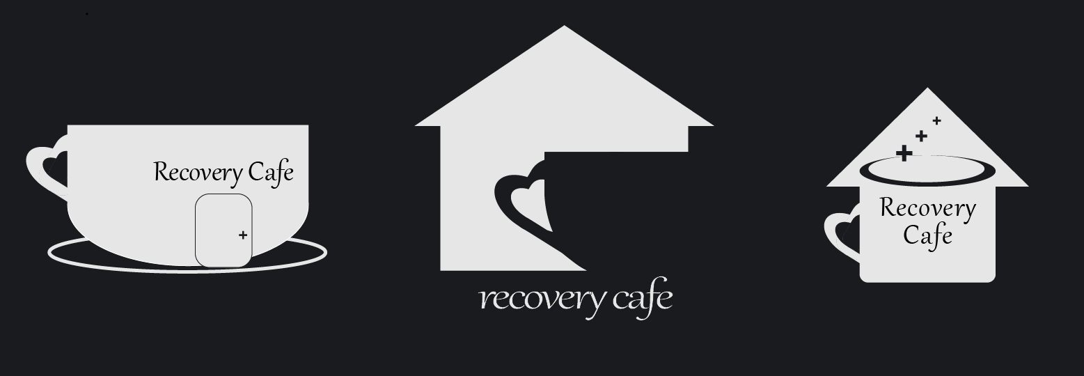
With peer critique, I began refining my logo in the center. I combined figure and ground to highlight Recovery Cafe as a home for those in need but also as a casual cafe to be more welcoming to newcomers. I attempted to balance the Gestalt principles with my understanding of the brand.
A house represents the home and shelter provided because Recovery Cafe serves as a refuge for those facing mental health challenges. Whitespace with figure and ground carve out a coffee mug for the literal cafe. I chose a script typeface to act welcoming with a personal, homemade touch which reflects a "homey" feel. The text is placed directly on the open end of the house towards the right (carved out by the mug) to represent an open door, welcoming all to visit.
Corners and edges are rounded to be smoother and more friendly. Lastly, a heart shaped handle on the mug communicates the idea of love and leverages proximity with the mug to communicate that both love and coffee are provided by the cafe.
Icon Design
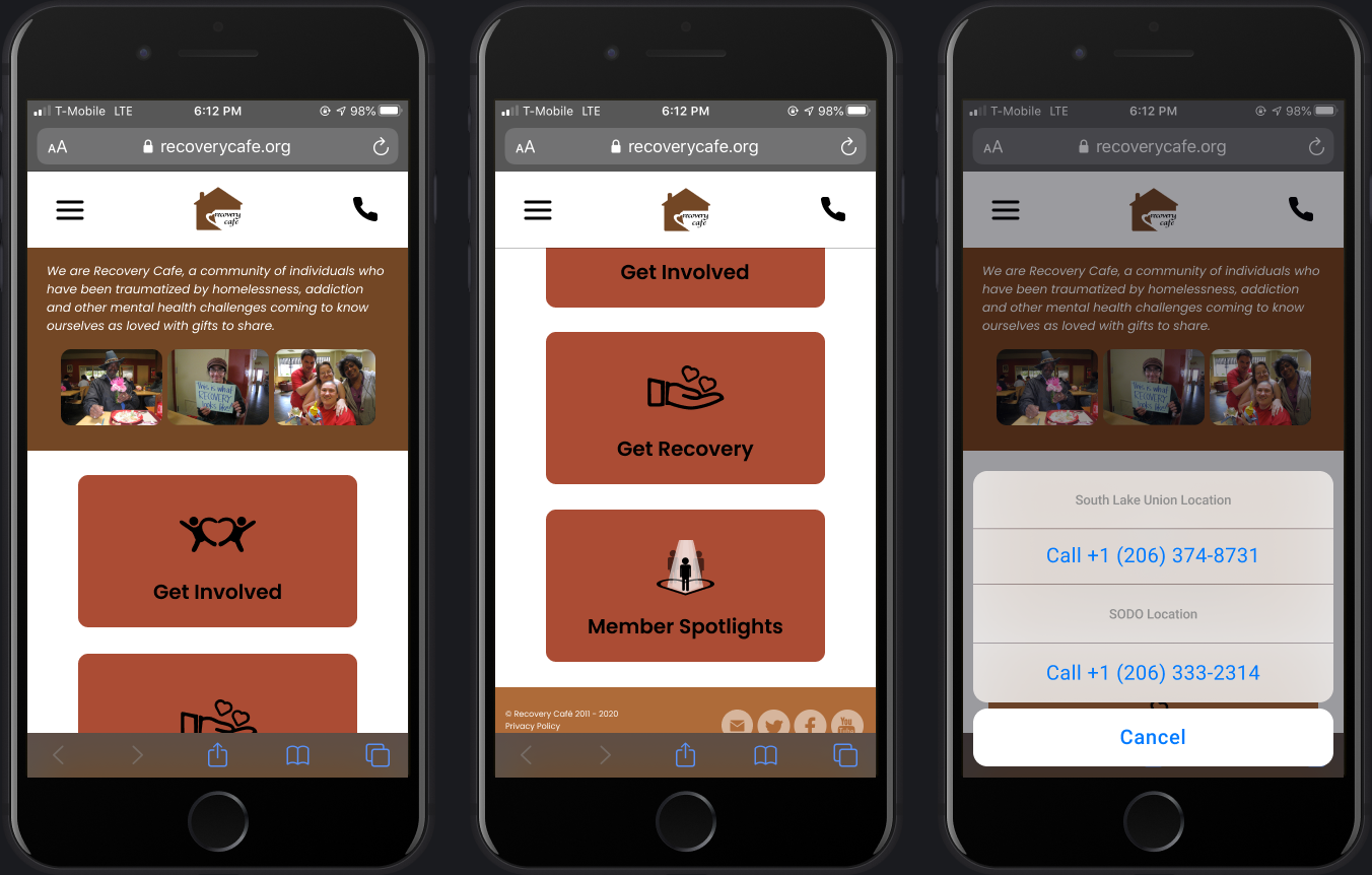
Focusing on user interactions with the website, I designed three icons to assist with the navigation - icons for Get Involved, Get Recovery, and Member Spotlights, which were the main call to actions and were the efforts to engage that I mentioned earlier.
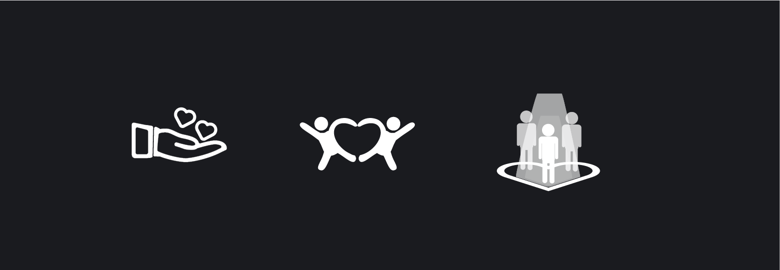
The process for these icons was similar to that of the logo. However, my main goal was to communicate the efforts to engage. I did not have to brainstorm a new set of key words to ideate around, but I did refer back to the previous list to keep in mind Recovery Cafe's brand identity.
TASK FLOW
I began identifying current pain points and then navigating through the website as one of Recovery Cafe's target users. After empathizing with the audience, I created a user task flow chart to illustrate their pathway to receiving support. My focus began with the home page, followed how an individual might learn more about the cafe through reading or contacting, and then eventually reach the end goal of receiving aid.
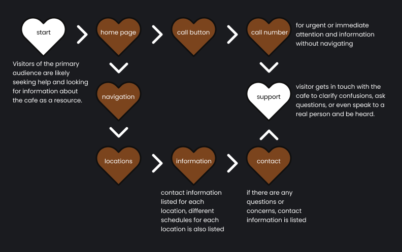
PAINS
I have highlighted some of these pain points below. These were pain points identified through my site audit and empathy, noted on the user task flow. I focus on redesigning mobile screens to try and reduce the challenges presented by these pain points.
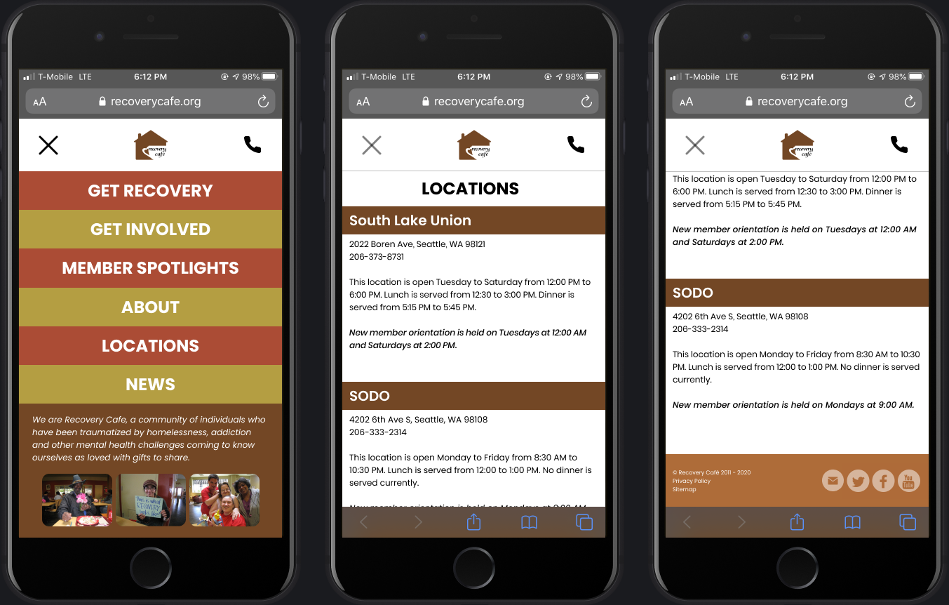
MOBILE SCREENS
With critique from my peers on my original wireframes, I began working on screens that improved condensing information and utilized the client’s current color palette. This was done to maintain brand identity and not completely renovate Recovery Cafe. In designing the home page, I highlighted three options for visitors to get help, give help, or read about success stories.
By identifying the pain points, I set to offer easy access to the three main call to actions in an effort to engage visitors. Ensuring that contact was accessible meant those in need of help may get connected to receive help, especially if it were urgent.
REFLECTION
During this project, I was lucky to consistently give and receive feedback with my classmates to constantly reiterate. Reiterating constantly after receiving feedback from critique was challenging, While I thought to myself that re-doing design after critique made my previous work irrelevant, I realized that I needed to have pre-existing work to receive critique and feedback. This helped me appreciate the design process more.
Working alongside my classmates helped me build off their work and generate ideas, leveraging their designs and being able to separate what was successful from less successful attributes.
Most importantly, I learned that design is never done - I learned to continue being curious, ask questions, and constantly strive for new ideas. These lessons were a result of me learning the value of critique.