Reddit Capstone
service :
design systems, web design
timeline :
jan 2022 - june 2022
(6 months)
role :
lead designer
To preface, this is not a concise case study. Rather, this is a process book overviewing the 6 months with reflections throughout. Please get in touch for a succint case study.
This was a multistage project encompassing the full design process from research to proof of concept with additional artifacts along the way. I completed this in collaboration with Cindy Zhao, Kenny You, and Kim Tran from the Human Centered Design & Engineering department at the University of Washington alongside Della Sigrest and Marco Fabrega from Reddit design. However, this documentation serves to solely focus on my contributions, designs, and reflections.
Special thanks to the HCDE IND CAP Fund for supporting our research efforts. Thanks to Beth Kolko, Meg Moldestad, Anna Ruoxi Shang, and Shengzhi Wang for a hefty two quarters and their continued guidance.
EXECUTIVE SUMMARY
Reddit is a social platform with almost 48 million monthly active users who submit content ranging from links, text posts, images, and videos. These submissions are then voted up or down by other members. They are primarily recognized for their forum-like environment however Reddit now has other live features like voice hubs and live video streaming in specific threads called ‘subreddits.’ Overall, it is a network of communities where users can immerse themselves into their interests.
As the online social behavior of the world moves towards a desire for real-time engagement, community belonging, and authentic connection, users find themselves using various products to mimic social club behavior. Synchronous engagement empowers individuals in this pursuit as it enables users to communicate in real-time. Synchronous engagement products enable users to live in an online community that feels alive, constantly connected and attempt to emulate social club behavior. However, these products do not fully replicate the latter as conversation picking is not streamlined and easily discoverable.
While Reddit is successful at community building, the existing structure is not conducive to enabling a real-time engagement platform. In addition to this, synchronous features require a large amount of moderation time and effort to ensure a safe and valuable environment. In the following reflection, I discuss our process from research to design. Our research consisted of secondary research, competitive analysis, interviews, and surveys. I then share affinity diagramming from these research protocols and the data used to extract key findings from these. After consolidating our key findings, we transitioned into the ideation stage and sketched potential designs for integrating synchronous features on Reddit before designing. Designing involved a constant iterative process of low fidelity screens and feedback before developing in depth, high fidelity screens.
INTRODUCTION
As the world transitions more towards a digital structure, so too does the way individuals interact with one another. Synchronous engagement empowers individuals in the pursuit of real time engagement, community belonging, and authentic connection by allowing users to communicate in real time. Synchronous interaction improves engagement with help from task completion, willingness to learn, positive learning attitudes, and creating meaningful communities [1]. Platforms help users feel alive, constantly connected, and emulate social club behavior virtually. Existing products allow users to join voice chats and see one another through video cameras among other actions, nearly emulating social club behavior.
Social clubs empower individuals to gather around common themes whether those are interests, goals, passions, or the like. In a physical setting, club members can freely walk around to enter or exit conversations. They are completely aware of their surroundings including who is around and what they are speaking about. This is a welcoming affordance, allowing users to know what is happening and enter conversations relevant to them. They see and hear every group, allowing them to find the right fit for the time being.
While individuals are not physically present in virtual synchronous platforms, they are often represented by a profile picture or their video cameras. These are extensions of one's identity that users are in control of. In the same way, avatars on Reddit empower Redditors to customize their appearance on Reddit, creating their own profile avatar, complete with hair, jackets, jerseys, capes, event-themed gear, and partner inspired characters. They also enable Redditors to align themselves with their favorite communities while also providing individuality, distinction, and prestige. Avatars or other representations of one's identity are clearly important, especially in social settings. Many users maintain online impressions and different identities through Reddit accounts [2]. Avatars are a direct reflection of a user's chosen identity and help manage the way they leave impressions.
PROBLEM
With existing platforms, users must select one room to enter whether that's a voice channel, breakout room, or other. There is an inherent barrier here that a user may see a populated voice channel or breakout room and join only for all existing participants to all be away from their keyboard or discussing something uninteresting and irrelevant to the user. While it is easy enough to join and leave, this is an obstacle that may be removed. It's really a blockade that users must open themselves in order to discover what's happening and is not user friendly for discoverability and inserting oneself into a conversation.
In short, existing products poorly emulate social club behavior and meeting others. They can often feel forced and users often join to converse about something that's predetermined including group work, games, videos, or the like.
In addition, Reddit avatars are only supported on one's profile page, their profile hovercard, in comments they leave, and in posts they create. These are pretty static and avatars are not the emphasis of these screens at all (emphasis being comments, posts, and history of the two). These options are limited, especially in terms of others engaging with one another and their avatars. This means avatars are more or less strictly for oneself. Again, however, avatars are an identity for individuals that express themselves to others. They are critical in one's portrayal of themselves or their passions and interests.
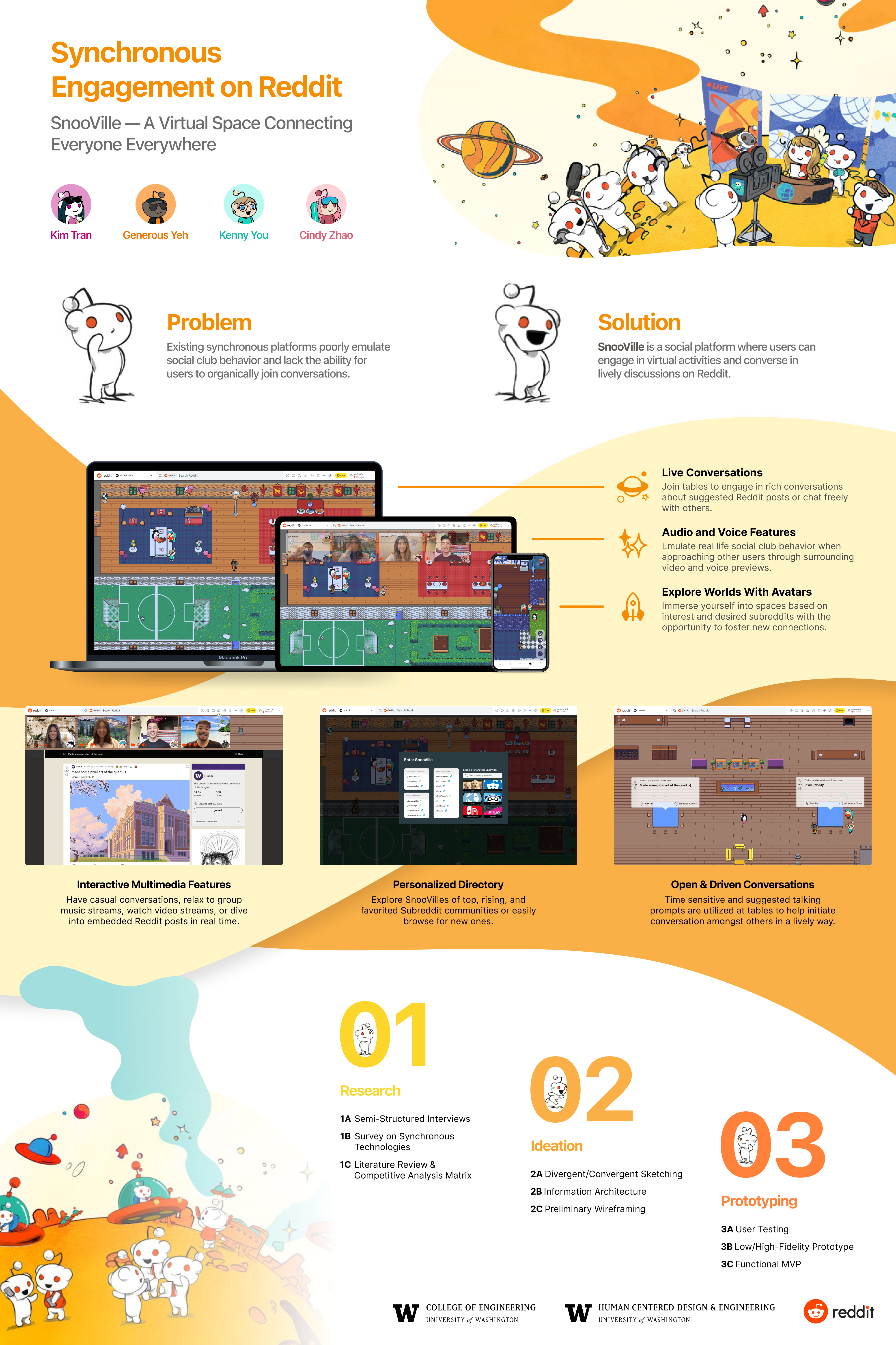
SOLUTION PREVIEW
As these problems were identified, so were opportunities for design. To combat the challenge of conversations locked behind some entrypoint, we explored previews on SnooVille. As we showcased video previews, we also acknowledged an opportunity to utilize ambient sound to fully replicate social club behavior, where one is able to see multiple people or groups as well as hear their conversations to determine where to walk towards. Previews were stronger as users became closer to conversations, allowing users to become aware of discussions initially, but slowly integrate themselves if desired.
In a similar fashion, we acknowledged SnooVille being an extension of Reddit and able to utilize existing features on Reddit. For starters, suggested prompts would be available on select tables to guide conversation. This helped tackle the problem that conversations may sometimes feel forced or predetermined to a group planning to work, game, or participate in other activities together. These prompts were to be pulled from existing Reddit posts with respect to each SnooVille's specific subreddit. They are suggested because we acknowledge that conversation can be exhausted over time and discussions deserve to flow freely, especially if one post leads to users discussing related topics or posts. This would allow for conversation starters and review of Reddit posts, encouraging discussion and empowering users to view new posts or look back on previous posts with new perspectives in real time. Prompts refresh after set timers, pulling in new Reddit posts to engage users.
Leveraging this fact, we further extended Reddit links to open in SnooVille. As links were sent in chat, they would open up embedded into SnooVille to maintain real time engagement and allow for real time discussion around a given post or comment. With the existing Reddit platform, this discussion is fairly limited as one may comment but they are forced to refresh the page to determine if there are responses. With SnooVille, users are capable of discussing in real time to add comments and further elaborate on posts instead of relying on notifications and refreshing.
Finally, as we observed an opportunity to utilize avatars, we placed a larger emphasis on them being a focal point. Users were to express themselves through their Snoo avatars and walk around accordingly, reinforcing the idea that avatars were an extension of oneself and by a user's avatar joining a conversation, they too would join. As compliments are passed around physically and through social club behavior, SnooVille sought to empower users to compliment one another. Complimenting one's Snoo avatar would be the equivalent of complimenting others in a social setting, for instance their outfit.
RESEARCH
secondary research
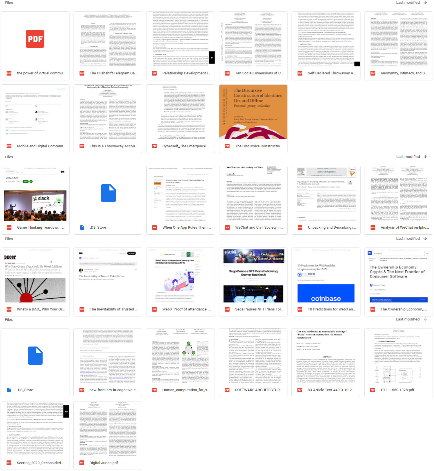
The beginning of our research focused on gathering context and understanding the problem space. Breaking down our sponsor prompt, we identified a need to understand synchronous interaction and safety. Through desk research and white papers about online communities and interactions within them, I gained a better perspective about what individuals might be expecting and their struggles in such communities. Working with our sponsors, we identified certain areas to focus on that would inform our perspective about synchronous products, user intentions interacting online, identities, and moderation.

The above categories and their respective papers extended my view on how individuals tend to engage online. While I initially focused on simply talking and sharing content, these papers helped me increase my perspective and take into account the ways users portray themselves, place value in relationships or virtual objects, and safety with moderation. The way users portrayed themselves heavily impacted my desire to accommodate user avatars and allow users to freely express themselves while building relationships as a result of their preferred identities. Users placing value in relationships or virtual objects helped me understand sentimental value behind communities, increasing rationale for separate SnooVille subreddits where each community shares common goals, interests, or passions. Finally, reading about moderation helped me understand the challenges moderators face and the various support they might need.
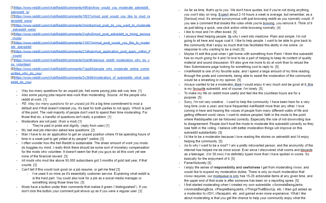
After gaining a better understanding and building context around our problem space, I browsed Reddit threads to consider our primary users. Redditors were an excellent source and lay in the space between primary and secondary sources as they utilized Reddit and other synchronous platforms. Reddit posts and comments around synchronous engagement, moderation, and avatars guided my thoughts, allowing me to narrow my scope a little and identify what aspects of synchronous engagement, moderation, and avatars I wished to explore. Reddit threads were a great first hand experience as they make up our audience. While I read about preferences in synchronous platforms and avatars, I focused heavily on moderation through these posts. Redditors sharing their opinions through comments allowed us to discover what they see in a moderator position as well as what throws them off.
Finally, I resorted to commentary of existing platforms, their features, and why certain elements are successful or unsuccessful. This included blogs and articles analyzing trendy products which may have been compared to other platforms. As I read through various opinions and analysis, I began to notice common patterns and trends such as voice chat existing in most, if not all, synchronous platforms. Alongside this, I quickly gauged what products exist and what I could examine later through competitive analysis.
competitive analysis
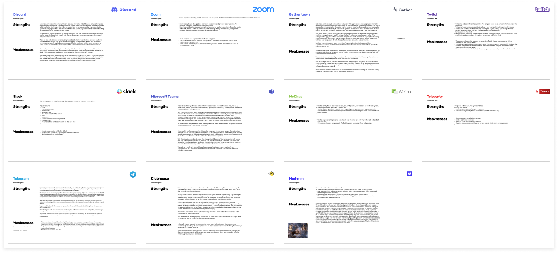
After identifying existing products, I went further to examine over 12 competitors while focusing on their features and functions. By doing this, I was able to note common themes that were necessities, more unique areas for exploration, and potentially features that were not working well and could be avoided. Examining these competitors also allowed me to consider unique appeals for each, if applicable, and begin to think about what our to-be solution might offer and differentiate itself from others.
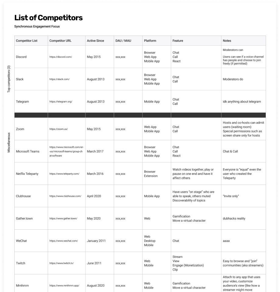
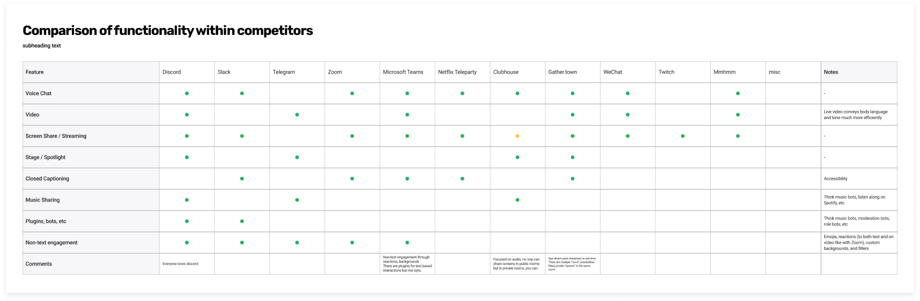
After comparing various products to identify their platforms, popularity, and features, I set out to dive deeper into each product to determine what was working well and what was not. Figure 9 below showcases an extensive degree of analysis for specific products focused on strengths and weaknesses alone, acknowledging each platform being widely used.
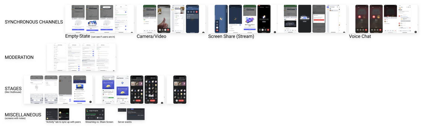
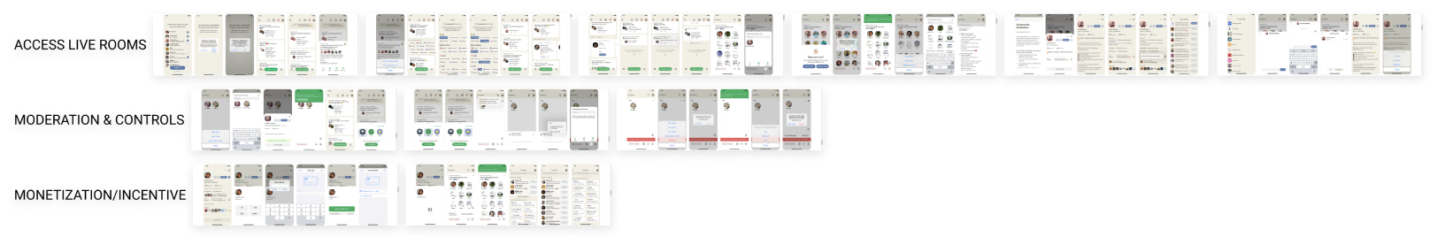
To wrap up my competitive analysis, I dove even further into specific products to examine flows. Evident through the labels in Figures 10 and 11, I was able to group various topics such as features and offerings. Together, these screens helped us understand existing products, how they were similar or different, and identify key elements for our design alongside other, possibly low priority design considerations. It was important to see what types of flows existed to maintain a sense of familiarity for our users and help them onboard or utilize our product smoothly.
interviews
I spoke to three individuals in my network and asked them questions around their Reddit usage as well as any synchronous products they engage with. I also asked them to imagine being a moderator and walk me through their expectations. I took this time to dig into existing user feelings and expectations to gather an idea about what users enjoy, what keeps them coming back to specific products, and how we might relate some sort of synchronous platform with Reddit. While fairly loaded, these questions were critical in confirming our own biases, backing up our previous research from whitepapers and competitive analysis, and evaluating products.
One area of focus I had with my interviews was discoverability. Users noted a tendency to join synchronous groups by knowing others or having some sort of tructure such as a class, but were less familiar with finding public or new groups. On the other hand, they were able to freely explore Reddit and discover noteworthy subreddits to read. The approaches to each environment contrasted starkly and proved that users were willing to explore new groups if they were presented clearly, though they would not necessarily go out of their way to explore. This was a perspective that was uniquely gained from interviews speaking to users as reading papers and examining existing products could not quite provide this information. Rather, those forms of research provided a foundation to build upon but left gaps as I was unable to ask writers or users about their opinions halfway and the idea of discoverability was not a very popular topic for discussion or analysis.
survey
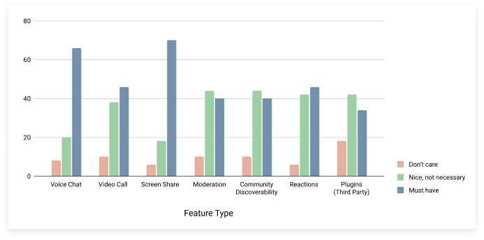
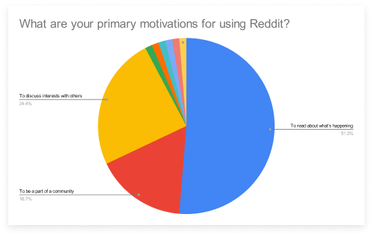
After the team's interviews, we conducted a survey to confirm our findings through the masses. Our survey consisted of thirteen questions including demographics, questions about Reddit, and questions about synchronous platforms. While a majority of responses confirmed our suspicions and findings from previous research, we also gained insight into specific feelings or products to further examine and consider.
The order in which we conducted interviews first and then rolled out a survey was intentional. We had a strong foundation to build upon from our secondary research and sought to gain a better understanding through semi-structured interviews, which then informed the types of questions we needed to ask on our survey for further clarification. We could have rolled out a survey first before conducting interviews, but it was important to reach a majority of users for a platform that draws on Reddit with millions of daily active users. As a result, it was important to identify the questions and concerns we had for a larger audience rather than form stronger conclusions due to selective interviews. A survey with more responses was more important than in depth conversations with few participants. If we had conducted the survey first, our interviews would have been enhanced, but they would be limited in identifying patterns or gaining an idea about what the majority of the population prefers.
affinity mapping
Summarizing findings was also a significant portion of the research phase. With user data from interviews and surveys, I was able to cluster similar quotes from participants to discover shared points around interests, goals, and pains. After grouping elements, it was clear that some areas were much more commonly noted than others and those were to be focal points of our design because they were so relevant and important to our users. After grouping like comments and quotes, we then decided on category names to best represent contents in each group. Ten major classifications were identified (content control, community engagement, subjective discussions, objective discussions, learning oriented talks, safety from personal choices, moderation, frustration, anonymity, and user experience) and can be seen below in Figure 14.
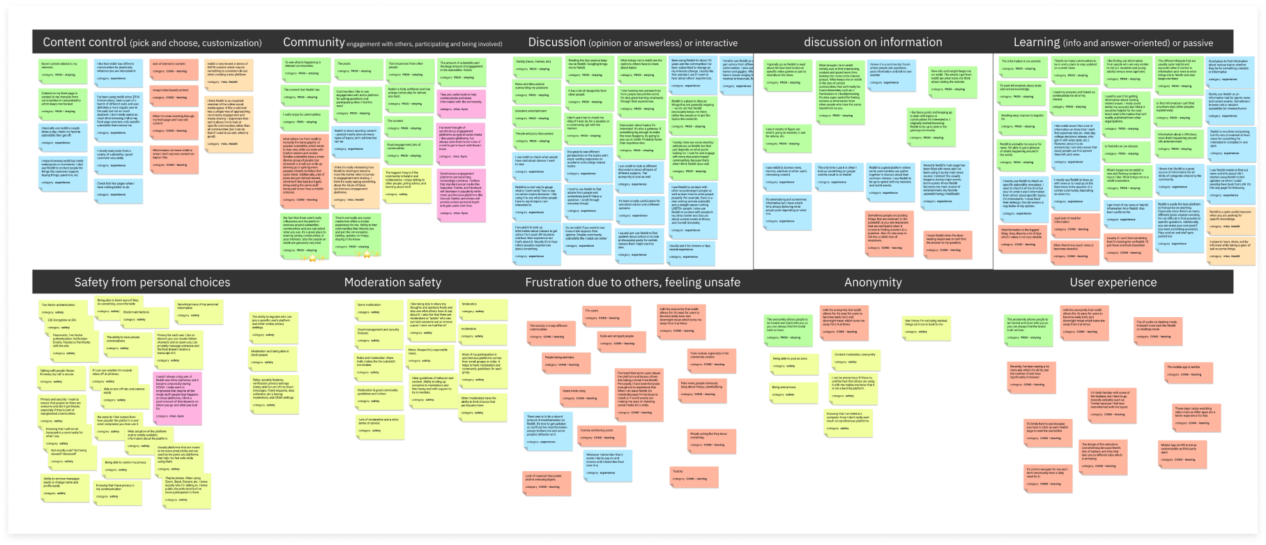
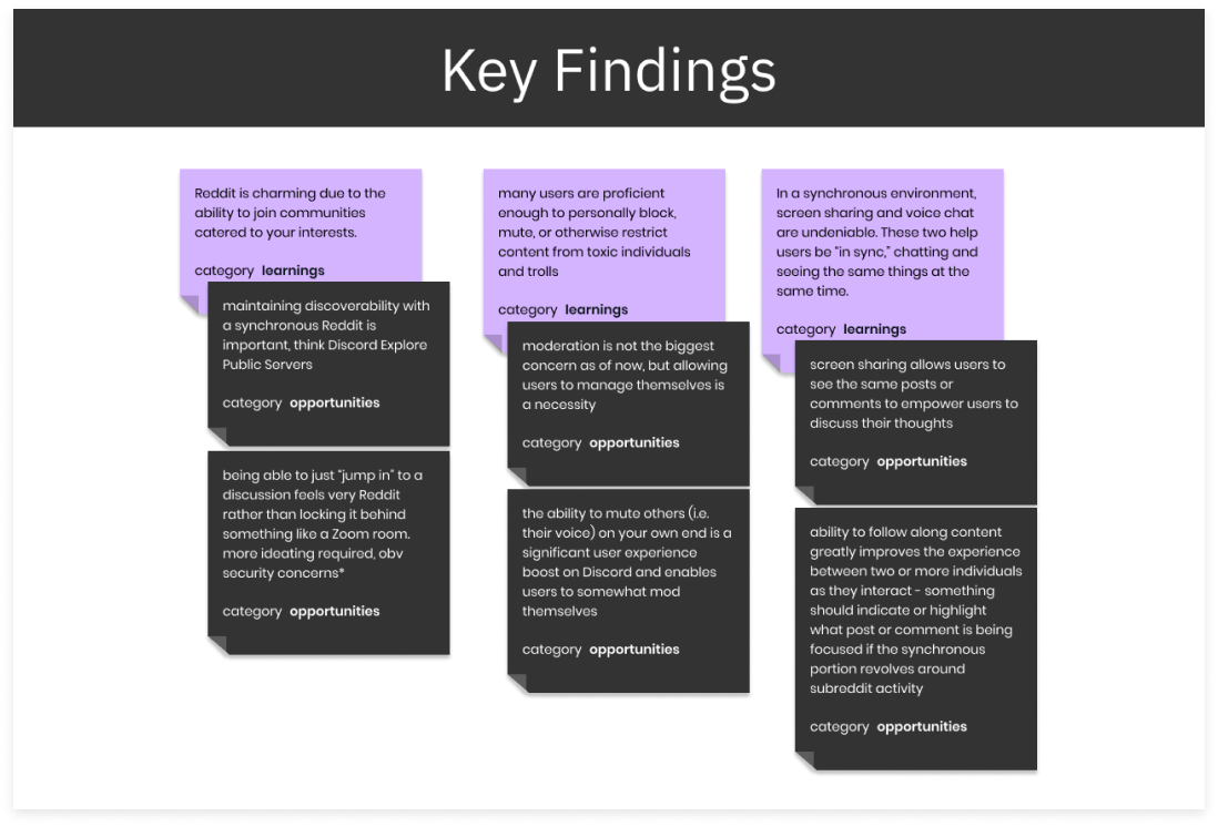
With these categories identified and findings easily readable and digestible, we identified the most significant takeaways from which I noted possible design opportunities shown in Figure 15.
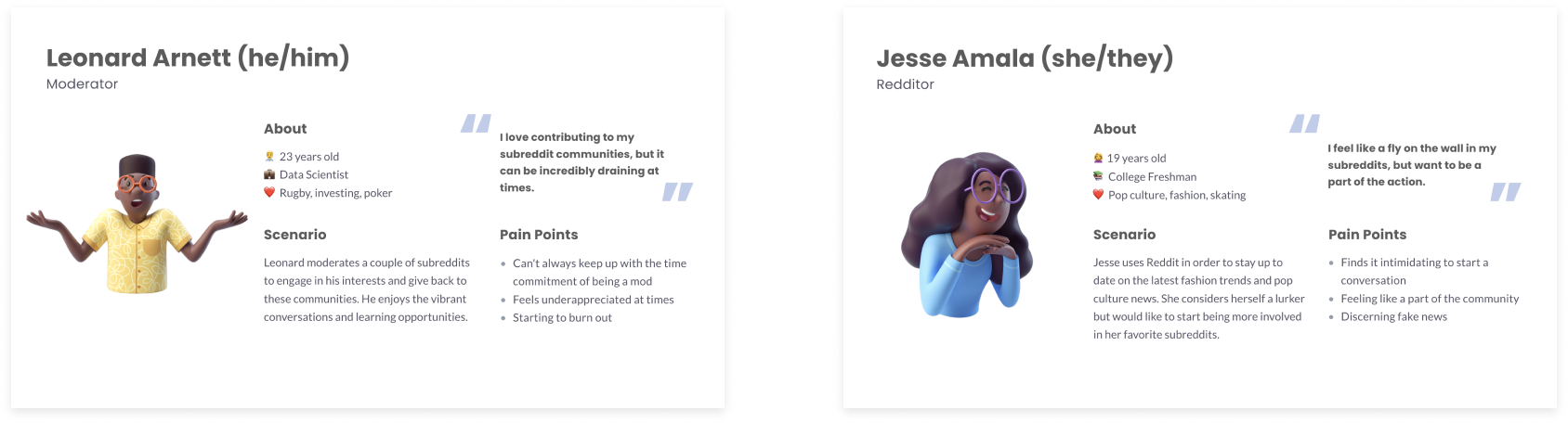
personas
I initially crafted a basic Reddit user persona from my research but later, we collectively summarized our shared findings to create two main personas as a team. One moderator persona guided our thoughts as we considered how our solution might be safe for all users while not creating excessive work for moderators. A typical Redditor persona helped scope the general population and guide our work in designing for the millions of daily active Redditors. These personas were succinct to ensure that our constant referencing them would not be difficult. Having access to user stories, especially their pain points that we discovered, increased our ability to address the problems we found and ensure our ideation was backed by research.
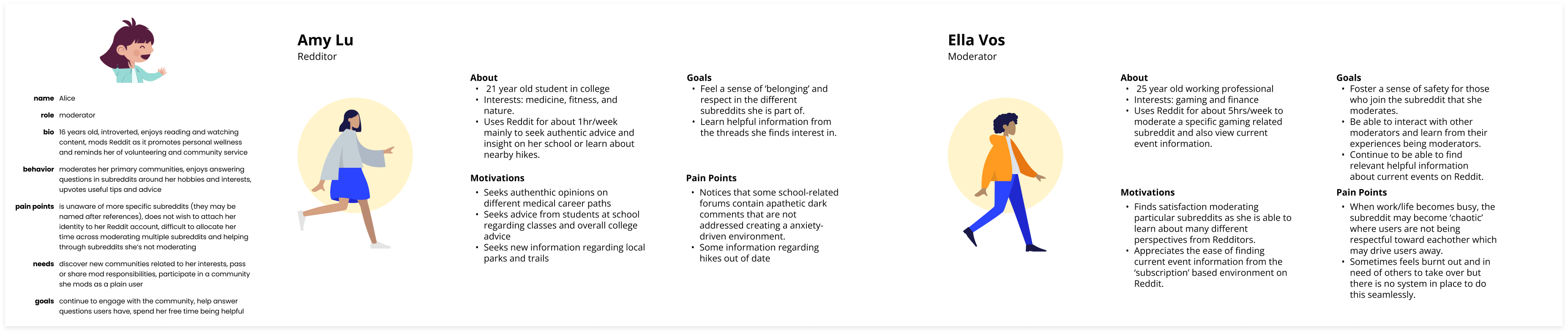
Despite having previous persona iterations, we finalized on two that addressed our primary audience of Redditors and secondary audience of moderators. Anymore may seem helpful but would be overwhelming to consistently reference in our ideation and design.
IDEATION
sketching
Together, we had over 40 divergent and convergent sketches throughout our ideation process. These focused on integrating voice and text chat, video streaming, and creating a general virtual environment where users could interact. Below are 10 of my own sketches.
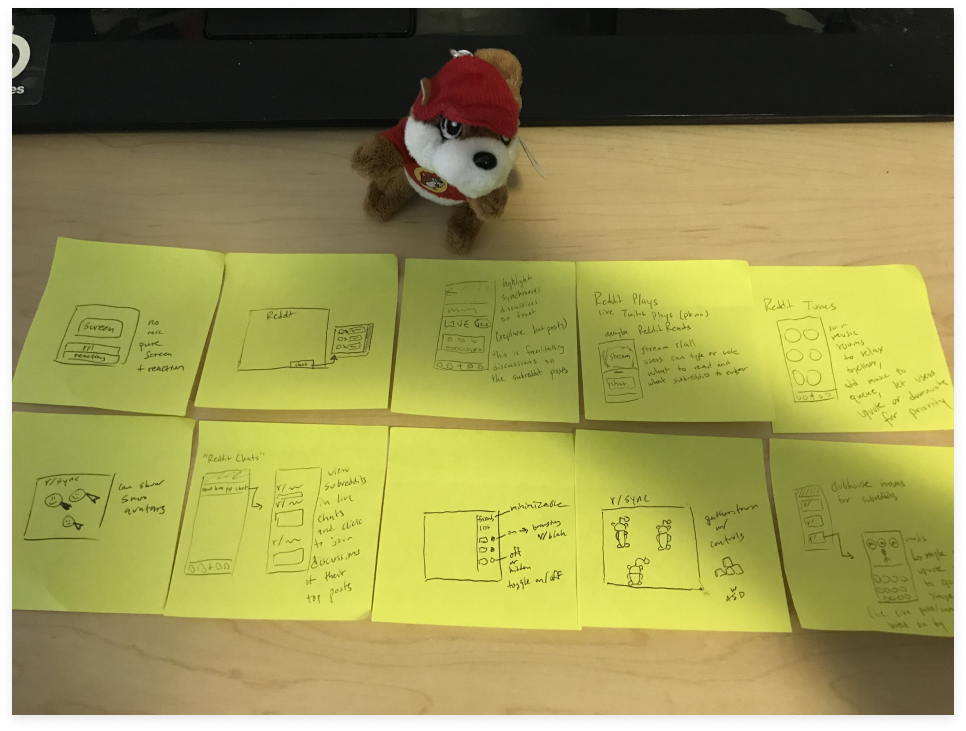
From our sketches, we discovered similar themes in our ideas for what synchronous may look like. We also narrowed down our idea to a web based virtual world to integrate with Reddit. We discovered that some of our ideation already existed or was currently being explored and as a result, we navigated away to a more unique idea. One competitor we examined was Clubhouse and we imagined this platform on Reddit, where users could raise their hand in conversation and moderators would unmute them to participate. This was the primary idea we were leaning towards, especially because we could envision a mobile experience and a large population of Reddit browses the product through their mobile devices. However, we soon found out that Reddit Talk was this exact concept we envisioned and was released publicly just a month prior to our brainstorm. As a result, our direction shifted towards a new open world concept.
After gaining a better understanding and building context around our problem space, I browsed Reddit threads to consider our primary users. Redditors were an excellent source and lay in the space between primary and secondary sources as they utilized Reddit and other synchronous platforms. Reddit posts and comments around synchronous engagement, moderation, and avatars guided my thoughts, allowing me to narrow my scope a little and identify what aspects of synchronous engagement, moderation, and avatars I wished to explore. Reddit threads were a great first hand experience as they make up our audience. While I read about preferences in synchronous platforms and avatars, I focused heavily on moderation through these posts. Redditors sharing their opinions through comments allowed us to discover what they see in a moderator position as well as what throws them off.
Finally, I resorted to commentary of existing platforms, their features, and why certain elements are successful or unsuccessful. This included blogs and articles analyzing trendy products which may have been compared to other platforms. As I read through various opinions and analysis, I began to notice common patterns and trends such as voice chat existing in most, if not all, synchronous platforms. Alongside this, I quickly gauged what products exist and what I could examine later through competitive analysis.
information architecture
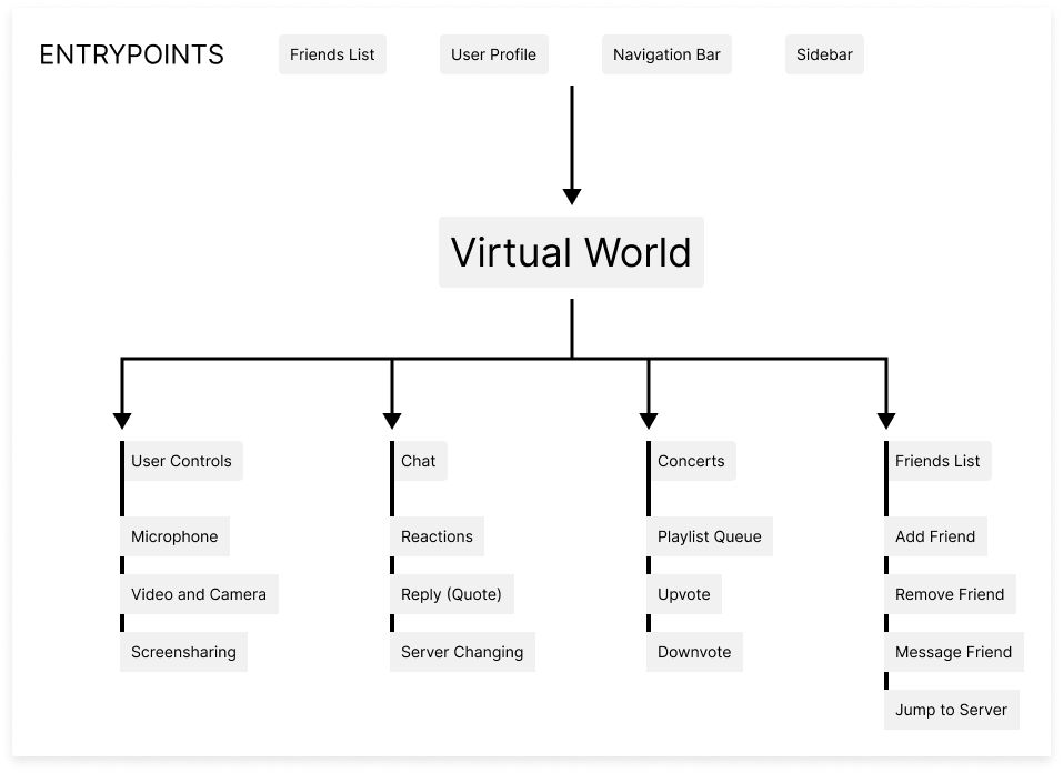
As we leaned in on a virtual world, we wanted to identify a direction to design for. Creating an entire virtual world with all the features other products may have was not feasible given our constraints including timeline. To resolve this, I mapped out an information architecture beginning with entry points to a virtual space before considering actions users might undergo within this environment. While not extensive, the following information architecture in Figure 19 previews actions, scenarios, and elements that were to be designed for. Attempting to consider further flows may have been interesting, but not viable as we would be overwhelmed in attempting to design for more factors. I acknowledge that a more in depth information architecture would allow for better understanding of the product as a whole and more careful craftsmanship towards user flows, but given time constraints any more ideas would lead to a heavy emphasis on designing screens to showcase possibilities rather than flows for users and testers to imagine our product.
wireframes
To wrap up the ideation phase, we further imagined our product through wireframes. These allowed us to consider a skeletal structure for our design and decide if the idea was feasible. Wireframing was a critical step in understanding how our platform may visually appear and if this display may be overwhelming to users. If it were, then we would need to reevaluate proposed designs or redirect our focus to another concept.
DESIGN
lo-fi
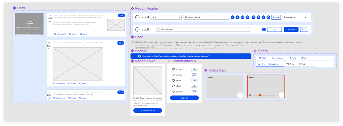
Before designing multiple screens, I created a miniature design system to ease our process and ensure consistency across design. This included commonly used elements and sped up later design iterations as modifying one component applied across all designs.
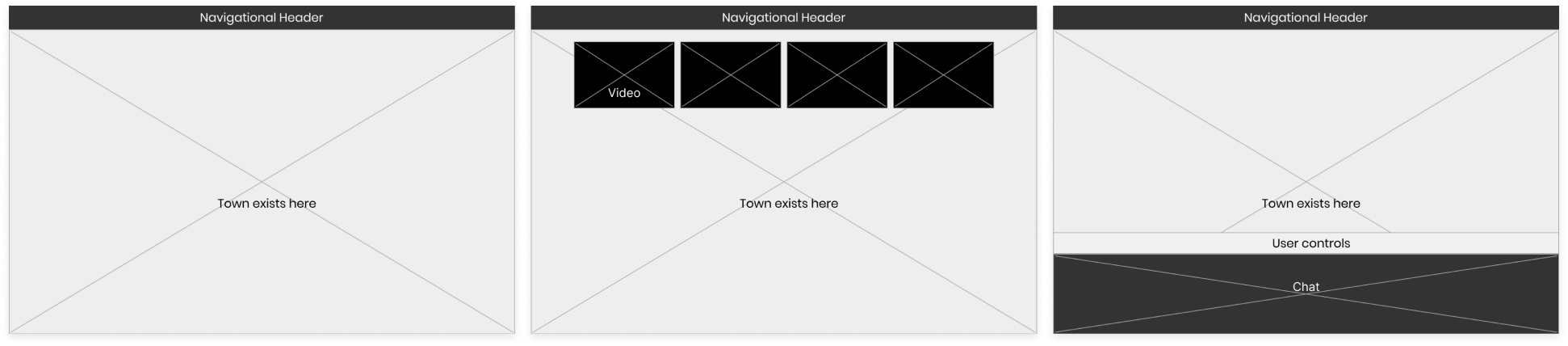
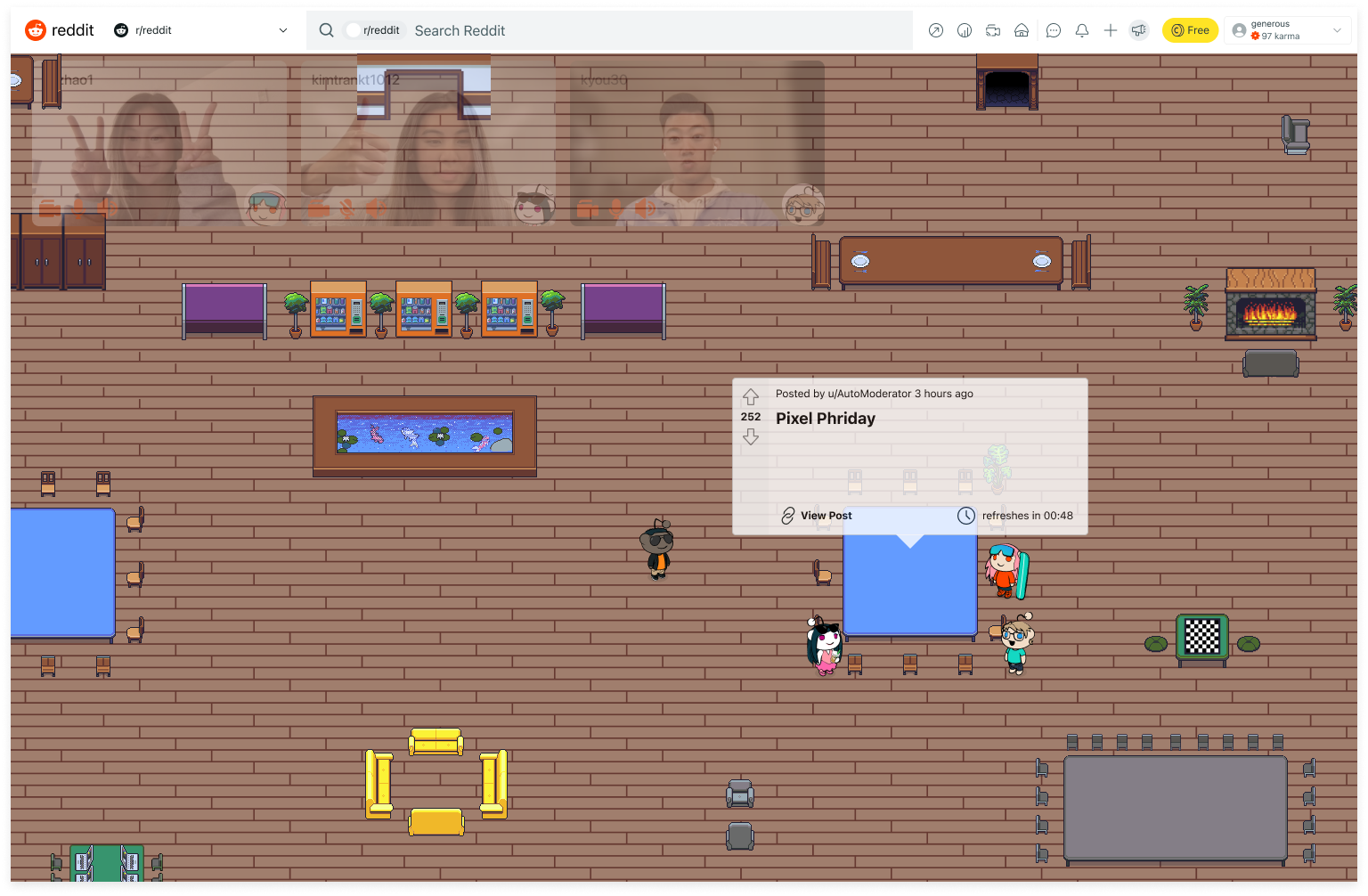
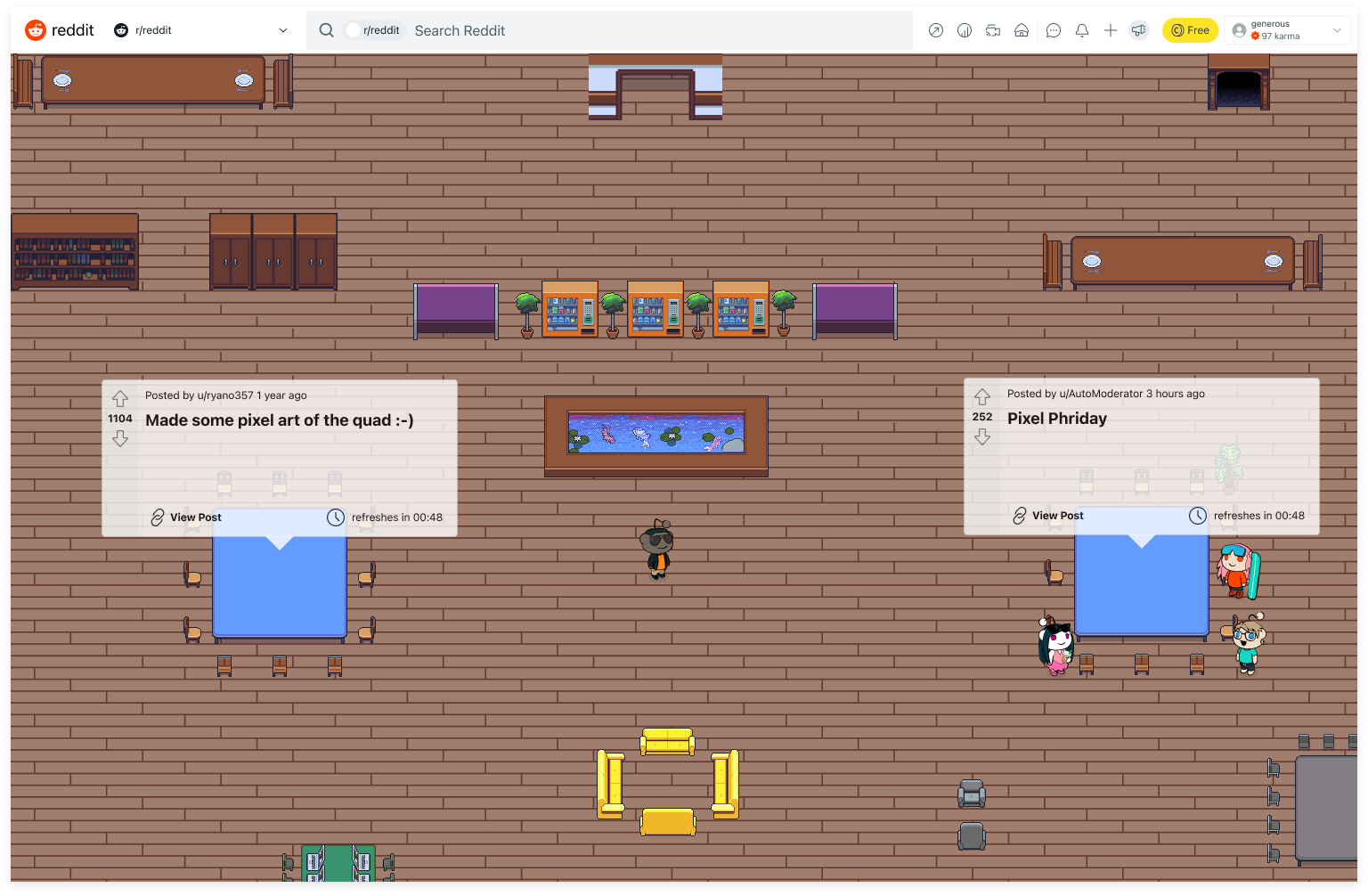
After validating our idea and understanding a basic user flow that showcased the purpose of a Reddit open world, we began low fidelity iterations to represent the concept. Low fidelity is an important stage where testing and validating is most efficient. Remaining in low fidelity ensures that rapid iteration is possible because designs do not need to be polished and can be adjusted to fix errors or oversights. Using these screens, we discussed our idea with our sponsors and had them share how they envisioned interacting on SnooVille, our product. I created the flow of joining an existing conversation, chatting through voice and text, and accommodating new users as shown below in Figure 21.
usability feedback
As a result of our discussions with peers and our sponsors, we discovered the concept being well received with room to be improved. While our low fidelity screens were minimal and not flushed out which was not intentional, this flaw resulted in valuable feedback as we received greater feedback around possibilities. Our testers were not solely focused on trying to improve existing screens or interactions but rather saw gaps where they could provide multiple insights for us to explore. In speaking to numerous testers, I gained a better understanding of what aspects of SnooVille were engaging and where gaps in the user flow existed. Through our user tests, we noted three significant areas to focus our upcoming design.
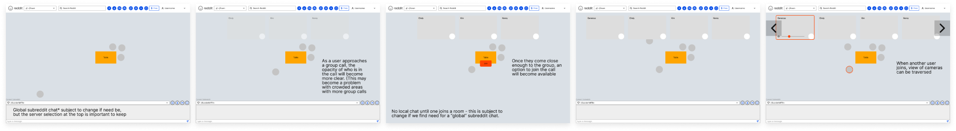
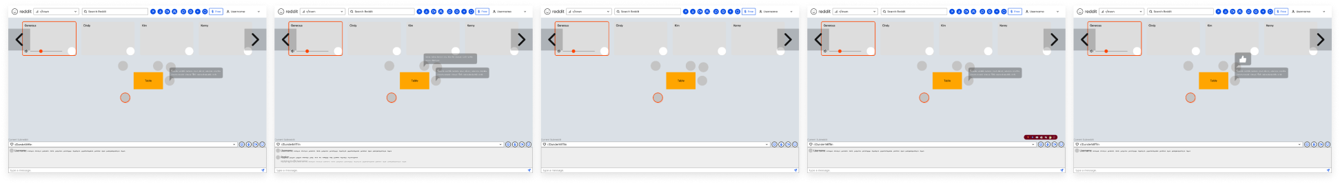
First, we showcased video cameras with visibility that scaled with distance and were asked to consider pushing this idea of a physical space which culminated in a design choice to incorporate ambient sound. Connecting the bridge between physical and digital spaces later became the most important design requirement as we sought to bring social club behavior to the virtual realm. We were told to think about how to make our space livelier, much like walking around in a real city or real community. However, in addition to suggestions and constructive criticism, we also were given compliments such as our idea being great at evoking feelings by showing people and crowds. Seeing characters was much better than seeing a number of participants displayed.
Next, my chat was originally placed at the bottom of the screen and being full width, took up a significant amount of real estate. This was immediately noted by testers who recommended experimentation with positioning or having a flexible chat. This idea was reinforced when considering short text messages such as a simple greeting.
Finally, we were stressed to not neglect on-ramps. While I had made explicit note of entry points, on-ramping was an unfamiliar area for me. On-ramping refers to the process of speeding up a user's entry and overall prompting or encouraging them to interact with specific elements. Alongside this, we realized a lot goes into selling the idea and making it feel real to stakeholders. We were also told to use content from Reddit top communities to create real use cases. I ended up brainstorming a significant portion of potential on-ramp interactions but did not lead the design efforts. Instead, I supported the design by presenting my suggestions for possible on-ramps and providing critique to these ideas.
hi-fi
Working through multiple iterations with feedback, we finally moved on with designing higher fidelity screens with respect to our timeline. With more time, we may have remained at the low fidelity stage to test additional ideas, but we had a primary user flow established which was to serve as our minimum viable product.
Our process was not as linear, however, as we designed multiple screens to showcase the many features we envisioned and ultimately missed a logical progression. When sharing our new designs, we were immediately asked to consider the user journey and that some flow would be crucial rather than a series of divided screens. We then realized that these screens connected together in our minds because we had spent extended periods of time discussing how users would engage with one another but we skipped a few screens connecting features in our explicit design. Our sponsors, who had some context of our idea, were a bit confused by our process and presentation of the journey, emphasizing the lack of progression in our designs which would not appeal to general users or stakeholders who could not vicariously live through the screens.
To emulate the full experience, I utilized a Wizard of Oz prototyping approach to test user flows and gauge success. I controlled the character from the main user's point of view in a Figma design file while showing the prototype. Prototypes update with changes to design files so when I moved the Snoo avatar, the prototype reflected this and mimicked movement to viewers who were not exposed to the design file. I then utilized after delay effects to showcase transitions such as video cameras slowly appearing as the Snoo came closer.
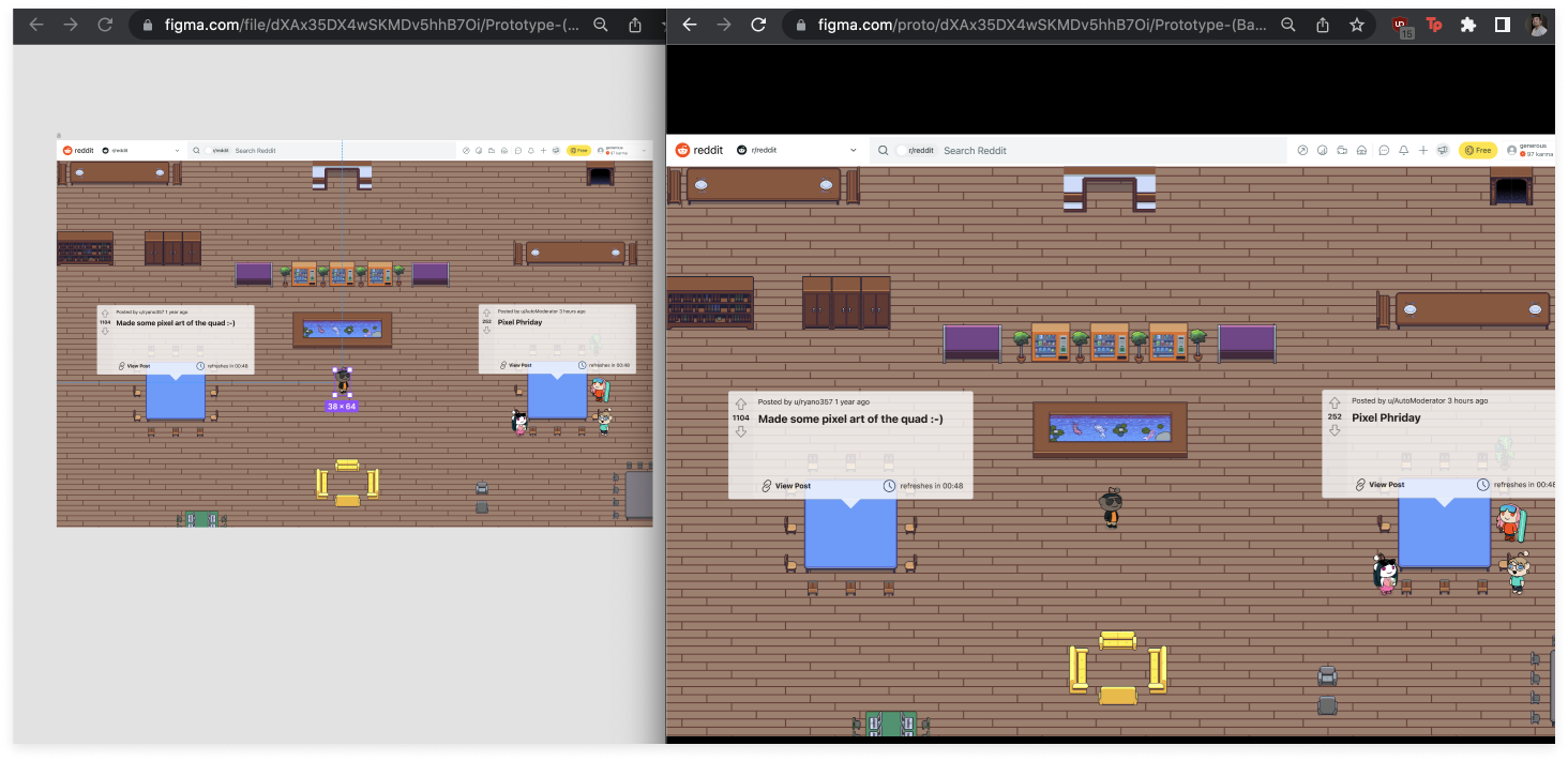
Later, I discovered an easier way to emulate movement by simply sliding the background so the Snoo avatar was always centralized. This also solved the dilemma of having the background reveal more areas as one walked towards edges and corners. By keeping the Snoo centered the entire time, that logistical concern was eliminated.
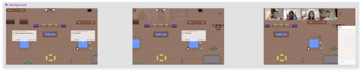
After successfully inducing “movement” into the prototype for the audience to view, I focused on integrating Reddit into SnooVille further. Prompts were already pulled from existing Reddit posts to guide conversation but there was room to expand. I showcased the act of clicking a Reddit link posted in chat which would be embedded into SnooVille and not link externally to facilitate conversations inside of SnooVille. An advantage of this was that discussions could be synchronous, in real time with nearby Redditors versus commenting on a post and having to wait for replies, if any at all.
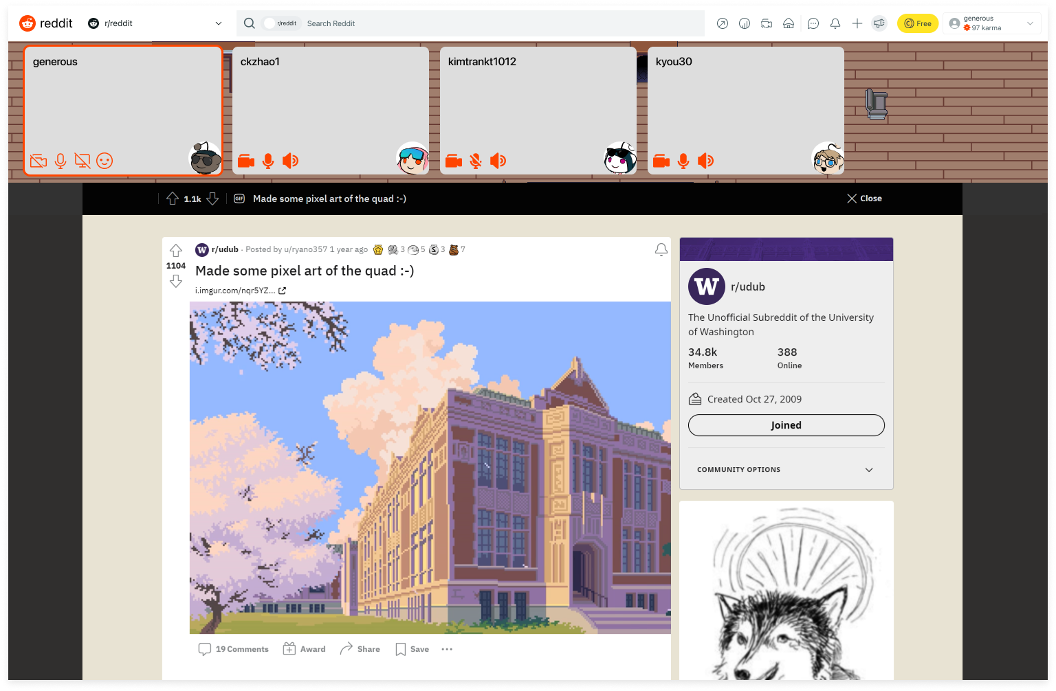
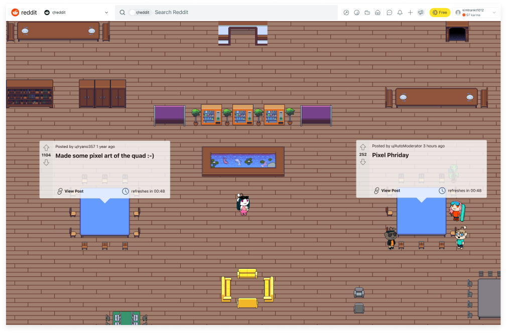
While no full prototype with every interaction is built and available due to complexity, the above screens summarize the main user flow. As a user loads into SnooVille, they spawn in the center and nearby suggested prompts are shown. Walking towards a conversation reveals a video preview of participants and ambient sound of their conversation is also shared. The closer one is, the more apparent these features are so video cameras become fully visible and audio is clearly heard. Walking away from a table with a suggested prompt or being directly in a conversation hides suggested prompts. Users are also able to chat through text and shared Reddit links are embedded into the platform to encourage real time, synchronous discussion.
SOLUTION SUMMARY
SOCIAL CLUB BEHAVIOR
Much like in a physical setting, users gain awareness around conversations nearby through video previews and ambient sound, empowering them to freely pick and choose where to go
GUIDED CONVERSATIONS
Drawing from Reddit posts, suggested prompts that refresh are shown to drive discussion and gather groups so users do not necessarily need pre-arranged agendas to interact
EMBEDDED REDDIT
As an extension to Reddit, posts are opened within SnooVille so real time, synchronous discussion can occur without having to refresh posts to view comment replies
CONCLUSION
A full design process within two quarters may not seem particularly challenging, but attempting to learn alongside the way expended a majority of the timeline. We were not simply innovating a solution given a problem as we took this opportunity to learn about the problem space, our users and their struggles, as well as how to design better. Designing better is very broad, but it sums up the experience of accessing an existing design system provided by our sponsors, learning to maintain consistency in a space and product we have never designed for, and overall getting more comfortable and confident using our design tools.
next steps
Continuing these efforts takes form in many different ways including exploring other features, safety, and creating a more interactive prototype. The amount of effort required for a fully fledged prototype may not be worthwhile as this is simply a series of screens with an avatar taking steps. Having an engineer build out a prototype is much more feasible than design for this scenario. As for other features, while nice to have, they aren't necessary to most user motivations when using synchronous platforms. The most immediate next steps would thus be to explore moderation and safety on SnooVille involving cameras, audio, and text. Appropriate content is difficult to automoderate as individuals become increasingly proficient at bypassing filters. Relying on moderators alone is not an effective solution either because they are overworked and underserved. Moderators are essentially volunteer positions and having them enforce safety on a platform like SnooVille would grow increasingly difficult, especially with growing communities. Similarly, not all subreddit moderators may choose to explore new platforms.
After creating a safe space, it is important to revisit on-ramps as a solution such as SnooVille requires users to join. Without encouragement or persuasion to try out SnooVille, the platform may be disappointing to view and users who are interested may find the lack of community deterring. Knowing this, it is important to consider the process by which users access solutions such as SnooVille, otherwise the solution does not solve any problems users encounter. Only then can we return to designing to expand the virtual environment and its features.
reflection
Working on this problem area was interesting as I discovered how products are so similar especially with features but they all remain successful. However, through ideating solutions after research, I found that there is a multitude of directions one can approach problems from, depending on the slightest difference in needs. For example, a platform focused on anonymity may not perform well with video and voice but a platform accommodating anonymity can take multiple approaches, omitting features or leaving them optional. This was one of the most interesting parts of this project because each design decision was then paired against our research to determine if it were truly the right, viable plan. While there can be multiple solutions to one problem, they will have varying levels of reception and success.
I enjoyed tackling a gamified solution as this is not something one designs for commonly. One of the biggest challenges with such a solution revolved around prototyping and animation. While Figma is a powerful tool, it is limited as there are aspects such as manipulating specific intervals Figma cannot quite replicate whereas other products excel at. As a result, I do wish I expanded my toolkit and worked with products outside of my comfort zone to not only learn them, but also potentially create better user flows and proof of concepts to share with our sponsors. Moving forward, I'll be able to explore the various design tools out there and look forward to the ability to enhance my capabilities in prototyping animations.
Working with a less diverse team, meaning we were all mostly interested in design, was definitely a challenge that I knew coming in, but was prepared for. Our research and management may not have been perfect without dedicated roles, but we were all able to approach design in different ways to learn and grow together. I had a fantastic time assisting my team in their design by leveraging my expertise in design systems, an area that is not focused on much outside of industry. By attempting to teach, I reinforced my own knowledge and ability. At the end of the day, I recognized this project as an opportunity for growth even while working with sponsors on real challenges. The environment, being with other students, was one that fostered growth and facilitated an imperfect scenario. Opportunities are not always ideal with delegated tasks and this experience allowed me to accept that challenge and work with it.
During our final meeting with sponsors, they asked for constructive criticism around their mentorship. I mentioned being more involved in our learning or our work by walking us through their design process, tips and tricks they utilize, and possibly co-designing together. They were adamant about not influencing our findings or solution in the beginning and this led to our team needing to feel more independent, which is not a bad thing but I believe there is room for improvement and growth when more members are involved.
I do acknowledge that we share fault for not asking, but we were uncertain about their involvement. Our sponsors also expressed uncertainty around this and thought it was valuable feedback especially as they can ask future sponsees for preferences in learning styles. With this in mind, I have learned to consider speaking up earlier in the process to best map out procedures. They briefly mentioned the possibility of us sharing designs with a larger Reddit design team for critique, but did not follow up and thus we continued to iterate with feedback from them and our network alone. While this was not a setback, I acknowledge that the best design occurs in the open and the more eyes and critique we receive, the more opportunities we discover. In the future, I am more open to all critique because I know it does not need to be addressed or integrated, but it provides new food for thought.
WORKS CITED
[1] Jhaver, S., Birman, I., Gilbert, E., & Bruckman, A. (2019). Human-machine
collaboration for content regulation. ACM Transactions on Computer-Human
Interaction, 26(5), 1-35. https://doi.org/10.1145/3338243
[2] Mengjin Xiao, Juxiang Zhou, and Tianwei Xu. 2020. Research on the Influence
of Synchronous Interactive Class on Student Online Learning Engagement. In
2020 12th International Conference on Education Technology and Computers
(ICETC'20). Association for Computing Machinery, New York, NY, USA, 98-104.
DOI:https://doi.org/10.1145/3436756.3437028